Victor Vasarely made paintings that refuse to sit still. His geometric grids pulse, bulge, and warp even though they’re just flat paint on canvas.
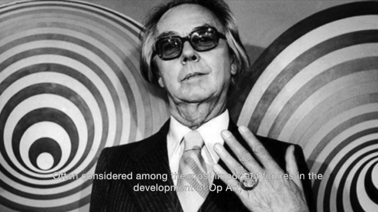
Born in Hungary in 1906, Vasarely became the acknowledged father of op art, a movement that weaponized optical illusions against comfortable viewing. His 1937 painting Zebra is considered one of the earliest examples of the style that would dominate 1960s visual culture.
This article examines Vasarely’s journey from medical student to graphic designer to pioneering painter. You’ll discover his systematic approach to color theory, his patented “plastic alphabet” method, and how his geometric abstraction techniques predicted digital art by decades.
We’ll explore his notable works including the Vega series, his influence on contemporary art, and practical tips for recognizing his distinctive visual language.
Identity Snapshot
Victor Vasarely (Gyozo Vasarhelyi; Hungarian: Vasarhelyi Gyozo)
Born: April 9, 1906, Pecs, Hungary
Died: March 15, 1997, Paris, France
Primary roles: Painter, Graphic Designer, Sculptor, Printmaker
Nationality: Hungarian-French (naturalized 1959)
Movements: Op Art, Kinetic Art, Geometric Abstraction
Mediums: Acrylic on canvas, gouache, tempera, serigraphs, ceramic, Lucite, glass, porcelain
Schools/Training: Muhely Academy (Budapest Bauhaus), Podolini-Volkmann Academy
Signature traits: Grid-based geometric forms, chromatic intervals, optical distortion, systematic permutations, hard-edge precision, spherical swelling effects
Iconography: Zebras, checkerboards, hexagons, cubes, ellipsoids, spheres, planetary folklore
Geographic anchors: Pecs (birthplace), Budapest (training), Paris (1930-1997), Gordes (summer studio), Aix-en-Provence (Foundation)
Key relationships: Claire Spinner (wife, fellow artist), Jean-Pierre Vasarely/Yvaral (son, artist), Denise Rene (gallerist), Sandor Bortnyik (teacher), Josef Albers (influence), Bridget Riley (contemporary)
Collections: Centre Pompidou, MoMA, Guggenheim Museum, Tate Modern, Albright-Knox Art Gallery, Vasarely Museum Budapest, Vasarely Museum Pecs, Fondation Vasarely Aix-en-Provence
Market signals: Large-scale acrylic canvases (typically 150-200cm square), edition serigraphs, public commissions, Vega series works command premium prices
What Sets Vasarely Apart
Vasarely built an entire visual alphabet from scratch.
His systematic approach to optical phenomena separated him from intuitive abstractionists. Where Piet Mondrian sought spiritual harmony through static grids, Vasarely made grids writhe and pulse. He patented his “unites plastiques” method in 1959, a modular system that turned painting into programmable code decades before digital art existed.
The Hungarian-French painter didn’t just create optical illusions. He weaponized retinal fatigue.
His work from 1947 onward forced viewers to become active participants. The eye couldn’t rest on a Vasarely canvas. It had to constantly recalibrate, searching for stable ground that never materialized. This aggressive engagement with human perception defined op art as a movement and made Vasarely its undisputed architect.
Origins & Formation
Medical Studies to Visual Arts (1925-1929)
Vasarely enrolled at Eotvos Lorand University in Budapest to study medicine in 1925. Two years in, he abandoned it completely.
The switch to art happened at Podolini-Volkmann Academy in 1927, where academic painting techniques bored him within months.
Bauhaus Immersion (1928-1929)
Real training began at Sandor Bortnyik’s Muhely Academy in 1928.
This Budapest institution operated as Hungary’s version of the Bauhaus. Cash-strapped but intellectually rich, it focused on applied graphic art and typographical design rather than fine art mysticism. The curriculum merged constructivism principles with commercial applications.
Vasarely painted Blue Study and Green Study in 1929. These early works showed competent handling of color theory but little hint of what followed.
Paris Migration (1930)
In 1930, Vasarely married fellow student Claire Spinner and moved to Paris immediately after.
The city offered work but little artistic community. He took positions at advertising agencies (Havas, Draeger, Devambez) from 1930-1935, designing pharmaceutical posters and commercial graphics. This commercial grind lasted thirteen years before serious painting began.
He kept mostly isolated from other artists during this period. The graphic design work paid bills and taught him about systematic visual communication, but it wasn’t art yet.
First Optical Experiments (1935-1944)
Working at Roger Bessard’s medical publishing house from 1935 onward gave Vasarely financial stability.
His 1937 painting Zebra emerged during this commercial phase. Two zebras intertwine against black, their stripes creating spatial ambiguity and movement through pure black-white alternation. No outlines. No modeling. Just contrast and pattern.
Art historians later called it the first op art painting. Vasarely just called it a study.
Chess Board (1935) and Girl-power (1934) showed similar interest in patterned surfaces and perceptual tricks.
Movement & Context
The Constructivist Inheritance

Vasarely absorbed constructivism through his Bauhaus training but stripped away its utopian rhetoric.
Russian constructivists like Kazimir Malevich wanted to rebuild society through geometric purity. Vasarely wanted to rebuild vision itself. His Tribute to Malevich (1954), a 100-square-meter ceramic mural at University of Caracas, acknowledged the debt while demonstrating how far he’d traveled beyond static suprematism.
Op Art Founding (1947-1965)

The Belle-Isle period (1947-1951) marked Vasarely’s break from representational work.
Walking Breton beaches in 1947, he noticed “internal geometry” in wave-polished pebbles and broken glass. This revelation pushed him toward pure geometric abstraction. The Gordes/Cristal works followed, inspired by cubic Provencal architecture.
His 1955 Yellow Manifesto laid out theoretical foundations for “visual kinetics.” The document positioned optical phenomena as legitimate artistic material, not gimmick. That same year, Galerie Denise Rene mounted “Le Mouvement,” grouping Vasarely with Calder and Duchamp. Op art had a name now.
Comparative Positioning
Vasarely vs. Josef Albers: Both explored color interaction systematically. Albers built nested squares that revealed simultaneous contrast. Vasarely distorted the grid itself, making space bulge and recede. Albers stayed meditative; Vasarely went kinetic.
Vasarely vs. Bridget Riley: Riley’s black-white paintings from the 1960s created more aggressive retinal vibration. Her curves and undulations felt organic despite geometric construction. Vasarely’s work remained colder, more architectural. Riley painted sensation; Vasarely programmed it.
Vasarely vs. Piet Mondrian: Mondrian’s grids were metaphysical diagrams. Fixed, stable, searching for universal order. Vasarely’s grids were perceptual engines designed to malfunction beautifully. Where Mondrian pursued balance, Vasarely engineered imbalance.
The Responsive Eye (1965)

MoMA’s “The Responsive Eye” exhibition made op art mainstream overnight.
Vasarely showed six works alongside Albers and Riley. Critics dismissed the movement as retinal parlor tricks. The public mobbed the galleries. Op art patterns invaded fashion, advertising, and record covers for the next decade.
Vasarely became an international celebrity at 59.
Materials, Techniques, and Process
Early Period Materials (1929-1950)
Vasarely started with gouache and tempera on paper during his graphic design years.
These water-based media allowed quick experimentation with color relationships and pattern development. The matte finish prevented distracting reflections that would interfere with optical effects.
Oil paint appeared occasionally but never became his primary medium. Too slow, too traditional.
Acrylic Revolution (1950s onward)
Acrylic paint transformed Vasarely’s practice after 1950.
The medium dried faster than oil and produced flatter, more uniform surfaces. No brushwork texture to distract from pure optical phenomena. He could build hard-edged geometric abstractions with surgical precision.
Canvas supports ranged from 50cm studies to 200cm square statement pieces. Most major works landed between 150-200cm per side. Perfect squares dominated, though some series used vertical rectangles.
The Plastic Alphabet System (1959-1997)
Vasarely patented his “unites plastiques” method in 1959.
The system worked like visual programming:
- Three primary colors (red variants, blue variants, green variants)
- Secondary colors in controlled quantities
- Black, white, gray
- Fixed geometric forms (circles, squares, triangles, ellipses, hexagons)
- Each unit numbered and catalogued
Assistants could execute works from this vocabulary. Permutations became theoretically infinite. The approach scandalized traditional painters but aligned perfectly with 1960s systems thinking.
Surface Preparation
Vasarely used commercially primed canvas almost exclusively by the 1960s.
Industrial preparation guaranteed consistent tooth and absorbency. He avoided visible brushstrokes obsessively. Each color field needed optical flatness. Any texture would create unwanted shadows that broke the illusion.
Color Application Method
He painted in layers, building opacity through multiple thin coats rather than single thick applications.
This technique produced luminous, even color saturation without surface variation. The approach borrowed from industrial painting more than fine art tradition. Edges stayed razor-sharp through masking and careful brushwork.
Sculptural Materials (1960s-1990s)
Vasarely experimented with Lucite, glass, and aluminum for three-dimensional work.
Transparent materials added another dimension to optical play. Light could pass through colored planes, creating layered effects impossible in painting. His ceramic and porcelain pieces used industrial manufacturing techniques to achieve precision beyond handcraft.
Themes, Subjects, and Iconography
The Zebra Motif (1937-1965)

Zebras appeared throughout Vasarely’s career as perfect subjects for optical exploration.
Their natural striping eliminated the need for outline or modeling. Form emerged from pattern alone. The 1937 Zebra established this approach. He returned to it in sculpture during the 1960s, creating vertical towers of interlocking striped forms.
Geometric Vocabulary
Circles, squares, hexagons, and ellipses formed Vasarely’s core symbolic language.
These weren’t abstract shapes representing something else. They were the content itself. The hexagon series (mid-1960s onward) explored impossible cube formations that appeared to project forward and recede simultaneously. Each arrangement tested different perceptual mechanisms.
The Grid as Foundation
Nearly every Vasarely work from 1947 onward started with a grid.
Sometimes regular, sometimes distorted. The grid provided structural order that he then systematically violated. Cells expanded and contracted. Lines bent. Space warped. But the underlying geometric logic remained readable even as it broke down.
Planetary Folklore (1963)

Vasarely’s “Folklore Planetaire” concept proposed universal visual communication.
He imagined his plastic alphabet as a new Esperanto, comprehensible across cultures without language. The series used his full vocabulary of numbered forms and colors in endless permutations. Each combination theoretically carried semantic meaning like words in a sentence.
Nobody else could read the language, but the ambition was genuine.
Compositional Schemes
Spherical Swelling: The Vega series (1957-1970s) made flat grids appear to bulge forward like pregnant spheres. Achieved through progressive cell distortion and strategic color contrast.
Cubic Ambiguity: Hexagon works created “Kepler’s cube” effects where foreground and background flipped depending on which color plane you focused on.
Linear Acceleration: Vonal series (1970s) used converging lines that appeared to rush toward vanishing points, creating kinetic energy in static paint.
Notable Works
Zebra (1937)

Medium: Gouache on paper
Size: 52 x 60 cm
Location: Various collections
Two zebras interlock against solid black background. Their bodies defined entirely by alternating black and white stripes with no outlines or contour work. The pattern creates spatial depth and suggests movement through pure optical means. Considered the first op art painting by many historians.
This work established Vasarely’s career-long interest in making form emerge from pattern alone. The zebra motif recurred in sculptures and prints for three decades.
Vega (1957)

Medium: Acrylic on canvas
Size: 195 x 130 cm
Location: Museum collections
A massive black-white checkerboard with systematically distorted lines that make the grid appear to bend and warp. Named after the brightest star in constellation Lyra. The piece presents contradictory spatial information that forces constant visual recalibration.
This painting marked Vasarely’s mature op art style. Pure geometric abstraction with aggressive perceptual effects.
Tribute to Malevich (1954)

Medium: Ceramic mural
Size: 100 square meters
Location: University of Caracas, Venezuela (co-designed with architect Carlos Raul Villanueva)
Monumental black-white composition acknowledging suprematism while demonstrating Vasarely’s divergence from static geometric painting. The scale transformed optical effects into environmental experience. Viewers couldn’t escape the visual field.
This commission established Vasarely’s interest in integrating art into architecture rather than keeping it confined to galleries.
Vega-Nor (1969)

Medium: Acrylic on canvas
Size: 200 x 200 cm (78.75 x 78.75 inches)
Location: Albright-Knox Art Gallery, Buffalo
A perfect square canvas showing an orderly grid that swells dramatically at the center like a pregnant sphere. Warm colors (orange, yellow) advance while cool tones recede. Cells become progressively smaller toward edges, strengthening the illusion of spatial bulge.
Vasarely explained: “This composition expresses the extension, the expansion of the Universe: the extreme of the great infinities of Nature.”
The work represents peak op art achievement. Maximum optical impact from minimal means.
Vega III (1957-1968)
Medium: Oil on canvas
Location: Solomon R. Guggenheim Museum, New York
Grid composition that creates three-dimensional sphere illusion through careful value gradation and cell distortion. The viewer’s movement around the painting constantly changes the apparent depth and position of the swelling form.
This work exemplified Vasarely’s Yellow Manifesto principle that viewers create the artwork through their active perception.
Keple-Gestalt (1968)

Medium: Acrylic on canvas
Size: 160 x 160 cm
Location: Museum collections
Hexagonal composition creating impossible cubic structures that shift between convex and concave depending on viewer focus. Part of the “Homage to the Hexagon” series that explored every permutation of six-sided geometry.
The work bridged painting and puzzle. Solving the spatial relationships became part of viewing experience.
Exhibitions, Collections, and Provenance Highlights
Major Exhibitions

Early Recognition:
- Kovacs Akos Gallery, Budapest (1930) – First solo show
- Ernst Museum, Budapest (1933)
- Galerie Denise Rene, Paris (1944, 1946, 1949, 1952, 1955, 1959-60, 1966, 1969, 1971-73, 1976)
International Breakthrough:
- “Le Mouvement,” Galerie Denise Rene, Paris (1955)
- “The Responsive Eye,” Museum of Modern Art, New York (1965) – Career-defining moment that made op art mainstream
Later Career:
- Over 150 solo exhibitions worldwide between 1965-1997
- Major retrospectives in Budapest, Paris, London, New York
Institutional Collections
Museums with significant holdings (3+ works):
- Fondation Vasarely, Aix-en-Provence (500+ works)
- Vasarely Museum, Budapest (400+ works)
- Vasarely Museum, Pecs, Hungary
- Centre Pompidou, Paris
- Museum of Modern Art, New York
- Solomon R. Guggenheim Museum, New York
- Tate Gallery, London
- Albright-Knox Art Gallery, Buffalo
- Art Institute of Chicago
- Peggy Guggenheim Collection, Venice
Provenance Patterns
Primary dealers:
- Galerie Denise Rene (Paris) – Lifelong relationship from 1944
- Sidney Janis Gallery (New York) – 1960s American representation
Notable collectors:
- Seymour H. Knox Jr. (Buffalo patron who donated Vega-Nor to Albright-Knox)
- Corporate collections embraced Vasarely’s systematic approach
- Museums acquired directly from exhibitions rather than through secondary market
Catalogue Systems
The Fondation Vasarely maintains the primary catalogue raisonne. Works are numbered according to series and period. Authentication requires documentation from Foundation or estate.
Market & Reception
Auction Performance
Vasarely’s market peaked in the 1970s during op art‘s commercial height.
Prices declined through the 1980s-1990s as the movement fell from fashion. The 2000s brought renewed interest from collectors who grew up with his work on album covers and posters.
Large Vega series paintings (200cm square) command premium prices. Early Zebra works and preparatory studies are highly sought. Edition serigraphs remain affordable entry points.
Authentication Challenges
Signature Variants:
- Early works signed “Vasarely” in script
- Later works often unsigned (assistants executed many pieces)
- Some signatures appear as “V. Vasarely” or just “V”
The Assistant Problem:
- Vasarely’s plastic alphabet system allowed assistants to execute works from his designs
- This raises questions about which pieces are “authentic” Vasarelvs
- The Foundation considers properly documented assistant-executed works legitimate
Common Forgeries:
- Geometric style makes Vasarely relatively easy to fake
- Period-correct acrylic examination helps authentication
- Provenance documentation becomes critical
Condition Patterns
Typical issues:
- Acrylic paint generally stable but some early works show flaking
- Canvas sagging affects optical effects (stretched tension matters)
- Surface scratches highly visible on flat color fields
- Some ceramic murals show weathering damage
Restoration concerns:
- Optical precision requires exact color matching
- Even minor tone shifts destroy intended effects
- Conservation often more expensive than for traditional paintings
Influence & Legacy
Upstream Influences
Direct Teachers:
- Sandor Bortnyik (Bauhaus methodology, systematic thinking)
Artistic Influences:
- Kazimir Malevich (suprematism, geometric purity)
- Moholy-Nagy (light, space, perception)
- Walter Gropius (art-industry integration)
- Piet Mondrian (grid structure, though Vasarely rejected his spiritualism)
Downstream Impact
Direct Followers:
- Jean-Pierre Vasarely (Yvaral) – Son who developed his own kinetic art practice
- Bridget Riley – British op art pioneer who acknowledged Vasarely’s foundation
- Richard Anuszkiewicz – American painter who explored chromatic vibration
- Jeffrey Steele – Systematic constructivist influenced by plastic alphabet concept
- Jesus Rafael Soto – Venezuelan kinetic artist
Movement Leadership:
- Established op art as legitimate artistic movement through theoretical writing
- Yellow Manifesto (1955) provided intellectual framework
- Museum exhibitions validated perceptual art as serious practice
Cross-Domain Influence
Graphic Design:
- Vasarely’s systematic approach influenced corporate identity design
- His patterns became synonymous with 1960s-70s visual culture
- Album covers, posters, textile design absorbed op art vocabulary
Architecture:
- Fondation Vasarely building (1976) designed by artist himself
- Integration of art into building facades
- Environmental optical installations
Fashion & Popular Culture:
- Op art patterns invaded 1960s fashion immediately after “The Responsive Eye”
- David Bowie’s 1969 album cover featured Vasarely work
- Psychedelic poster movement borrowed heavily from his visual language
Digital Art:
- Computational artists recognize Vasarely as conceptual predecessor
- His systematic permutations predicted generative art by decades
- Programming language metaphor in plastic alphabet system
Contemporary Revival:
- 2000s fashion designers rediscovered op art patterns
- Digital artists cite Vasarely as influence
- Museum retrospectives at Centre Pompidou (2019), various institutions
How to Recognize a Vasarely at a Glance
Grid Foundation: Nearly every work post-1947 starts with visible or implied grid structure. Even when distorted, the underlying geometric order remains readable.
Hard Edges: Absolutely no painterly brushwork. Every color transition is razor-sharp. If you see texture or blending, it’s not Vasarely.
Limited Palette: Most works use 3-6 colors maximum. Black-white period pieces (1951-1955) are strictly monochrome. Later color works follow systematic color theory rather than intuitive choices.
Optical Distortion: The grid always does something. It bulges, warps, creates depth illusions, or generates apparent movement. Static grids aren’t Vasarely.
Square Format: Paintings from 1955 onward heavily favor perfect squares, typically 150-200cm per side. Smaller works exist but major statements are square.
Signature Placement: When present, signatures appear discreetly at lower corners in script. Many works remain unsigned, especially those executed by assistants from his designs.
Surface Quality: Flat, matte acrylic finish without gloss or texture. The paint should look almost industrial, not handmade.
Geometric Vocabulary: Circles, squares, hexagons, ellipses, and triangles only. No organic forms, no gestural elements, no accidents.
Systematic Variation: If you see multiple works, they’ll show clear permutational relationships. Like seeing different sentences built from same visual vocabulary.
Period Markers: Zebra/animal motifs = 1930s-1940s. Black-white only = 1951-1955. Bright color with spherical bulge = Vega series 1957-1970s. Hexagon cubes = mid-1960s onward.
FAQ on Victor Vasarely
What is Victor Vasarely known for?
Victor Vasarely is recognized as the father of op art, a movement using optical illusions and geometric abstraction to create visual effects of movement and depth. His 1937 painting Zebra is considered among the earliest op art examples.
When and where was Victor Vasarely born?
Vasarely was born on April 9, 1906, in Pecs, Hungary, under the name Gyozo Vasarhelyi. He later moved to Paris in 1930, where he spent most of his career, eventually becoming a naturalized French citizen in 1959.
What techniques did Victor Vasarely use?
Vasarely developed a systematic approach using hard-edge geometric forms, color contrast, and grid distortions. He patented his “unites plastiques” method in 1959, creating a modular visual alphabet that allowed endless permutations of shapes and colors through precise acrylic application.
What is Vasarely’s most famous painting?
The Vega series (1957-1970s) represents Vasarely’s most celebrated work, featuring grids that appear to bulge spherically through strategic color placement and cell distortion. Vega-Nor (1969) at Albright-Knox Art Gallery exemplifies this optical swelling effect perfectly.
Where can I see Victor Vasarely’s art?
Major collections include Fondation Vasarely in Aix-en-Provence, Vasarely Museums in Budapest and Pecs, Centre Pompidou in Paris, MoMA and Guggenheim in New York, Tate in London, and Albright-Knox Art Gallery in Buffalo. Over 500 works exist at the Foundation alone.
How did Vasarely create optical illusions?
Vasarely manipulated geometric patterns, color relationships, and grid structures to exploit retinal perception. He used value gradation, progressive cell distortion, and strategic complementary colors to generate apparent depth, movement, and three-dimensional effects on flat surfaces.
What inspired Victor Vasarely’s art?
Walking Belle-Isle beaches in 1947, Vasarely noticed “internal geometry” in polished pebbles and glass fragments. This revelation pushed him toward pure geometric abstraction. Bauhaus training, constructivism, and Kazimir Malevich‘s suprematism also shaped his systematic visual approach.
Did Victor Vasarely work alone?
Vasarely employed assistants to execute works from his plastic alphabet designs. His systematic method treated painting like programming, where numbered forms and colors could be assembled by others. The Fondation Vasarely considers properly documented assistant-executed pieces authentic Vasarely works.
What is Vasarely’s Zebra painting about?
Zebra (1937) shows two zebras intertwining through black-white stripes without outlines or modeling. The pattern creates form entirely through optical means, establishing Vasarely’s career-long interest in making spatial depth emerge from pure contrast and repetition.
How much are Victor Vasarely paintings worth?
Values vary significantly by period, size, and series. Large Vega series canvases command premium prices at auction. Early Zebra works and major pieces from the 1950s-1960s are highly sought. Edition serigraphs offer more affordable entry points for collectors.
Conclusion
Victor Vasarely transformed how we understand visual perception through systematic geometric abstraction and optical phenomena. His patented plastic alphabet method predicted computational art decades before computers entered studios.
The Hungarian-French painter’s influence extends far beyond museum walls. His op art vocabulary infiltrated fashion, graphic design, and popular culture throughout the 1960s and continues inspiring contemporary artists today.
From early graphic design work to the breakthrough Zebra painting to the monumental Vega series, Vasarely built a visual language that speaks universally. His work demonstrates that systematic thinking and artistic innovation aren’t opposites.
Museums worldwide hold his kinetic paintings, from Centre Pompidou to the Fondation Vasarely. His legacy proves that challenging comfortable vision can be painting’s most powerful purpose.