Van Gogh didn’t just pick colors. He argued for them, bought them in bulk, and wrote about them obsessively across more than 800 letters to his brother Theo.
Understanding what colors Van Gogh used means looking at specific pigments: chrome yellow, cobalt blue, Prussian blue, vermilion, viridian, lead white. Each one had a purpose.
His palette shifted dramatically over his career, from dark Dutch earth tones to the vivid complementary color contrasts of his Arles period. Paris changed everything.
This article covers his core pigments, how his color choices evolved, the science behind why many of those colors look different today, and what his own letters reveal about his color theory thinking.
Van Gogh’s Core Color Palette

Vincent van Gogh worked with a well-documented set of pigments, most of which have been identified through scientific analysis of his surviving canvases and confirmed by his own letters to Theo.
He was a prolific painter. In roughly 10 active years as an artist, he produced nearly 1,000 paintings, and he documented his material choices in detail across hundreds of letters.
His core pigments fell into a few consistent groups: yellows, blues, greens, reds, and whites. He wasn’t experimental for its own sake. He used what was available, what was bright, and what was cheap enough to buy in bulk.
| Color Group | Primary Pigments Used | Notable Works |
|---|---|---|
| Yellows | Chrome yellow, cadmium yellow, zinc yellow | Sunflowers, The Sower |
| Blues | Prussian blue, cobalt blue, ultramarine | Starry Night, Irises |
| Greens | Viridian, emerald green (combined) | Field with Irises, Olive Trees |
| Reds | Vermilion, red lead, rose madder | The Night Cafe, Wheat Stacks |
| Whites | Lead white, zinc white | Used across nearly all works |
One thing worth noting: Van Gogh never used chrome green. According to pigment research, he combined viridian and emerald green instead. Small detail, but it matters when you’re trying to understand his actual technique.
He also used earth tones heavily in his early Dutch period. Raw sienna, burnt umber, and ochre dominated those years. They largely disappeared after Paris.
Pigment Availability in the 1880s-1890s
Van Gogh painted at a time when the oil painting world was changing fast. New synthetic pigments had become available in quick succession during the 19th century.
Pigments that were new or recently developed during his career:
- Cobalt blue (available from around 1804)
- French ultramarine (synthetic version developed in the 1820s)
- Viridian (introduced mid-1800s, loved by Impressionists)
- Cadmium yellow (available from the 1840s onward)
- Chrome yellow (widely used by the 1820s)
Van Gogh had access to more chromatic options than any painter from a generation earlier. He used them deliberately, not randomly.
How Van Gogh Used Yellow
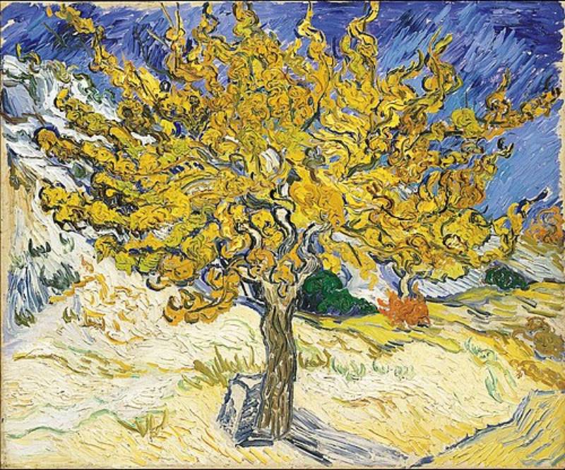
Yellow is the color most associated with Van Gogh, and for good reason. He returned to it obsessively, especially during his Arles period from 1888 to 1889.
In letters to Theo, he described yellow as the color of sunshine and warmth, writing about “how beautiful yellow is.” Paul Gauguin, who visited Van Gogh in Arles in 1888, observed that yellow seemed to flood everything Van Gogh touched, noting his friend’s deep connection to sunlight and his fear of darkness.
The three main yellows he used:
- Chrome yellow: His most-used yellow. Bright, intense, and relatively cheap. Used extensively in Sunflowers and The Sower.
- Cadmium yellow: More stable than chrome yellow, used for warmer tones
- Zinc yellow: Cooler and paler, used in layered mixtures alongside lead white
He also mixed these yellows together. Research on his self-portrait in front of the easel shows multiple layers combining cadmium yellow, zinc yellow, chrome yellow, and lead white, all in different ratios depending on the desired warmth of the tone.
The Chrome Yellow Problem
Chrome yellow is unstable. Van Gogh knew this, actually. In letter 595 to Theo, he wrote that the colors Impressionism had made fashionable were unstable, then added: “All the more reason to boldly use them too raw, time will only soften them too much.
He was right, but not in the way he hoped.
Research from the University of Antwerp confirmed what is now visible in aged paintings: the sulfur-rich variety of chrome yellow (PbCr1-xSxO4) is prone to photoinduced reduction, causing it to darken significantly over time. Studies published in Analytical Chemistry (Monico et al., 2011-2013) examined paint samples from 12 Van Gogh canvases and found evidence of this chemical breakdown in multiple works.
The 2015 study published in Angewandte Chemie confirmed degradation products at the paint-varnish interface in the Sunflowers held at the Van Gogh Museum in Amsterdam. What looks brownish in some of those yellows today was likely a vivid, saturated lemon yellow when first painted.
The REVIGO research project, a collaboration between the Van Gogh Museum, Tilburg University, Delft University of Technology, and AkzoNobel, confirmed that Van Gogh’s paintings originally displayed far greater color contrast than what visitors see today.
His Use of Blue and Violet

Van Gogh used three distinct blues, and he often layered or combined them within a single work.
Prussian blue is the darkest of the three. It has a greenish undertone and was invented in the early 18th century. Van Gogh used it for deep shadow tones and to build the darker portions of night skies.
Cobalt blue sits in the middle. More opaque than ultramarine and slightly greener. Research into his Starry Night confirms cobalt blue as one of the primary pigments used in the sky. Van Gogh used it mixed with lead white to create the swirling light tones.
Ultramarine gave him his richest, most saturated blue. Synthetic French ultramarine had been available since the 1820s and was cheaper than the historical lapis lazuli version. He used it when he needed pure, vibrant blue without the greenish cast of Prussian or cobalt.
Violet and Its Instability
The REVIGO project made a sobering discovery about Van Gogh’s violets and purples. Researchers searched his letters for the keywords violet, lilac, purple, and pink, then compared his written descriptions to what those paintings look like today.
The gap is significant. Many of his purples have faded or shifted dramatically.
In the Field with Irises near Arles, Van Gogh described the flowers in a May 1888 letter to Theo as “iris plants with purple flowers.” Today those irises appear more blue than purple, because the red pigments mixed to create the violet have faded. The buttercups he described as “very yellow” in the same letter now appear as a dull, brownish ochre.
His use of light-sensitive red pigments, including cochineal and eosin, contributed directly to this color shift. The original painting was considerably more vivid in its contrasts.
Green and Earth Tones in His Early Work

Before Paris, Van Gogh’s palette was almost unrecognizable compared to his later work. The Dutch period from roughly 1880 to 1885 was dominated by dark, heavy tones drawn from earth pigments.
The Potato Eaters (1885) is the clearest example. The palette is built almost entirely from raw sienna, burnt umber, ochre, and black, with very little blue or green and almost no yellow. Van Gogh wanted it to look like peasants eating with the same hands they used to dig the fields. The color choice was deliberate and narrative.
| Period | Dominant Tones | Characteristic Works |
|---|---|---|
| Dutch (1880-1885) | Raw sienna, burnt umber, ochre, black | The Potato Eaters, Weavers series |
| Paris (1886-1888) | Cobalt blue, cadmium yellow, rose madder | Self-portraits, still lifes |
| Arles (1888-1889) | Chrome yellow, viridian, vermilion | Sunflowers, The Night Cafe, Bedroom |
| Saint-Remy (1889-1890) | Cobalt blue, zinc white, mixed yellows | Starry Night, Irises in a Vase |
Emerald green (also called Veronese green, or vert Veronese in French) appeared in his palette during this period but came with its own problems. Like chrome yellow, it was chemically unstable. Van Gogh combined it with viridian rather than using either one alone.
Chrome green? He never used it. That’s one of the more specific findings from pigment studies of his paintings.
The Shift Away From Darkness
The transition out of dark earth tones happened quickly after Van Gogh arrived in Paris in 1886. Within months, his self-portraits were showing cobalt blues, cadmium yellows, and rose madder where there had previously been browns and greys.
He adopted elements of the Pointillist approach briefly, painting with small vibrant dots influenced by his contact with Georges Seurat. That phase didn’t last long, but it pushed him toward purer, brighter color use that stayed with him.
The earth tones didn’t disappear entirely. He used ochre and raw sienna throughout his career, particularly in skin tones and wheat fields. But they became supporting colors rather than the foundation of the palette.
How Paris Changed His Color Choices

Moving to Paris in 1886 is the single biggest turning point in Van Gogh’s color history. Before Paris, dark. After Paris, light.
The influence came from direct contact with working artists. He met Claude Monet, Pierre-Auguste Renoir, Edgar Degas, Paul Cezanne, and Georges Seurat during this period. He also studied with painter Fernand Cormon, who introduced him to the Impressionist circle.
Van Gogh wrote in 1886 that he admired the Impressionists but was “not one of the club.” He took what he needed and moved on.
What specifically changed in his palette:
- Rose madder and cerulean replaced or supplemented his earth-based reds
- Cobalt blue and cadmium yellow became primary colors in his work
- Black was largely abandoned, following Impressionist convention
- Lead and zinc white were used in much larger quantities than before
- He began mixing colors on the canvas rather than only on the painting palette
The Japanese woodblock prints he collected during his Paris years also pushed him toward flatter, bolder color application. He organized an exhibition of Japanese prints at a Parisian restaurant in 1887. The influence on his color thinking was real and documented in his letters.
Impressionism’s Specific Impact on Pigment Selection
The Impressionists had practical reasons for their lighter palettes. Painting outdoors in natural light required pigments that could capture daylight accurately. Dark studio browns looked wrong under open sky.
Van Gogh absorbed this logic. He didn’t paint in the Impressionist style exactly, but he took their understanding of color in natural light and pushed it further, using color not to describe light but to carry emotional weight.
His palette after Paris was consistently brighter, more saturated, and built around complementary colors placed side by side rather than mixed together. That last part came from a different source entirely: his study of Eugene Delacroix and the color theorist Charles Blanc.
Complementary Colors and Van Gogh’s Color Theory
Van Gogh didn’t just use colors intuitively. He studied the theory behind them carefully, and his letters show how seriously he took it.
The key text was Charles Blanc’s Grammaire des arts du dessin. Van Gogh first borrowed Blanc’s earlier book “Les Artistes de Mon Temps” from a friend in June 1884. He was so taken with it that he ordered the Grammaire shortly after. He copied out long passages and sent them to Theo.
Blanc’s book explained complementary color theory as developed by chemist Michel Eugene Chevreul and applied by Eugene Delacroix. The central idea: opposing colors on the color wheel reinforce each other when placed side by side. Mix them and they cancel out. Place them next to each other and they vibrate.
The Three Pairs He Used Systematically
Van Gogh’s use of complementary color pairs was, according to researchers, systematic rather than intuitive. He described specific pairings repeatedly across his letters.
Yellow and violet appears in works like Irises in a Vase at Saint-Remy, where he described mixing red and blue to create violet as a “binary color” set against yellow to make the irises “pop.”
Red and green is most visible in The Night Cafe (1888). In a letter to Theo on September 9, 1888, he wrote: “I have tried to express the terrible passions of humanity by means of red and green.” The blood-red walls against the bright green billiard table were a deliberate, theory-driven choice, not a casual one.
Blue and orange shows up across his wheat field paintings and portraits. He described The Sower as divided in two: “one half is yellow, the upper part, the lower part is purple,” a direct application of Blanc’s theory.
What Van Gogh Saw at the Louvre
Shortly after arriving in Paris, Van Gogh encountered a ceiling painting by Delacroix at the Louvre. It stopped him.
Purple placed next to yellow. Orange next to green. The Van Gogh Museum has documented this as a turning point in his understanding of color: he saw how bright colors placed unmixed and side by side could influence each other optically.
He described it as an eye-opener. For a painter who had spent years working in dark, mixed earth tones, seeing pure color contrast applied at scale was a different kind of education than anything he’d read in Blanc’s books.
The color theory he absorbed during this period shaped every major work that followed, from the Sunflowers series to Starry Night. It’s worth understanding that Van Gogh wasn’t reacting emotionally to color and then reaching for yellow or blue at random. He knew exactly what he was doing with those color psychology principles, even when the result looked wild.
Pigments That Have Changed Since He Painted
A lot of what you see in Van Gogh’s paintings today is not what he painted.
Multiple pigments he used routinely have degraded, faded, or shifted chemically since the 1880s. Researchers know this partly from scientific analysis and partly from comparing his paintings to his own written descriptions of them.
Key finding from the REVIGO project (a collaboration between the Van Gogh Museum, Delft University of Technology, Tilburg University, and AkzoNobel): Van Gogh’s works originally displayed far greater color contrast and intensity than they do today.
Chrome Yellow Darkening
The sulfur-rich variety of chrome yellow Van Gogh used extensively is known to darken with light exposure through a photoinduced chemical reduction. Researchers at the University of Antwerp published a series of studies between 2011 and 2015 confirming this process in paint samples taken from 12 Van Gogh canvases.
The practical result: Areas that were once vivid lemon yellow in works like Sunflowers now appear brownish or muted. The chemical change occurs at the interface between the paint layer and the varnish, where Cr(VI) compounds are gradually converted to Cr(III) compounds.
Van Gogh knew the colors were unstable. He wrote to Theo that “all the colors that Impressionism has made fashionable are unstable,” and added that this was all the more reason to use them boldly while he could.
Red Lead Whitening
Red lead, the orangey-red pigment Van Gogh used in works including Wheat Stacks under a Cloudy Sky (1889), is known to whiten over time through exposure to light.
University of Antwerp researchers identified the precise chemical pathway in 2015, using X-ray powder diffraction tomography on a microscopic paint sample from the painting. They found a rare lead mineral called plumbonacrite, which had never previously been documented in a pre-20th-century painting. It was the missing chemical link between red lead and the pale compound (hydro)cerussite that it eventually becomes.
This discovery, published in Angewandte Chemie, was significant for art conservation broadly, not just for Van Gogh research.
Faded Reds, Shifted Violets
The geranium lake pigment Van Gogh used was derived from eosin, a fluorescent red dye. It has very poor lightfastness.
Jackson’s Art research has documented a dramatic example in Irises (1890): the flowers were originally set against a pink background, which has now faded almost entirely to white.
The same fading affected his cochineal-based reds. In the Bedroom series (three versions of his room in the Yellow House in Arles), the fading of cochineal and eosin lake pigments turned doors and walls from violet to blue, directly contradicting Van Gogh’s stated intent for the painting. He described the bedroom specifically as a place of rest and calm, and chose those violet tones deliberately.
| Pigment | Original Color | Current Appearance | Cause |
|---|---|---|---|
| Chrome yellow (sulfur-rich) | Vivid lemon yellow | Brownish, muted | Photoinduced reduction (light exposure) |
| Red lead | Bright orangey-red | Pale, whitened | Conversion to (hydro)cerussite |
| Geranium lake / eosin | Pink to red | Near-white, gray | Poor lightfastness of dye base |
| Cochineal lake | Red-violet | Blue-shifted, faded | Red component fades, blue remains |
The implication is real: Van Gogh’s original color contrasts were sharper, more saturated, and more emotionally intense than what museum visitors see today.
What Van Gogh Said About Color in His Letters
The Van Gogh Museum has documented 903 total letters in Van Gogh’s correspondence, 820 written by him and 83 received. Of those he wrote, more than 650 went to Theo.
Color shows up constantly. He described specific pigments by name, sketched palette arrangements in the margins, and explained the emotional reasoning behind individual color choices in specific paintings.
How He Described His Palette in Writing
In a letter to Theo from 1882, Van Gogh listed exactly what he had bought for his palette at the time:
Ochre (red, yellow, brown), cobalt and Prussian blue, Naples yellow, terra sienna, black and white, supplemented with carmine, sepia, vermilion, ultramarine, and gamboge in smaller tubes. A practical shopping list, not a theoretical statement. He was clear about working within a budget and buying larger tubes of the colors he used most.
In a letter to his sister Willemien, he described his own self-portrait in unusually specific terms: pink-grey face with green eyes, ash-colored hair, a very red beard, and on the palette: lemon yellow, vermilion, Veronese green, cobalt blue.
Color as Emotional Expression in His Own Words
The Night Cafe letter is the most-cited example of Van Gogh explaining color psychology in his own terms. Writing to Theo on September 9, 1888, he said he had tried to express “the terrible passions of humanity by means of red and green.”
He described the room as “blood red and dark yellow with a green billiard table,” a deliberate collision of complementary colors designed to create discomfort rather than pleasure.
He also wrote about yellow in emotional terms. He described it in letters as the color of the sun and of life, connecting it directly to warmth, hope, and his experience of light in Arles. Paul Gauguin, who visited Van Gogh in Arles in 1888, observed in an essay that “the yellow-chrome Sun burst forth from the canvas” and noted Van Gogh’s deep personal connection to that particular hue.
Letters to Emile Bernard on Color Technique
Between 1888 and 1889, Van Gogh wrote 22 letters to the painter Emile Bernard. According to Wikipedia’s documentation of Van Gogh’s correspondence, these letters differ noticeably from those to Theo: he wrote more directly about technique, color use, and his artistic theories.
Three color principles Van Gogh articulated across his correspondence:
- Complementary colors placed side by side reinforce each other optically and should not be mixed into neutrals
- Color carries emotional meaning independent of what it represents literally
- Using unstable pigments boldly was preferable to restraint, because time would soften them anyway
He was consistent on all three. The paintings back it up.
Colors Across His Most Analyzed Paintings
Scientific pigment analysis has been carried out on dozens of Van Gogh’s works, using methods including X-ray fluorescence spectroscopy, infrared reflectography, and high-performance liquid chromatography.
The findings confirm what his letters suggest: he used a consistent set of pigments across his mature work, applied with variations in layering, mixing, and proportion depending on the painting’s purpose.
The Starry Night (1889)

Painted at the Saint-Paul-de-Mausole asylum in Saint-Remy, Starry Night is one of the most pigment-analyzed works in his catalogue.
Confirmed pigments in the sky: all three blues (ultramarine, cobalt blue, Prussian blue), zinc white for the swirling light areas, and chrome yellow for the stars and moon.
The cypress in the foreground uses viridian combined with other greens and darker earth tones. The village below sits in much more muted tones, creating the stark contrast between the calm settlement and the turbulent sky. ColourLex’s pigment mapping project found that the value relationships in the sky were built through layering rather than direct mixing.
Sunflowers (1888-1889 Series)
Multiple versions exist. The Amsterdam version at the Van Gogh Museum has been studied most extensively.
Chrome yellows in several formulations dominate the palette. Cadmium yellow mixed with vermilion created the warm orange tones. Lead white was used heavily in the lighter petals. The 2015 Angewandte Chemie study found both the lightfast PbCrO4 variety and the unstable sulfur-rich variety of chrome yellow in the same painting, side by side.
That mix matters: some areas have held their yellow, others have browned. The contrast between degraded and intact areas within a single work makes the original palette hard to read accurately today.
The Night Cafe (1888) and Bedroom in Arles (1888)
The Night Cafe: built on red and green complementary contrast. Vermilion and chrome green (which Van Gogh did not typically use, but analysis suggests was present here) on the walls and ceiling, with yellow-green gas lamps creating the disturbing, sickly light effect he described to Theo.
Bedroom in Arles: the degradation story here is significant. Research documented by the Van Gogh Museum shows that the cochineal and eosin lake pigments used in the walls and doors have faded from violet to blue, changing the emotional character of the painting entirely. Van Gogh wanted the bedroom to feel restful. The original violet tones were softer and warmer. The current blue reads differently.
Irises (1889)
The J. Paul Getty Museum holds one version; the Metropolitan Museum of Art in New York holds another.
Both have been analyzed for pigments. The irises used a violet mixture of red and blue pigments against a yellow background, a direct application of Van Gogh’s complementary color harmony principles. The pink background in the Getty version, confirmed through analysis, has faded almost entirely to white due to eosin lake degradation.
Looking at it now, it reads as blue flowers against a neutral background. Van Gogh painted purple flowers against a vivid pink. Two very different paintings, same canvas.
Van Gogh’s Color Legacy in Later Art
Van Gogh died in 1890. Within a generation, the color choices he made and the theory he applied had reshaped how painters across Europe thought about what paint could do.
His influence is documented and direct, not just a general “inspiration.” Specific movements, specific artists, specific works trace back to his approach to color as emotional carrier rather than visual description.
Van Gogh and Fauvism
Fauvism emerged in France around 1905. The Metropolitan Museum of Art has documented it as a movement whose leader, Henri Matisse, arrived at the Fauvist approach after studying the work of Van Gogh, Gauguin, and Cezanne alongside the Pointillism of Seurat.
The connection is direct. Matisse was given a Van Gogh drawing by the Australian artist John Russell, who had been a close friend of Van Gogh’s. Wikipedia’s Fauvism article documents Russell as a formative influence on Matisse’s shift toward pure color.
What the Fauvists took from Van Gogh specifically:
- Color used non-descriptively, to express emotion rather than match reality
- Pure pigments placed side by side rather than blended
- Color as the primary structural element of a painting
The Art Story has documented Fauvism as “an extreme development of Van Gogh’s Post-Impressionism,” particularly in its liberation of color from realistic purpose.
Van Gogh and Expressionism
German Expressionism drew from the same source. The Van Gogh Museum itself hosted an exhibition, “Van Gogh Inspires: Matisse, Kirchner, Kandinsky,” documenting the influence on key Expressionists including Ernst Ludwig Kirchner and Wassily Kandinsky.
Both the Fauves and the German Expressionists shared an inheritance from Van Gogh. The Metropolitan Museum notes that while the French Fauves were more concerned with formal pictorial organization, the German Expressionists were more emotionally engaged with their subjects. Van Gogh was relevant to both tendencies because his work contained both.
His Influence on How Artists Think About Color Today
The practical impact runs through Expressionism, through Fauvism, and into Abstract Expressionism and color field painting.
His core idea, that color saturation and contrast carry emotional content independent of subject matter, is now a standard premise in art education. Most painters working today with expressive color are, at some remove, working with ideas Van Gogh articulated in letters to Theo more than 130 years ago.
If you want to understand how he actually applied those ideas yourself, the approach to painting like Van Gogh comes down to a few practical things: work with complementary pairs, apply paint thickly and unmixed, and use color to carry the emotional weight that subject matter alone cannot.
His palette was not random. It was argued, studied, and defended in over 800 letters. That’s the part most people miss.
FAQ on What Colors Did Van Gogh Use
What were Van Gogh’s favorite colors?
Yellow was his most used color, particularly chrome yellow. He also returned constantly to cobalt blue, Prussian blue, and viridian green. His letters to Theo confirm yellow held the deepest personal significance, connecting it to sunlight, warmth, and emotional energy.
What pigments did Van Gogh use most often?
His core pigments included chrome yellow, cadmium yellow, cobalt blue, ultramarine, Prussian blue, viridian, vermilion, lead white, and zinc white. He documented these purchases in detail across his correspondence, often noting which suppliers he used and which tube sizes were most economical.
Why did Van Gogh use so much yellow?
He connected yellow directly to sunlight and life. After moving to Arles in 1888, the intense southern French light shifted his palette toward saturated yellows. He wrote to Theo that yellow stood for the sun itself, describing it as “how beautiful yellow is.”
Did Van Gogh use complementary colors?
Yes, systematically. He studied complementary color theory through Charles Blanc’s writings and applied yellow/violet, red/green, and blue/orange pairings deliberately. The Night Cafe’s red walls against a green ceiling is a direct, intentional example of this approach.
What blue did Van Gogh use in Starry Night?
All three of his blues: ultramarine, cobalt blue, and Prussian blue. Pigment analysis has confirmed their presence in the sky. Zinc white was used for the swirling light areas, and chrome yellow for the stars and crescent moon.
Why do Van Gogh’s colors look different today?
Several pigments he used are chemically unstable. Chrome yellow darkens with light exposure, red lead whitens, and eosin-based reds fade to near-white. REVIGO project research confirmed his paintings originally had far greater color contrast than what is visible today.
Did Van Gogh mix colors on the canvas?
Yes. He often applied paint thickly and mixed colors directly on the canvas surface rather than only on the palette. This impasto technique created layered tonal mixtures, visible in his self-portraits and landscape works from the Arles and Saint-Remy periods.
What colors did Van Gogh use in his early Dutch period?
Dark earth tones dominated: raw sienna, burnt umber, ochre, and black. The Potato Eaters (1885) shows this palette clearly. He largely abandoned these tones after moving to Paris in 1886 and encountering the Impressionists’ lighter, brighter approach to color.
How did Van Gogh’s palette change after Paris?
It shifted dramatically toward brighter, more saturated hues. Exposure to Claude Monet, Georges Seurat, and Camille Pissarro pushed him toward pure pigments, lighter tones, and the structured use of complementary pairs that defines his mature work.
What colors did Van Gogh use in Sunflowers?
Multiple chrome yellow formulations, cadmium yellow, vermilion mixed with cadmium for orange tones, and lead white. Scientific studies published in Analytical Chemistry found both stable and unstable chrome yellow varieties within the same painting, explaining why some areas have browned while others remain bright.
Conclusion
This conclusion is for an article presenting what colors did Van Gogh use across a career that ran barely a decade but produced nearly 1,000 paintings.
His pigment choices were deliberate. Chrome yellow, Prussian blue, vermilion, viridian, lead white: each served a specific purpose within his complementary color system.
The Dutch period’s raw sienna and burnt umber gave way to saturated Post-Impressionist hues after Paris. That shift was permanent.
Much of what museum visitors see today differs from what Van Gogh painted. Pigment degradation has altered his violets, reds, and yellows significantly.
His letters to Theo remain the clearest record of his paint color choices and the emotional reasoning behind them. Read those alongside the paintings.