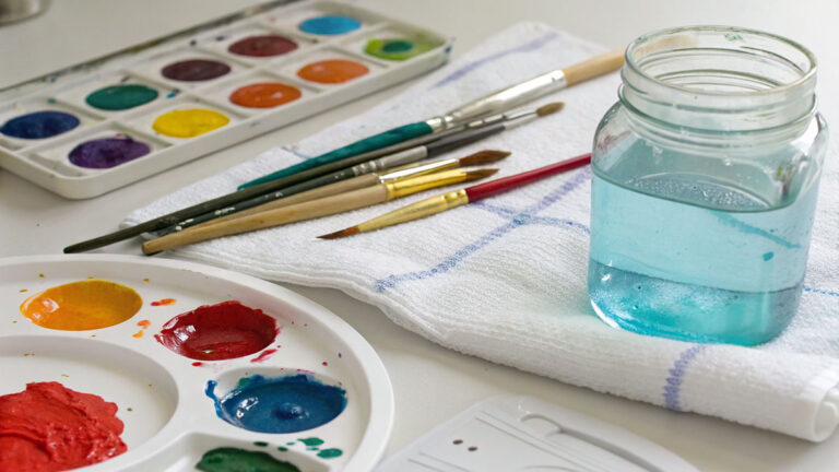
Few painters chose their pigments as deliberately as Raphael Sanzio.
Understanding what colors Raphael used means going beyond what’s visible on the surface. His palette combined ultramarine from lapis lazuli, vermilion, lead white, verdigris, and red lake glazes, each applied in a specific sequence and for specific reasons.
Modern technical studies using XRF and Raman spectroscopy have confirmed the exact pigments in his panel paintings and Vatican frescoes. Some findings were genuinely surprising.
This article covers his full Renaissance pigment palette, how he used color differently in fresco versus panel painting, what he inherited from Perugino and Leonardo, and what recent scientific analysis has added to the picture.
The Pigments Raphael Used
Raphael Sanzio worked with almost the full range of pigments available in early 16th-century Italy. His palette was rich by the standards of the time, and modern technical analysis has confirmed its exact makeup.
Scientific studies using X-ray fluorescence (XRF) and Raman spectroscopy on works including the Ansidei Madonna and the Madonna of the Pinks have identified his core pigments. Walnut oil was his preferred binder, with linseed oil appearing in specific passages (Natural Pigments, 2024).
| Pigment | Color | Primary Use |
|---|---|---|
| Ultramarine (lapis lazuli) | Blue | Virgin’s mantle, sky passages |
| Vermilion | Red | Drapery, flesh tone base |
| Lead white | White | Highlights, flesh tones, grounds |
| Lead-tin yellow | Yellow | Drapery, architectural highlights |
| Verdigris | Green | Surface greens, glazed passages |
| Bone black / Carbon black | Black | Shadows, underdrawings |
| Smalt | Blue | Backgrounds where ultramarine was impractical |
| Red lake (madder, kermes) | Red | Glazes over vermilion |
A 2024 study published in Heliyon (Ioele et al.) specifically examined cross-section samples from the Deposition (Galleria Borghese) and confirmed this layered palette, noting that individual passages often combined two or three pigments to build optical depth.
A particularly rare discovery came from ACS Omega research (2025) on Christ Blessing (1505-1506): Egyptian blue was confirmed in the background, the only documented use of this ancient synthetic pigment in any panel painting attributed to Raphael.
How Raphael Used Blue

Blue was the most symbolically loaded color in Raphael’s paintings. His use of it was deliberate, expensive, and tied directly to the subjects he painted.
Ultramarine and the Virgin’s Mantle
Ultramarine came from ground lapis lazuli, imported from Afghanistan. During the Renaissance, it cost more than gold by weight, and patrons specified in contracts exactly how much would be used and on which figures (Thalira, 2025).
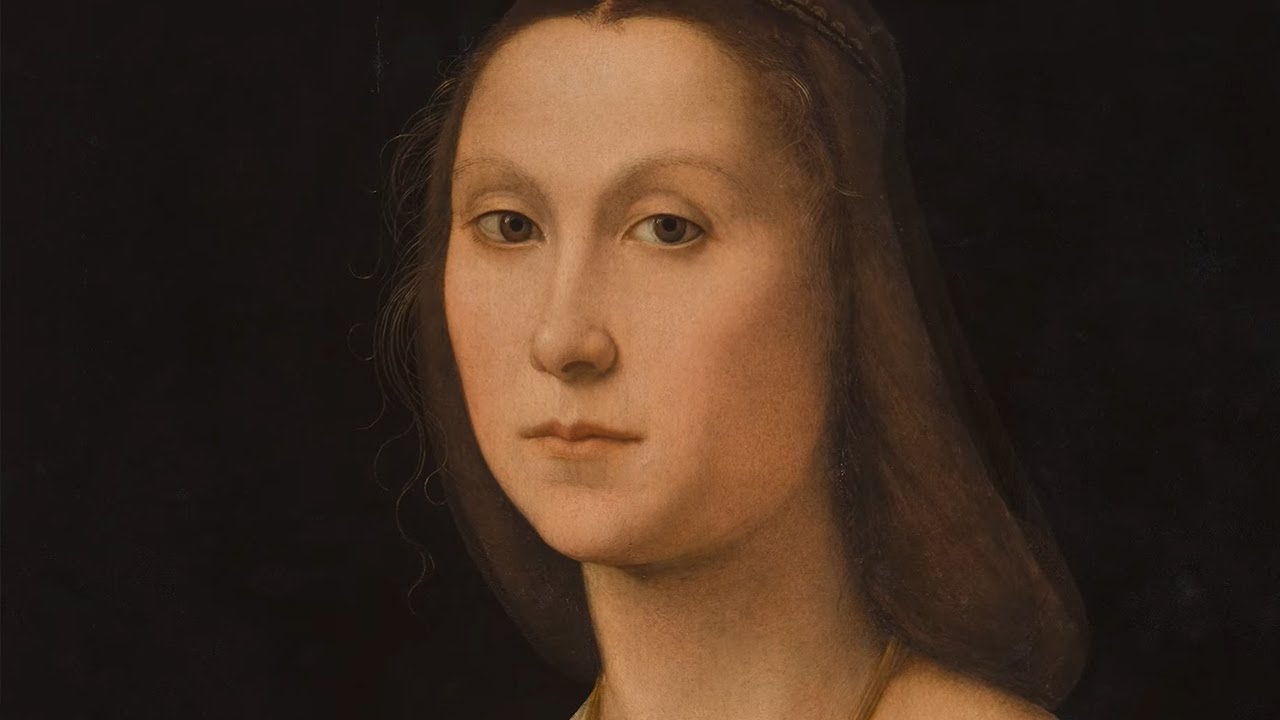
Raphael reserved it almost exclusively for the Virgin Mary’s mantle. You can see this clearly in the Madonna of the Meadow, the Sistine Madonna, and the Ansidei Madonna. The blue is not decorative. It is a statement of devotion and cost.
Technical analysis of the Ansidei Madonna confirmed that Raphael layered natural ultramarine over azurite or an azurite-and-white mix, creating a notably thicker paint layer than in other color areas (Natural Pigments, 2024).
Smalt and Azurite as Alternatives
Where to use smalt: backgrounds, architectural passages, sky areas where full ultramarine was impractical or unaffordable.
Where azurite appeared: as a base layer beneath ultramarine, or as a cheaper standalone blue in less prominent areas.
Why this matters: the substitution tells us a lot about workshop economics. Smalt was far cheaper and easier to apply in large areas. Raphael’s studio was pragmatic.
The 2025 ACS Omega study on Christ Blessing also confirmed azurite and ultramarine together in the background, alongside the rare Egyptian blue. Three separate blue pigments used in a single compositional area.
Red and Flesh Tones in Raphael’s Paintings

Reds in Raphael’s work split into two categories: structural reds in drapery and the subtler reds that built lifelike skin. Both required layering, and both tell us something about how he worked.
Drapery Reds
A 2024 analysis of the Deposition (Heliyon, Ioele et al.) confirmed vermilion as the base pigment in red drapery passages, with red lake glazes applied on top. The glaze layer added transparency and depth that vermilion alone could not produce.
Vermilion (cinnabar, mercury sulfide) gave strong, opaque reds. It was durable in oil but costly. Raphael’s studio used it in focal passages like liturgical textiles, not as a filler pigment.
Flesh Tones

Building skin required a specific sequence. Analysis from ARTEnet’s study of Raphael’s technique documented it as:
- Greenish-brown underpainting (verdaccio), closely following Perugino’s workshop practice
- Flesh-colored veils of lead white, yellow ochre, and a small amount of vermilion
- Final modeling with thin, translucent layers adjusting warmth and shadow
The result in paintings like La Fornarina and the Portrait of Baldassare Castiglione is skin that looks genuinely three-dimensional, not flat. That effect comes entirely from the layered approach, not from any single pigment.
Spectrophotometry analysis of Saint Catherine confirmed red lake glazes applied over a vermilion base as Raphael’s standard method for translucent reds (Natural Pigments, 2024).
Yellow, Gold, and Ochre Pigments
Lead-tin yellow was Raphael’s go-to for saturated yellow drapery. It is an opaque, warm yellow that holds well in oil and sits cleanly next to blues and reds without muddying.
Yellow ochre appeared in more muted passages and was a standard component of flesh tone mixes alongside lead white and vermilion. It is an earth pigment, naturally occurring, stable, and inexpensive compared to lead-tin yellow.
| Yellow Pigment | Character | Typical Application |
|---|---|---|
| Lead-tin yellow | Opaque, warm, bright | Drapery highlights, yellow garments |
| Yellow ochre | Earthy, muted, stable | Flesh tones, underpaint, shadow areas |
| Gold leaf | Reflective, precious | Early panel works, halos, decorative borders |
Gold leaf appears in Raphael’s earlier panel paintings but largely disappeared in his Roman period. By the time he was painting the Vatican Stanze, gilded passages had given way to painted highlights in lead-tin yellow. This shift reflects the broader move in High Renaissance painting away from the conventions of Gothic art and medieval altarpiece tradition.
Orpiment, a yellow arsenic sulfide pigment, was identified in a small number of Raphael’s works but was not a regular part of his palette. It was difficult to use and chemically incompatible with lead-based pigments, which ruled it out for most passages.
Green Pigments and Verdaccio Underdrawing
Raphael’s use of green ran deeper than surface color. Greens showed up in underpaint layers that never appeared in the finished image.
Surface Greens
Verdigris was his main surface green. Copper-based, moderately transparent, and best applied as a glaze over an opaque layer. Analysis of the green sleeve passages in Saint Catherine documented this exact approach: an opaque base of verdigris mixed with lead white or lead-tin yellow, then a copper green glaze on top (Natural Pigments, 2024).
The problem with verdigris is long-term stability. Many of Raphael’s greens have shifted toward brown or grey as the copper-based pigment degraded over five centuries. What reads as dull green today was often a vivid, jewel-like color when first painted.
Underpaint Greens
Green earth (terra verde) was foundational. Not visible in the finished surface, it appeared in flesh tone underpaint as part of the verdaccio tradition inherited from Perugino.
This greenish-brown underlayer modeled form in shadow areas. Lead white flesh tones applied over it picked up a subtle warmth in highlights and a cooler, slightly green undertone in half-shadows, which is exactly what gives Renaissance portraits their naturalistic, almost sculptural appearance.
In fresco work, particularly the Vatican Stanze, verdaccio showed up in underdrawing passages where the rapid planning of forms required a fast-drying, neutral marking medium.
Raphael’s Use of Color in Fresco vs. Panel Painting

The medium changed everything. Not just how Raphael painted, but which pigments he could use at all.
Why Fresco Restricted His Palette
Buon fresco requires pigments ground in water and applied to wet lime plaster. As the plaster dries, it becomes highly alkaline, and many pigments react badly to this chemistry.
Ultramarine was chemically incompatible with wet lime plaster. In his Vatican frescoes, including The School of Athens (1509-1511) and the Disputation of the Sacrament, blue passages that required ultramarine had to be applied a secco, meaning onto dry plaster with a binding medium added. This made them less permanent and more vulnerable to flaking than true fresco passages.
Restoration work on the Stanza della Segnatura (Vatican Museums, completed 2012) confirmed Raphael’s use of limewater glazes for atmospheric effects in the fresco, and identified the pigments compatible with wet plaster as the structural core: azurite and Egyptian blue for blues, malachite for greens, vermilion for reds, and lead-tin yellow for highlights.
Panel Painting Advantages
On panel, Raphael had far more flexibility. Oil and walnut oil as binders meant he could:
- Layer extensively without time pressure
- Glaze translucent reds and greens over opaque bases
- Use the full ultramarine palette for blue passages
- Adjust and rework compositions mid-process (confirmed by X-ray analysis of the Sistine Madonna)
X-ray analysis of the Sistine Madonna showed compositional changes made during painting. This kind of reworking was only possible on panel. In fresco, Raphael planned everything in advance through detailed cartoons because once the plaster dried, the paint was permanent.
The difference between the two mediums is visible if you look closely. Fresco Raphael is flatter, more architecturally composed. Panel Raphael has more optical depth, richer shadows, and more complex surface color. Same painter, very different painting mediums.
Influence of Perugino and Leonardo da Vinci on Raphael’s Color Choices

Raphael’s color language did not appear fully formed. It came directly from two painters, absorbed at different stages of his development and combined into something that was genuinely his own.
What Perugino Passed On
The Perugino inheritance was specific: cloudless blue skies, deep blues, soft roses, yellows, and the blue-green tones of the Umbrian hills (Natural Pigments, 2024).
Raphael’s Marriage of the Virgin (1504) is the clearest evidence. Scholars at Artble note the colors are derived almost directly from Perugino’s Christ Handing the Keys to Saint Peter, right down to the palette choices in the architectural background and figure groupings.
Perugino’s approach relied heavily on glazing with oils to produce soft shadows and light-reflective color. That technique became Raphael’s own foundation, well before he ever encountered Leonardo.
What Leonardo Changed
Leonardo’s sfumato shifted how Raphael thought about the transition between light and shadow in flesh tones. Not a wholesale adoption. More of a refinement.
Before Florence (pre-1504): flat, clear, Umbrian color conventions.
After Florence (post-1504): softer tonal modeling in faces and hands, pyramid figure groupings, greater atmospheric depth.
Raphael’s Madonna of the Meadow (c. 1505-1506) shows the result plainly. The sfumato around Mary’s face is documented by Wikipedia as one of Raphael’s most studied examples of the technique. But the palette under it still comes from Perugino: soft blues, warm rose tones, green-touched landscape.
His color work became known by art historians as “unione,” one of the four identified modes of High Renaissance color use described by Marcia B. Hall. Unlike Leonardo’s sfumato or Michelangelo’s cangiante, unione balanced tonal softness with sustained color brilliance. Perugino taught him the palette. Leonardo taught him how to move through it.
Technical Analysis and Modern Research on Raphael’s Palette
The last twenty years have produced more confirmed facts about Raphael’s painting materials than the previous four centuries combined. Non-invasive scanning has made it possible to study these works without touching them.
Key Studies and What They Found
A 2022 study published in the Journal of Cultural Heritage (Alberti et al.) used macro-XRF scanning on Raphael’s Baglioni Entombment at the Galleria Borghese. The MA-XRF maps revealed a previously undocumented reapplication of the gypsum ground layer, and identified a female figure that was eliminated from the composition before completion.
Triumph of Galatea, Villa Farnesina: Egyptian blue confirmed in the sky, sea, and the whites of figures’ eyes. Researchers from the Lincei Academy confirmed Raphael appears to have synthesized this ancient pigment in his own workshop, its first documented use in Renaissance painting (Sgamellotti et al., published in Rendiconti Lincei).
Christ Blessing (1505-1506), Pinacoteca Tosio Martinengo: ACS Omega (2025) confirmed Egyptian blue alongside azurite and ultramarine in the background, the only documented instance in any attributed Raphael panel painting.
Baglioni Deposition (2026, npj Heritage Science): Combined hyperspectral imaging and MA-XRF decoded red pigment stratigraphy in detail, showing vermilion as the base layer with red lake glazes on top across red drapery passages.
What Analysis Has Corrected
Earlier scholarship assumed Raphael’s greens were stable. Conservation analysis showed most have shifted color over five centuries as verdigris degraded. What appears dull grey-green in paintings like the School of Athens was originally far more vivid.
X-ray analysis of the Sistine Madonna confirmed compositional changes during painting, overturning earlier assumptions that Raphael planned all panel compositions with the same rigid preparation process as his frescoes.
| Study | Method | Key Finding |
|---|---|---|
| Baglioni Entombment (2022) | MA-XRF | Eliminated figure identified; gypsum ground reapplication documented |
| Triumph of Galatea (2020) | MAXRF + infrared luminescence | Egyptian blue confirmed in sky, sea, and figure eyes |
| Christ Blessing (2025) | Multi-technique noninvasive | Egyptian blue on panel; earliest known use in sacred Raphael subject |
| Baglioni Deposition (2026) | HSI + MA-XRF combined | Red pigment stratigraphy: vermilion base, red lake glaze confirmed |
The combination of XRF and Raman spectroscopy is now standard across major institutions. XRF maps elemental distribution in the paint layers. Raman identifies molecular structure, particularly useful for organic pigments like red lakes that XRF alone cannot fully characterize (MDPI, 2024).
The Galleria Borghese and the Vatican Museums have both published research from ongoing diagnostic campaigns. The Uffizi’s technical archive holds cross-section samples from Raphael’s early panel works. None of this was accessible without non-destructive analysis, and it continues to revise what we thought we knew about his painting materials and process.
Well, the thing is, even with all this analysis, there are still open questions. The distribution of Egyptian blue across his frescoes is still being mapped. The 2024 discovery of Egyptian blue in the Loggia of Cupid and Psyche (Villa Farnesina) suggests it appeared in more of his Roman-period work than previously recognized, and researchers suspect more examples are waiting in other works.
To understand how Raphael’s color use fits within the broader famous Renaissance paintings tradition, his palette sits alongside [Titian‘s] richer, more oil-saturated chromatic approach and Michelangelo‘s cangiante color shifts as one of the three defining color systems of the High Renaissance period.
FAQ on What Colors Did Raphael Use
What pigments did Raphael use most often?
Raphael’s core Renaissance pigment palette included ultramarine, vermilion, lead white, lead-tin yellow, verdigris, red lake, and bone black.
Walnut oil was his preferred binder, confirmed by spectrophotometry analysis across multiple panel paintings.
Why did Raphael use blue so frequently?
Blue carried strong religious meaning. Ultramarine from lapis lazuli was reserved for the Virgin Mary’s mantle as a mark of devotion and expense.
Patrons specified it by contract. It cost more than gold by weight during the Renaissance.
Did Raphael use the same colors in frescoes and panel paintings?
No. Fresco restricted his palette significantly. Ultramarine was incompatible with wet lime plaster, so it had to be applied a secco in his Vatican frescoes.
Panel paintings allowed full glazing and richer layering with the complete pigment range.
What green pigments did Raphael use?
Verdigris was his primary surface green, typically glazed over an opaque base layer. Green earth appeared in underpaint for flesh tone modeling.
Many of his greens have since shifted toward brown due to verdigris degradation over five centuries.
How did Raphael build flesh tones?
He started with a greenish-brown verdaccio underpainting, then built up layers of lead white, yellow ochre, and small amounts of vermilion.
This layered approach, inherited from Perugino’s workshop, created the sculptural, lifelike skin visible in portraits like La Fornarina.
What blue pigments did Raphael use besides ultramarine?
He used smalt in backgrounds and architectural passages where ultramarine was impractical. Azurite appeared as a base layer beneath ultramarine in works like the Ansidei Madonna.
Egyptian blue was also confirmed in the Triumph of Galatea fresco at Villa Farnesina.
Did Raphael use gold in his paintings?
Gold leaf appears in his earlier panel paintings, particularly in halos and decorative borders. By his Roman period, painted highlights in lead-tin yellow replaced gilded passages.
This shift reflects the broader move away from Gothic art conventions toward High Renaissance naturalism.
How has modern analysis changed what we know about Raphael’s palette?
Significantly. MA-XRF scanning of the Baglioni Entombment (2022) revealed an eliminated figure. ACS Omega research (2025) confirmed Egyptian blue in Christ Blessing, previously unknown in Raphael panel paintings.
How did Perugino influence Raphael’s color choices?
Perugino passed on a specific palette: cloudless blues, soft roses, warm yellows, and blue-green Umbrian hill tones. Raphael’s Marriage of the Virgin replicates these color conventions almost directly.
Glazing with oils for soft, light-reflective color was also a direct inheritance.
What colors did Raphael use in the School of Athens?
The fresco used pigments compatible with wet plaster: azurite and Egyptian blue for blues, malachite for greens, vermilion for reds, lead-tin yellow for highlights.
Ultramarine passages were applied a secco and remain more vulnerable to deterioration than the true fresco sections.
Conclusion
This conclusion is for an article presenting the full scope of Raphael’s painting materials, from his core Italian Renaissance pigments to the surprising discoveries still emerging from technical analysis.
His use of vermilion, lead-tin yellow, verdigris, red lake glazes, and mineral earth pigments was deliberate. Every color choice connected to the medium, the subject, and the patron’s expectations.
What makes his palette genuinely interesting is how it shifted across his Umbrian, Florentine, and Roman periods.
MA-XRF mapping and Raman spectroscopy continue to revise what we know. Egyptian blue in the Triumph of Galatea and the Christ Blessing panel were unknown until recently.
Raphael’s color technique sits at the intersection of craft, chemistry, and artistic intention. That combination is why his paintings still hold up under scientific scrutiny five centuries later.