That frustrating moment when your watercolor colors meet with a harsh, obvious line instead of flowing together smoothly. Learning how to blend watercolor paint separates beginner work from professional-looking paintings.
Most painters struggle with timing, water control, and brush techniques when starting out. I’ve watched countless students create muddy mixtures or fight against paint that dries too quickly.
This guide covers everything from essential tools and paint consistency basics to advanced glazing methods.
You’ll master wet-on-wet techniques, color mixing strategies, and troubleshooting common problems that create hard edges.
By the end, you’ll understand brush control, paper preparation, and timing secrets that create those seamless color transitions you see in gallery paintings. No more guessing about water ratios or wondering why your Daniel Smith watercolors won’t blend properly.
Essential Tools and Materials for Smooth Blending

Brush Selection and Care
The right brush control makes all the difference when you’re learning watercolor techniques. Round brushes from sizes 6 to 14 work best for most blending situations.
I’ve found that natural Kolinsky sable brushes hold more water and paint than synthetic alternatives. They create smoother gradients too.
For larger wash areas, flat brushes between 1/2 inch and 1 inch wide distribute paint evenly. Princeton brushes offer good quality without breaking your budget.
Synthetic vs Natural Hair Performance
Natural hair brushes absorb more water and release it gradually. Synthetic brushes work well for beginners but don’t hold as much paint medium.
Keep two water containers ready – one for cleaning, one for fresh water. This prevents muddy colors from contaminating your mixtures.
Clean your brushes gently between colors using paper towels or natural sponges. Harsh scrubbing damages the brush tips.
Paper Characteristics
Cold-pressed watercolor paper has enough texture to grip the paint while allowing smooth flow. Hot-pressed paper works better for detailed work but can be tricky for beginners.
Arches 140lb paper stays flat during painting without buckling. Lighter papers need stretching first.
Fabriano and Strathmore offer good alternatives that won’t cost as much. The paper surface affects how your paint spreads and blends.
Pre-stretching Techniques
Soak your paper in clean water for 10-15 minutes before painting. This prevents warping when you add wet paint later.
Tape the edges to a board while damp. Let it dry completely before starting your painting.
Water Management Tools
Spray bottles help keep your paper surface slightly damp for better color flow. Don’t oversoak – just a light mist works.
Two clean water containers prevent color contamination. Change the water when it gets cloudy.
Natural sponges lift excess water and create soft textures. Paper towels control moisture levels and fix mistakes quickly.
Basic Blending Techniques
Wet-on-Wet Blending

This watercolor wash technique creates the smoothest color transitions. Start with clean water on your paper surface.
While the paper gleams but isn’t pooling, drop in your first color. Watch it spread naturally across the wet area.
Add your second color while the first is still damp. The colors will flow together on their own.
Paint Application Timing
Timing matters more than anything else in wet-on-wet work. Paint spreads differently as paper dampness changes.
Very wet paper creates soft, fuzzy edges. Slightly damp paper gives you more control over where colors go.
Practice on scrap paper first. You’ll learn how your specific paper and paints behave together.
Controlling Paint Spread
Tilt your paper to guide paint flow. Gravity helps create natural-looking gradients.
Use less water for more controlled blending. More water means less predictable results.
Control color intensity by adjusting your paint-to-water ratio before applying it to paper.
Wet-on-Dry Transitions
Paint one color and let it dry completely. Then add water to soften the edge where you want the next color.
Apply the second color while the edge stays damp. This creates a gradual transition without hard lines.
Feathering techniques work well here – use a clean, damp brush to soften edges after applying paint.
Working with Damp Edges
Keep edges workable by misting lightly with your spray bottle. Don’t flood the area.
Work quickly once you dampen an edge. You have maybe 30 seconds before it dries again.
Practice smooth brush strokes that follow your intended gradient direction.
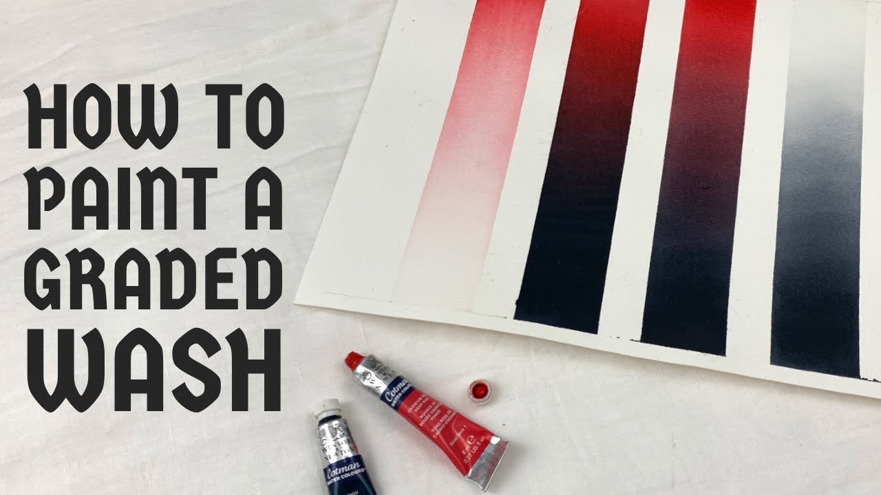
Graded Washes
Start with your darkest color mixing at one end of the area. Add clean water to your brush as you move across.
Each brush stroke should overlap the previous one slightly. This prevents streaky results.
Single color gradations teach you brush control before attempting more complex color transitions.
Multi-Color Transitions
Begin with your first color at full strength. Clean your brush and pick up the second color.
Apply the second color where you want it strongest, then blend toward the first color while both stay damp.
Work from light colors to dark ones when possible. Light colors won’t show over dark ones effectively.
Color Mixing Strategies

Mixing on Paper vs Palette
Direct application creates more vibrant results than pre-mixing on your palette. The colors blend naturally on paper.
Palette mixing gives you more control over exact shades before committing to paper. Both approaches have their place.
I prefer mixing warm and cool colors directly on paper – the results look more natural than palette mixtures.
Palette Pre-mixing Advantages
Test your color combinations on scrap paper before applying them to your main painting. This prevents unpleasant surprises.
Pre-mixing works better for color consistency across larger areas. You can recreate the exact same shade multiple times.
Use a stay-wet palette to keep mixtures workable longer during painting sessions.
Temperature Transitions
Warm to cool color shifts create depth and interest in watercolor paintings. Yellow-orange transitioning to blue-violet works beautifully.
Avoid mixing exact opposites on the color wheel – you’ll get muddy browns instead of clean transitions.
Keep your mixtures simple. Two colors blend cleaner than three or more.
Managing Muddy Mixtures
Muddy colors happen when you mix too many pigments together. Stick to primary colors and their neighbors.
Clean your brush thoroughly between different color families. Leftover paint contaminates fresh mixtures.
If a mixture turns muddy, don’t try to fix it. Let it dry and glaze a clean color over top instead.
Complementary Color Blending
Complementary colors create vibrant contrasts when placed next to each other. Orange and blue make striking combinations.
When you blend complementaries directly, they create neutral grays and browns. Use this for shadows and background areas.
Red and green transitions work well for landscape painting. Keep the mixture closer to one color than the other for best results.
Orange and Blue Combinations
These colors create beautiful sunset and sky effects. Start with pale orange and transition to light blue.
Don’t blend them completely – leave some areas more orange, others more blue. Pure mixture zones should be smaller.
Add tertiary colors like yellow-orange or blue-violet to make the transition more complex and interesting.
Yellow and Purple Mixing
This combination creates the most neutral grays when mixed equally. Lean toward yellow for warm grays, purple for cool ones.
Use this mixture for realistic shadow colors in outdoor scenes. Natural shadows contain both warm and cool elements.
Practice these transitions on separate studies before incorporating them into finished paintings.
Advanced Blending Methods
Glazing for Depth

Glazing creates luminous color depth by layering transparent washes. Each layer must dry completely before adding the next.
Use diluted paint for glazing layers – about 20% paint to 80% water works well. Thicker applications look muddy instead of transparent.
Build complexity gradually with multiple thin layers. Three light glazes beat one heavy application every time.
Transparent Layer Application
Apply glazes with confident, unbroken brush strokes. Going back over wet glaze creates streaks and uneven coverage.
Work quickly across each section to maintain wet edges. Hesitation shows in the final result.
Daniel Smith and Winsor Newton watercolors offer excellent transparent pigments for clean glazing effects.
Drying Time Considerations
Wait until previous layers feel completely dry to the touch. Rushing creates unwanted color mixing instead of true glazing.
Hot weather speeds drying but can cause uneven results. Work in cooler conditions when possible.
Color intensity builds with each glaze layer. Plan your final result and work backward from there.
Lifting and Modification
Clean, damp brushes lift wet paint to create highlights and texture. Work while the paint stays workable.
Natural sponges create organic textures when pressed into wet washes. Different sponge types give varying effects.
Paper towels work for geometric shapes and clean edge lifting. Fold them for sharp lines.
Clean Brush Lifting Techniques
Rinse your brush thoroughly before lifting. Dirty brushes add unwanted color instead of removing it.
Blot the brush on paper towels first – you want damp, not dripping wet. Too much water creates back-runs.
Lift with gentle pressure and quick movements. Scrubbing damages the paper surface.
Salt and Alcohol Effects
Table salt dropped into wet paint creates crystalline textures as it absorbs moisture. Coarser salt makes bigger patterns.
Rubbing alcohol creates organic, cell-like textures when dropped into damp paint. Work timing matters here too.
These effects look best in background areas rather than focal points. Use them sparingly for maximum impact.
Negative Space Blending
Paint around shapes instead of painting the shapes themselves. This negative space approach creates softer, more natural results.
Plan your light areas before starting. Once you paint over them, they’re difficult to recover.
Work from light to dark values, preserving your brightest areas throughout the process.
Working Around Reserved Areas
Use masking fluid to protect complex light shapes while painting backgrounds. Remove it after the paint dries completely.
Soft edge creation happens naturally when you paint carefully around shapes with wet-on-wet techniques.
Leave breathing room around reserved areas. Tight edges look forced and unnatural.
Background Integration
Connect background colors through reserved areas using glazing. This unifies the whole composition.
Vary your background colors slightly – pure flat washes look amateur. Add subtle color temperature shifts.
Consider how background colors affect the perceived color saturation of your main subjects.
Troubleshooting Common Blending Problems

Preventing Hard Edges
Timing adjustments solve most hard edge problems. Watch your paper’s moisture level constantly.
Keep a spray bottle handy for emergency edge softening. A light mist can save a transition that’s drying too fast.
Work in smaller sections if your paint dries before you can blend properly. Room humidity affects working time significantly.
Moisture Level Corrections
Paper that’s too wet causes uncontrolled paint spread. Blot excess water with clean paper towels.
Paper that’s too dry won’t accept smooth color transitions. Mist lightly and wait for proper absorption.
The paper should have a subtle sheen without visible water pools. This gives you maximum blending time.
Brush Technique Fixes
Use larger brushes for smoother washes. Small brushes create streaky, uneven coverage.
Maintain consistent pressure throughout each stroke. Varying pressure causes value inconsistencies.
Overlap each stroke by about one-third. Complete coverage requires this overlap pattern.
Avoiding Muddy Colors
Limited palette approaches keep colors cleaner than using every tube you own. Start with just primary colors plus one or two earth tones.
Clean your brush thoroughly between color families. Leftover paint contaminates fresh mixtures instantly.
Mix colors toward one parent color or the other. True 50/50 mixtures often look dull.
Clean Brush Practices
Change your water frequently during painting sessions. Dirty water creates muddy mixtures even with clean brushes.
Use separate brushes for warm and cool color families when possible. This prevents accidental contamination.
Blot brushes on paper towels before picking up fresh paint. Remove excess moisture and leftover pigment.
Color Temperature Awareness
Keep warm colors (reds, oranges, yellows) separate from cool ones (blues, greens, purples) until you want mixing.
Understand which pigments are warm or cool versions of each hue. Cadmium red is warm; alizarin crimson is cool.
Use temperature shifts to create depth and interest without muddying your mixtures.
Controlling Paint Flow
Paper angle management directs paint flow where you want it. Tilt your board to guide gravity-assisted blending.
Adjust paint consistency for different flow rates. Thicker paint stays put; thinner paint moves freely.
Environmental factors like humidity and temperature affect flow dramatically. Adapt your techniques accordingly.
Paint Consistency Adjustments
Test consistency on scrap paper before applying to your painting. You can’t undo overly wet applications easily.
Add water gradually to paint mixtures. It’s easier to thin paint than to thicken it again.
Different pigments have varying flow characteristics. Quinacridone colors flow differently than earth pigments like Raw Umber.
Environmental Factor Considerations
High humidity keeps paint workable longer but makes precise control harder. Low humidity speeds drying and hardens edges quickly.
Work near a window for good light but away from direct sun, which dries paint too fast.
Room temperature between 65-72°F gives optimal working conditions for most watercolor techniques.
Practice Exercises and Skill Building
Basic Gradient Studies
Single color value scales teach brush control and water management. Practice these daily for steady improvement.
Start with your darkest mixture and add clean water progressively. Aim for smooth transitions between each step.
Use a ruler to mark equal sections, then try to match the gradual progression. Precision builds muscle memory.
Two-Color Blending Strips
Practice with adjacent colors on the color wheel first. Yellow to yellow-orange blends easier than yellow to purple.
Paint horizontal strips about 1 inch wide and 6 inches long. This gives enough space for gradual transitions.
Try the same color pairs with different water ratios. Notice how dilution affects blending smoothness.
Circular Gradient Wheels
Paint circular gradients from dark centers to light edges, or vice versa. This builds radial blending skills.
Work quickly in small sections around the circle. Complete coverage requires overlapping your wet edges.
These exercises improve your understanding of paint flow and timing simultaneously.
Shape-Based Blending Practice
Simple geometric forms like spheres and cylinders teach light and shadow relationships through color blending.
Paint basic shapes using only gradation from light to dark. No outlines – just color transitions defining the forms.
Focus on smooth value changes rather than perfect shapes. Blending skill matters more than drawing accuracy here.
Organic Shape Exercises
Natural forms like clouds, rocks, and tree foliage require softer, more varied blending approaches.
Study real objects and notice how colors shift gradually across curved surfaces. Nature rarely has hard edges.
Paint leaf shapes using wet-on-wet techniques. Let colors flow naturally within the boundaries.
Complex Object Studies
Combine multiple simple shapes to create complex subjects like fruits, flowers, or buildings.
Each individual surface needs its own light-to-dark progression, but they should work together as a unified whole.
Consider how reflected light affects each surface differently based on its angle and texture.
Speed and Timing Drills
Quick blend exercises build confidence and muscle memory. Set a timer for 2-minute color transitions.
Work faster than feels comfortable initially. Speed forces you to make decisive brush strokes instead of fussing over details.
Repeat the same exercise multiple times, trying to improve smoothness with each attempt.
Extended Working Time Practice
Some subjects need longer blending time. Practice maintaining wet edges for 10-15 minutes straight.
Use stay-wet techniques like light misting to extend your working time when necessary. Control the moisture, don’t let it control you.
Large landscape backgrounds often require extended working sessions for smooth results.
Multiple Color Transitions
Paint rainbow-style transitions using all spectrum colors in sequence. This challenges both timing and color mixing skills.
Try analogous color schemes like blue through green to yellow. These blend more easily than scattered spectrum colors.
Advanced painters can handle transitions between complementary colors without creating muddy results.
Practice these exercises regularly, and your watercolor blending will improve dramatically over time.
FAQ on How To Blend Watercolor Paint
What’s the best paper for smooth watercolor blending?
Cold-pressed watercolor paper works best for beginners learning blending techniques. Arches 140lb paper stays flat without buckling when wet.
Hot-pressed paper creates smoother washes but requires more skill. Fabriano and Strathmore offer good alternatives at lower costs.
How much water should I use for blending?
Start with paint consistency like heavy cream for controlled blending. Add clean water gradually until you achieve the right paint flow.
Too much water creates back-runs and unpredictable spreading. Practice different ratios on scrap paper first.
Why do my colors turn muddy when blending?
Muddy colors happen when you mix too many pigments or use dirty brushes. Stick to primary colors and adjacent hues for cleaner results.
Clean your brush thoroughly between color families. Daniel Smith and Winsor Newton single-pigment paints blend cleaner than mixed colors.
What’s the difference between wet-on-wet and wet-on-dry blending?
Wet-on-wet technique applies paint to damp paper for soft, flowing transitions. Wet-on-dry adds paint to completely dry surfaces for more controlled edges.
Wet-on-wet creates atmospheric effects. Wet-on-dry gives you precision for detailed work and gradual color changes.
How do I prevent hard edges in my blends?
Timing is everything – work while paint stays workable. Keep a spray bottle handy for emergency edge softening.
Use larger brushes for smoother coverage. Overlap each stroke by one-third to avoid streaking.
Which brushes work best for watercolor blending?
Round brushes sizes 6-14 handle most blending situations. Kolinsky sable brushes hold more water and create smoother gradients than synthetics.
Princeton and Escoda offer quality alternatives. Flat brushes work better for large wash areas and even coverage.
How long should I wait between layers when glazing?
Wait until previous layers feel completely dry to touch. Rushing creates unwanted color mixing instead of transparent glazing effects.
Hot weather speeds drying but can cause uneven results. Test with your knuckle – no coolness means it’s ready.
Can I fix blending mistakes after they dry?
Lift wet paint immediately with clean, damp brushes or paper towels. Once dry, glazing over mistakes works better than scrubbing.
Use masking fluid to protect areas while reworking backgrounds. Gentle lifting with natural sponges creates soft corrections.
What’s the best way to practice blending techniques?
Start with single color gradations from dark to light. Practice daily value scales to build muscle memory and brush control.
Try two-color strips using adjacent colors on the color wheel. Speed drills improve timing and confidence.
How do room conditions affect watercolor blending?
High humidity keeps paint workable longer but makes control harder. Low humidity speeds drying and creates hard edges quickly.
Work at 65-72°F away from direct sunlight. Use a spray bottle to maintain optimal moisture levels during extended sessions.
Conclusion
Mastering how to blend watercolor paint transforms your artistic expression from amateur attempts to confident, flowing paintings. The techniques covered here build systematically from basic brush control to advanced glazing methods.
Your success depends on consistent practice with proper materials. Invest in quality Arches paper and natural hair brushes when possible.
Timing and water management matter more than expensive supplies. Watch your moisture levels constantly and work within your paint’s workable time.
Start with simple gradient exercises daily. Single-color value scales build the muscle memory needed for complex atmospheric perspective and landscape work.
Remember that wet-on-wet techniques create soft, natural effects. Wet-on-dry methods give you precision control for detailed areas.
Don’t rush between layers when glazing. Patience prevents muddy results and preserves the luminous quality that makes watercolor painting so appealing.
Keep practicing these aquarelle painting fundamentals, and you’ll develop the intuitive feel that separates skilled painters from beginners.