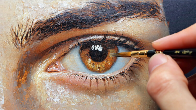
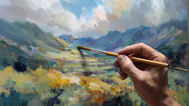
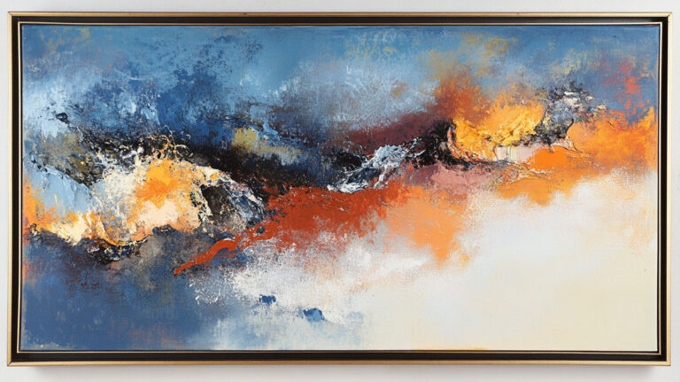
Flat paintings get ignored. Textured ones get touched.
If you have been looking for acrylic paint texture ideas that go beyond basic brushwork, you are in the right place. Acrylics are one of the most flexible mediums for building surface depth, from thick impasto layers to mixed media effects using sand, paste, and household tools.
This guide covers everything from paint application techniques and acrylic mediums to surface preparation, layering strategies, and the tools that actually make a difference.
By the end, you will know exactly how to add raised texture, visual depth, and tactile interest to your work, regardless of your experience level.
What is Acrylic Paint Texture

Texture in painting refers to the surface quality of a finished piece. In acrylics specifically, it splits into two categories: physical texture you can actually feel with your hand, and visual texture that only looks three-dimensional.
Physical texture is built up from the surface. Visual texture is painted. Both are legitimate, and knowing which one you’re after changes everything about how you approach the work.
Acrylics are genuinely well-suited for texture work. The fast drying time means you can add layer after layer without waiting days between sessions. And unlike oil paint, the binder stays flexible once dry, so thick applications don’t crack the way they might on other mediums.
Heavy body acrylics hold their shape after application. That’s what makes them the go-to for raised texture. Fluid acrylics are the opposite: thin, fast-spreading, better for glazing over texture rather than building it.
| Texture Type | What It Is | Best Acrylic Consistency |
|---|---|---|
| Physical (Tactile) | 3D Relief: Actual peaks, ridges, and valleys that cast real shadows on the canvas. | Heavy Body acrylics or Modeling Paste (Marble Dust/Polymer mix). |
| Visual (Implied) | Trompe l’oeil: Flat, smooth paint that uses light and shadow to mimic a 3D surface. | Fluid or Soft Body acrylics for smooth detail work. |
| Mixed | Hybrid Depth: A physical 3D structure that is enhanced by painted “visual” details on top. | Heavy Base for the structure + Fluid Glazes to highlight the peaks. |
One thing that trips up beginners: adding texture for its own sake. Texture works best when it serves the subject. Rock and bark call for it. Polished glass and calm water usually don’t.
The global artist grade acrylic paints market was valued at USD 0.47 billion in 2024, with heavy body acrylics holding the majority share, according to Business Research Insights. That’s a direct reflection of how many artists are working with thick, texture-oriented paint.
Texture Techniques Using Paint Application Only
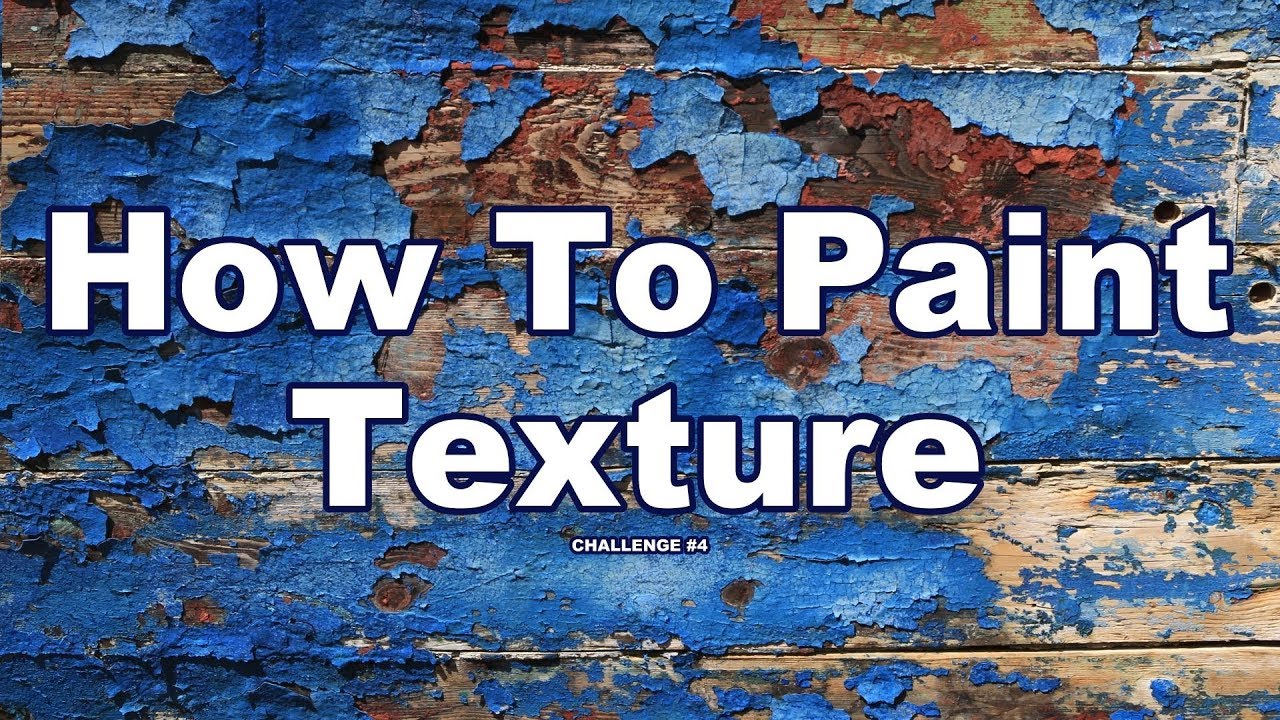
You don’t need any additives to get real texture. The way you apply the paint itself can create everything from soft ridges to sharp peaks. These are the techniques worth knowing before you buy a single medium.
Impasto Painting
What it is: applying paint thickly enough that the marks stay visible after drying. Brush strokes, knife marks, even fingerprints all become part of the surface.
Vincent van Gogh is the most referenced example of impasto done at an extreme level. His technique in works like “The Starry Night” used paint so thick it created actual ridges casting small shadows across the canvas. To understand what impasto means in acrylic painting and how it differs from its oil paint origins is useful before you start experimenting.
In practice: squeeze heavy body acrylic directly onto the canvas. Don’t thin it. Apply with a stiff bristle brush using short, confident strokes. The paint should hold its shape as it dries.
Palette Knife Texture

Sharp edges, flat planes, and knife-scraped grooves are all things a brush can’t really produce on its own. That’s where palette knife painting in acrylics becomes its own technique rather than just a mixing tool.
- Load the flat of the knife with paint and press it flat against the canvas, then lift quickly for a textured stamp
- Use the edge of the knife to drag thin lines through wet paint
- Scrape back through fresh paint to reveal the layer underneath
- Build angular “slabs” of color for rocks, cliffs, or abstract shapes
Liquitex and Golden both make heavy body acrylics that respond well to knife work. The paint stays where you put it without sliding.
Dry Brush Effects
Load a stiff brush, wipe most of the paint off on a paper towel, then drag it lightly across the surface. The paint catches on raised areas and skips over valleys.
The result is a rough, broken texture that reads as worn wood, rough stone, or fur. It works especially well over a dried textured base because the dry brush highlights every ridge. Dry brushing in acrylic painting is one of those techniques that looks harder than it is once you understand the paint-to-bristle ratio.
Key variable: how much paint remains on the brush. Too much and it fills in. Too little and nothing transfers. It takes about ten seconds of practice to find the right amount.
Stippling
Tapping a stiff-bristled brush straight down onto the surface creates a dotted, porous texture. Artists use it for foliage, moss, rough stone, and skin texture. Stippling in acrylic painting can be built up in layers to create real depth.
- Use an old, splayed brush for irregular results
- A brand-new stiff brush produces cleaner dots
Layer dark, then mid-tone, then light stippling for convincing foliage. The spacing between dots controls how dense the texture reads.
Texture Mediums and What They Actually Do

Commercial acrylic mediums are formulated to change specific properties of the paint. Most people grab them without reading what they actually do. That’s how you end up with cracked surfaces and muddy color.
The acrylic mediums category is worth understanding before buying. Each one behaves differently and suits different texture goals. Acrylic mediums broadly cover everything from gel and paste to specialty texture additives.
| Medium | Consistency | Best For | Mix or Apply Alone? |
|---|---|---|---|
| Soft Gel | Smooth, like heavy body paint. | Subtle texture, glazing, and extending paint without losing “body.” | Mix with paint to maintain transparency and flow. |
| Heavy Gel | Thick, holds high peaks. | Building pronounced, 3D brush marks and holding heavy objects for collage. | Both: Mix for color volume or apply alone for clear texture. |
| Modeling Paste | Putty-like, stiff, and white. | Sculptural effects, “carving” into paint, and heavy structural buildup. | Apply Alone: Usually used as a base and painted over once dry. |
| Light Modeling Paste | Whipped, airy consistency. | Large-scale textures where weight is a concern; excellent for avoiding “sag.” | Apply Alone: Best for keeping large canvases lightweight. |
| Sand Texture Gel | Gritty, sandy finish. | Simulating stone, concrete, earth, or weathered architectural surfaces. | Both: Mix for a tinted “stucco” look or apply alone. |
| Glass Bead Gel | Viscous with tiny spheres. | Crystalline, bubbling, or pearlescent light-reflective effects. | Apply Alone: Best applied as a top layer to maximize light refraction. |
Gel Mediums
Soft, regular, and heavy gel are the same product at different body levels. They all dry clear and flexible, and they all extend paint without weakening color significantly.
Mix heavy gel directly into paint to add body and reduce the amount of pigment you use per stroke. Apply it in thick layers for ridges and peaks that survive drying without cracking. Golden Artist Colors produces one of the most consistent heavy gel options on the market.
Modeling Paste vs. Light Modeling Paste
Standard modeling paste is dense. It builds high and dries hard. Apply it more than about 6mm thick in one pass and it will crack as the outer surface dries before the core.
Light modeling paste fixes that problem. It contains hollow microspheres that reduce weight and cracking risk. You can apply it thicker in a single layer. The trade-off: it’s slightly less rigid and a bit more porous after drying.
Liquitex’s modeling paste and Golden’s light modeling paste are the two most widely used in professional studios. Both accept acrylic paint directly once dry.
Specialty Texture Gels

These skip the mixing step entirely. They come pre-loaded with grit, beads, or fiber and can go straight from the jar to the canvas.
- Sand texture gel: reads as stone, rough earth, or weathered wood
- Glass bead gel: creates a crystalline surface that catches light
- Fiber paste: produces a matte, slightly fuzzy surface reminiscent of paper
- Pumice gel: coarse and matte, works well for rocky landscapes
One thing to know: these mediums dry to their texture as-is. Painting over them with a thin glaze adds color without filling in the grain.
Household and Mixed Media Materials for Texture
Some of the best texture results come from materials that cost nothing. Before buying a specialty gel, it’s worth knowing what’s already in your kitchen or garage.
Roughly 26% of U.S. consumers identify DIY and arts and crafts as a personal hobby (Statista Consumer Insights, 2024), and a big part of that is improvising with what’s at hand.
Gritty and Granular Materials
Sand is the obvious one. Mix play sand or fine builder’s sand directly into acrylic paint, or sprinkle it over a wet painted surface. The result reads as earth, stone, or beach. Salt works differently: sprinkle it over wet paint and it draws moisture toward each grain, creating small starbursts or craters as it dries. Scrape it off once the paint is fully dry.
Baking soda mixed into paint creates a matte, chalky texture that resembles stone or aged plaster. It doesn’t affect color noticeably. The ratio matters: more than about one part baking soda to three parts paint and the surface becomes fragile and prone to flaking.
Fabric and Paper Collage Materials
Tissue paper, cheesecloth, and burlap can be pressed into wet gesso or gel medium and painted over once dry. Each material leaves a different surface pattern baked into the painting.
- Tissue paper: subtle wrinkled texture, almost like cracked paint
- Cheesecloth: open weave creates a cross-hatch impression
- Burlap: strong grid pattern, reads as rough fabric or woven material
Artists like Jean-Michel Basquiat worked mixed media collage into painted surfaces. The idea of embedding material into the work rather than just applying paint on top goes back decades in contemporary art.
Improvised Printing and Stamping Tools
Crumpled aluminum foil pressed into wet paint leaves irregular, jagged ridges that read as cracked earth or bark. Plastic wrap pulled across wet paint and then removed creates a network of fine lines. Old credit cards scrape and drag paint into flat planes.
None of this requires art supplies. That’s the point. Texture comes from pressure, displacement, and mark-making, not from expensive products.
Texture on Different Surfaces
The support you paint on changes how texture behaves. Same technique, different result depending on what’s underneath.
Heavy body acrylics are projected to hold 54.2% of the acrylic paint market in 2025, according to Future Market Insights, driven largely by their use in textured and layered painting. That demand comes from artists working across canvas, panel, and alternative surfaces.
Canvas
Stretched canvas is the most common support, but its slight give works against heavy texture applications. A thick layer of modeling paste can flex and crack slightly as the canvas moves.
Solution: apply a rigid ground first. Two or three coats of gesso, sanded between layers, reduces the canvas flex and gives texture paste something stable to hold onto. For very heavy texture work, canvas board or a stretched canvas with a thicker frame is better than standard gallery wrap.
Wood Panel
Wood doesn’t flex. That’s its main advantage for thick texture work. Modeling paste and heavy gel can be applied in thicker passes without the cracking risk you get on canvas.
The trade-off is weight, especially for large work. Birch plywood panels primed with gesso are the standard choice. MDF is heavier but has a very smooth surface that takes impasto well. A solid look at painting on wood vs. canvas makes the decision clearer depending on your texture goals.
Paper and Alternative Surfaces
Heavy watercolor paper (300gsm or above) handles light texture work reasonably well. It will buckle under heavy paste application unless it’s stretched or taped down.
Burlap, cardboard, and primed fabric all produce their own base texture before you apply a single stroke of paint. The substrate becomes part of the texture work rather than a neutral ground.
| Surface | Best For | Prep Needed |
|---|---|---|
| Stretched Canvas | Light to Medium: Best for “painterly” styles where a slight spring is desired. | Multiple Gesso Coats: Standard primer is often too thin; 2-3 additional coats prevent paint “sinking.” |
| Canvas Board | Medium Texture: More stable than stretched fabric; won’t sag under medium-weight gels. | Basic Prime: Usually requires 1-2 coats of gesso to ensure the edges don’t lift. |
| Wood Panel (Birch) | Heavy Texture & Impasto: Rigid enough to handle the weight of heavy modeling pastes. | Sealing & Sanding: Apply Gesso, then light sanding (220 grit) to achieve a professional “slick” finish. |
| MDF Panel | Structural Work: Ideal for industrial textures or massive, high-relief abstract pieces. | Edge Sealing: Crucial to seal the absorbent edges with medium/primer to prevent warping. |
| Thick Watercolor Paper | Small-Scale Studies: High portability for texture experiments and color swatching. | Stabilization: Must be taped or “stretched” to a board to prevent the paper from curling when wet. |
What gesso actually does matters here. It’s not just primer. It controls absorbency and creates the tooth that holds texture paste and thick paint in place.
Layering Strategies for Complex Texture
Single-layer texture looks flat compared to built-up surfaces. The most interesting acrylic texture work is almost always the result of multiple passes, each one dry before the next goes on.
This is where acrylics have a clear advantage over oil. Fast drying time means layering in a single session is realistic. Layering in acrylic painting and building texture at the same time is genuinely one of the medium’s strongest features.
Building from Rough to Fine
Start coarse, finish fine. Apply your heaviest texture in the first or second pass. Modeling paste, heavy gel, or sand-mixed paint go down first. This creates the structural layer.
Once that dries completely, switch to softer body paint or gel and refine. Add color variation. Build shadow into recesses and lighter tones onto peaks. The detail reads on top of the structure, not competing with it.
Glazing Over Texture
A glaze is thin, transparent paint applied over a dry surface. Over textured work, it settles into recesses and sits thin on ridges, creating automatic light and shadow variation.
Mix a small amount of fluid acrylic with glazing medium or a lot of water. Brush it loosely over the dried texture. Let gravity and the surface irregularity do the rest. This is the technique that makes rock and bark look convincingly real without overworking the detail.
Glazing in acrylic painting is a separate skill from building texture, but the two work extremely well together. The texture gives the glaze something to react to.
Sanding Between Layers
Light sanding between dried texture layers sounds counterintuitive but it does two things: it knocks down sharp peaks that catch too much highlight, and it creates a slightly abraded surface that grips the next layer better.
- Use 220-grit or finer sandpaper
- Sand dry, not wet
- Wipe dust off before the next application
- Works especially well when building multiple paste layers on a wood panel
The result is a surface that looks built up over time rather than applied in one session. That difference is visible in the finished piece.
Texture for Specific Painting Subjects
Texture isn’t one-size-fits-all. What works for rock faces looks wrong on water. What reads as bark looks odd on fabric. Matching your texture technique to the subject is where things start to click.
The craft and hobby market is projected to reach $74.3 billion by 2033, with painting remaining one of the top creative activities (Empower, 2025). Most of that growth is driven by hobbyists working on representational subjects like landscapes and botanicals.
Landscape Texture
Rocks, cliffs, and bark are the most texture-friendly subjects in landscape work. They justify heavy application without looking overdone.
For rocky terrain, apply modeling paste with a palette knife in angular strokes, then let it dry fully. Paint over with a dark base tone first. Dry brush lighter colors over the raised edges to suggest light catching stone.
Bark works similarly but with more vertical drag. Use a stiff flat brush loaded with heavy body paint, pulling downward in short strokes. Layer a second dry-brush pass in a lighter tone once the base is dry.
Helpful to look at how landscape painting in acrylic handles depth before building texture, since texture and depth often need to work together in the same piece.
Abstract Texture Backgrounds
Abstract work gives you the most freedom with texture. There’s no subject to “get right,” so the texture itself becomes the content.
- Drag a wide squeegee or old credit card across wet paint for horizontal sweeps
- Press crumpled plastic wrap into wet paint, then remove it for a web-like pattern
- Use a comb or fork dragged through thick paint for rhythmic line texture
Artists like Jackson Pollock and Mark Rothko built abstract painting techniques that treated surface texture as a primary visual element rather than a secondary finish.
Organic and Natural Subjects
Water and glass need restraint. Over-texturing these surfaces kills the illusion entirely. Smooth gel medium applied in thin, deliberate strokes reads more convincingly as water than any paste or impasto layer.
For foliage, stippling and sponging create the broken, irregular quality of leaves without overworking. Fan brushes loaded with two colors at once produce a quick, believable result for treetops and grasses.
| Subject | Best Texture Approach | Tool to Use |
|---|---|---|
| Rock and Cliff | Heavy Relief: Building angular, faceted surfaces that mimic geological fractures. | Palette Knife: Allows for sharp, flat planes and “broken” edges. |
| Bark and Wood | Directional Grooving: Creating vertical “trenches” that catch dark glazes and light highlights. | Stiff Flat Brush: Excellent for dragging thick paint to create a “grain” effect. |
| Foliage and Grass | Fragmented Texture: Breaking up the surface into thousands of tiny, organic “peaks.” | Old Stiff Brush / Fan Brush: Natural “irregularity” is your best friend here. |
| Water and Glass | Luminous Smoothing: Minimal physical texture; the surface should be as “slick” as possible. | Soft Flat Brush: Designed to lay down paint without leaving visible bristle marks. |
| Abstract Backgrounds | Experimental Mark-Making: Using non-traditional tools to create repetitive or chaotic patterns. | Scrapers, Plastic Wrap, Combs: Anything that can “plow” or “stamp” the paint. |
Common Texture Mistakes and How to Fix Them
Most texture problems come from one of two things: applying too much too fast, or skipping the prep. Both are fixable.
Cracking from Over-Thick Single Passes
Acrylic paint and modeling paste dry from the outside in. Apply them too thick in one go and the outer surface skins over before the core dries, creating internal tension that cracks the surface.
The fix: build up in layers, each one no thicker than about 6mm. Let each pass dry completely before adding the next. Light modeling paste handles this better than standard paste for thick applications.
Applying paste or heavy gel too fast in one pass is the most common palette knife mistake beginners make, according to Skillshare’s guide on palette knife techniques. The fix is gradual buildup, not thinner paste.
Paint Sliding Off an Unprimed Surface
Heavy texture paste has weight. On an unsealed or under-primed surface, it can slide, sag, or simply fail to bond properly after drying.
- Always prime with at least two gesso coats before applying any paste
- Sand lightly between coats for a better grip
- On very smooth surfaces like MDF or glass, add a coat of acrylic medium before gesso
Priming a canvas correctly before any texture work saves a lot of frustration later. The steps are simple but they matter.
Texture Drying Too Flat
Over-diluted medium is almost always the cause. Adding too much water to gel or modeling paste breaks down the structure, and the raised marks collapse as the water evaporates.
Gel medium should never be thinned with more than about 25% water if you want it to hold its shape. Modeling paste should be used straight from the container for structural texture work. Adding retarder instead of water buys working time without destroying body.
Muddy Color Over Textured Surfaces

Painting opaque color over heavy texture tends to fill in the recesses and flatten everything out. The texture disappears under layers of thick paint.
Two approaches fix this. First, use thin transparent glazes so the texture reads through the color. Second, paint dark into the recesses first, let it dry, then dry brush lighter tones across the peaks. The contrast between recess and peak is what makes texture visible.
Knowing how contrast works in painting helps here more than most people expect. Texture is only as visible as the tonal difference between its high and low points.
Tools That Expand Texture Options

Brushes do a lot. They don’t do everything. Some of the most interesting texture results come from tools that weren’t originally designed for painting.
The arts and crafts market was valued at USD 43.4 billion in 2024 and is projected to reach USD 79.2 billion by 2032 (Verified Market Research). That growth reflects a much broader interest in materials, tools, and non-traditional approaches to making work.
Silicone Shapers and Colour Shapers
Silicone shapers look like stiff brushes with a rubber tip instead of bristles. They don’t absorb paint, which means they push and displace it rather than applying it. The result is a different quality of mark entirely.
What they do well:
- Carve clean lines through wet impasto without tearing the surface
- Blend smooth curves in heavy gel without brush marks
- Press organic shapes into wet paste with controlled pressure
Colour Shapers by Princeton and the Catalyst line both cover this category. They come in different firmnesses, which controls how much they displace versus blend.
Texture Rollers and Stamps
A foam roller loaded with paint and rolled across a textured surface creates a repeating pattern that would take hours to paint by hand. Good for abstract backgrounds, decorative textures, and large canvas preparation.
Rubber texture stamps pressed into wet paste leave a negative impression. Press in, lift cleanly, let dry. The depth of the impression depends on how wet the paste is and how much pressure you use.
Timing is everything here. Too wet and the impression closes up. Too dry and the stamp pulls the paste off the surface.
Rubber-Tipped Tools for Sgraffito
Sgraffito means scratching back through wet paint to reveal the layer underneath. It’s one of the oldest texture techniques, and it works as well with acrylics as it ever did with oil.
You can use the handle end of a brush, a toothpick, a comb, or a proper rubber-tipped sgraffito tool. The key is working while the top layer is still wet. Sgraffito in acrylic painting has a short window compared to oil, so speed matters.
Old Credit Cards and Scrapers
These aren’t improvised in a pinch kind of tools, they’re genuinely useful. A credit card edge creates a flat plane of color with a sharp bottom edge that no brush can match. Drag it across heavy paint at an angle for striations. Press it flat and lift for a stamped texture.
Commercial paint scrapers in varying widths do the same thing with more control. Using a paint scraper well is mostly about angle and pressure, both of which take about ten minutes to figure out.
| Tool | Best Texture Use | Works Best With |
|---|---|---|
| Silicone Shaper | Smooth Carving: Acts like a “finger” that doesn’t absorb paint; ideal for sculpting clean grooves. | Heavy Gel / Impasto: High-viscosity mediums that hold the shape of the “plowed” line. |
| Texture Roller | Repeating Patterns: Creating consistent, mechanical grids or organic “wallpaper” effects. | Medium Body Acrylic: Needs enough “tack” to hold the print without being so thick it clogs the roller. |
| Rubber Stamp | Impressed Negative: Pressing a shape into the paint to leave a recessed design. | Modeling Paste / Gel: Requires a medium that won’t “slump” back into the impression as it dries. |
| Sgraffito Tool | Scratched Detail: Thin, needle-like lines that reveal the dry color hidden beneath the wet layer. | Heavy Body / Wet Impasto: Best for “drawing” with light into a dark top coat. |
| Credit Card / Scraper | Drag Striations: Large, flat sweeps that create a “distressed” or industrial look. | Heavy Body / Paste: Materials that can be “skidded” across the surface to leave gaps and ridges. |
FAQ on Acrylic Paint Texture Ideas
How do I add texture to acrylic paint without buying special mediums?
Mix sand, baking soda, or sawdust directly into your paint. Crumpled foil, plastic wrap, and old credit cards all create surface texture using materials you already have. No specialty products needed.
What is the best acrylic medium for creating raised texture?
Modeling paste builds the most structural texture. Heavy gel medium is a close second. Both hold their shape after drying. For large areas, light modeling paste reduces the risk of cracking.
Why is my acrylic texture cracking after it dries?
You applied it too thick in one pass. Acrylic paste skins over on the outside before the core dries, causing tension cracks. Build up in thin layers, letting each one dry completely before adding more.
Can I use a palette knife for texture instead of a brush?
Yes, and it often produces better results for raised texture. A palette knife creates sharp ridges, flat planes, and scraped grooves that brushes cannot replicate. Heavy body acrylics work best with this technique.
What household items work well for acrylic paint texture effects?
Sand, salt, tissue paper, cheesecloth, and aluminum foil all work well. Salt pressed into wet paint creates small craters as it draws moisture. Foil pressed and lifted leaves jagged, irregular ridges.
Does the painting surface affect how texture looks?
Significantly. Wood panels hold heavy texture better than stretched canvas because they do not flex. Canvas needs several gesso coats to reduce movement. Thick modeling paste on unsupported canvas can crack over time.
How do I paint over texture without flattening it?
Use thin, transparent glazes rather than opaque paint. Glaze settles into recesses and sits lightly on peaks, keeping the surface variation visible. Dry brushing lighter tones over raised areas also highlights texture effectively.
What is the impasto technique and how does it create texture?
Impasto means applying paint thickly enough that brush or knife marks stay visible after drying. The raised marks catch light and cast small shadows, creating physical and visual texture simultaneously. Heavy body acrylics are the standard choice.
How do I add texture to an abstract acrylic painting?
Scrapers, combs, plastic wrap, and sponges all produce distinct abstract texture effects. Apply heavy body paint or gel, then drag or press tools through it while wet. Each tool leaves a different surface pattern.
Can I seal a textured acrylic painting without losing the texture?
Yes. Use a soft brush or foam applicator to apply varnish gently. Spray varnish works well for heavily textured surfaces since it does not flatten raised areas the way a stiff brush can under pressure.
Conclusion
This conclusion is for an article presenting acrylic paint texture ideas that range from simple dry brush effects to layered impasto work built up on wood panels.
The techniques covered here, whether you are mixing sand into paint or reaching for a modeling paste and palette knife, all follow the same basic principle: texture needs structure, preparation, and patience.
Start with one method. Get comfortable with how heavy body acrylic behaves under a knife or a silicone shaper before combining techniques.
Surface preparation, proper layering, and the right paint consistency make the difference between texture that holds and texture that cracks.
Pick one idea from this guide and put it on canvas today.