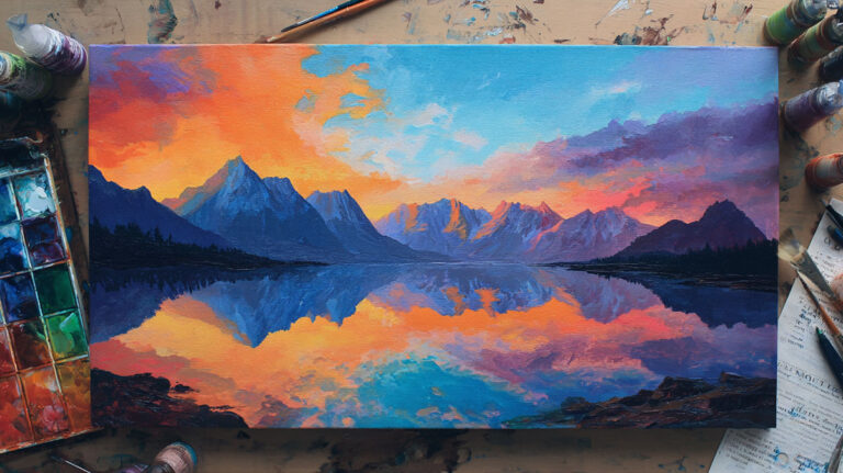
Most color mixing problems have nothing to do with talent. They come from not knowing how acrylic paint actually behaves.
Learning how to mix acrylic paint covers more than combining colors on a palette. It includes paint consistency, medium ratios, color bias, and why some mixes go muddy while others stay clean.
Nearly 49% of U.S. adults participate in creative activities like painting, according to Americans for the Arts. A lot of them hit the same walls early on.
This guide covers everything from color theory and the color wheel to glazing ratios, acrylic mediums, and how to recreate a custom mix you made last week.
By the end, you will have a clear, practical system for mixing colors accurately, every time.
What Acrylic Paint Mixing Actually Involves

Mixing acrylics is not just about combining two colors on a palette. It covers three separate things: pigment mixing (color), consistency mixing (how thick or thin the paint is), and medium mixing (how the paint behaves on the surface).
Most beginners focus only on color. That’s where the frustration starts.
Acrylics are water-based paints built from three components: pigment particles, an acrylic polymer binder, and water. When you mix acrylics, you’re working with all three at once, not just the color you see in the tube.
The binder is what makes acrylics stick to surfaces and dry flexible. Disturb the binder too much, and the paint loses adhesion. That’s why adding too much water or the wrong medium creates problems that have nothing to do with color at all.
There’s also the dry shift. Acrylics dry noticeably darker than they look wet on the palette. This is most obvious with dark transparent pigments like alizarin or phthalo blue. Opaque colors like cadmium yellow shift far less. It matters a lot when you’re trying to match a color you mixed yesterday.
According to Global Growth Insights, over 1.2 billion liters of acrylic paint were sold worldwide in 2023 alone. Clearly, a lot of people are painting. Getting the basics of mixing right makes the whole experience less wasteful and more predictable.
Pigment mixing vs. medium mixing
Pigment mixing changes color: hue, value, saturation.
Medium mixing changes behavior: drying speed, viscosity, transparency, and finish. Both matter, and confusing the two leads to unexpected results on canvas.
| Mixing Type | What It Changes | Common Tools |
|---|---|---|
| Pigment mixing | Hue, value, saturation | Palette knife, brush |
| Consistency mixing | Thickness, flow, spreadability | Water, fluid medium |
| Medium mixing | Dry time, finish, transparency | Retarder, gel, gloss/matte medium |
Why acrylics are less forgiving than oils
Oil paint stays wet for hours, sometimes days. You can go back, rework edges, blend slowly. Acrylics? Thin layers can be touch-dry in under 10 minutes.
That fast dry time is a genuine advantage for layering. But it punishes hesitation when you’re blending or trying to match a wet mix to a dry one.
I’ve seen plenty of painters switch to acrylics from oils and immediately hit a wall with blending. The fix isn’t more water. It’s understanding that acrylics need a different workflow, not just a different medium.
Tools and Surfaces for Mixing Acrylics

The surface you mix on changes the result. A paper palette absorbs paint fast, which throws off your color reading and wastes expensive pigment. A glass or ceramic surface gives you a clean, accurate read of the color.
Golden Artist Colors specifically recommends glass palettes for their smooth, nonporous surface that makes mixing much easier and keeps colors true.
Palette types compared

Stay-wet palette: best option for longer sessions. A damp sponge under a membrane sheet keeps paint workable for hours. The Masterson Sta-Wet is the standard go-to for most acrylic painters.
Glass palette: excellent color accuracy, easy to clean, zero absorption. Some painters use a sheet of glass over a white or grey surface to better judge tone.
Disposable paper palette: convenient but not great for color accuracy. The paper absorbs moisture fast, which changes how the paint looks and handles.
Palette knife vs. brush for mixing

Most experienced painters use a palette knife for mixing, not a brush. Brushes pick up paint unevenly, and mixing with them wears down the bristles faster than anything else.
A palette knife gives a thorough, consistent mix. You can see the color develop clearly without it getting trapped in bristle clusters.
That said, mixing small amounts of a tint directly into a stroke? A brush works fine for that. Your mileage varies based on scale and technique.
The Color Wheel and How It Applies to Acrylics
The traditional RYB color wheel (red, yellow, blue as primaries) is fine as a starting point. But it does not accurately predict what happens when you mix modern acrylic pigments.
The more accurate model for acrylics is based on cyan, magenta, and yellow as primaries. These align better with how actual pigments behave in mixtures.
Golden Artist Colors uses this approach in their professional palette, built around benzimidazolone yellow, quinacridone magenta, and phthalo blue as the core mixing primaries. It gives a wider range of clean secondary colors than a standard RYB setup.
Color bias and why it matters
Every pigment leans warm or cool. Cadmium red leans orange-warm. Quinacridone red leans cool toward violet. This “bias” determines what you get when you mix.
To mix a clean purple, you need a red that leans toward blue (cool red) and a blue that leans toward red. Using a warm red with a warm blue produces a dull, muddy result instead of the vibrant purple you wanted.
Color bias is one of the most overlooked concepts in acrylic mixing. Understanding it explains almost every “why does my purple look brown?” problem.
Warm vs. cool versions of each primary

| Color | Warm Version | Cool Version |
|---|---|---|
| Red | Cadmium Red (orange bias) | Quinacridone Magenta (violet bias) |
| Blue | Ultramarine Blue (violet bias) | Phthalo Blue (green bias) |
| Yellow | Cadmium Yellow (orange bias) | Hansa Yellow (green bias) |
The underlying logic comes from Johannes Itten’s color theory and Josef Albers’ work on color interaction, both of which form the backbone of how contemporary color theory is taught in art education today.
How to Mix Colors Accurately
One rule covers most mixing mistakes: always add dark to light, never the other way around.
Dark pigments are far stronger than light ones. A small amount of phthalo blue dropped into titanium white will dominate the mixture within a few strokes. Add white to phthalo blue, and you’ve wasted half a tube of white trying to lighten it.
Start with the lighter color. Add the darker in tiny increments. Test on a scrap surface after each addition before touching your canvas.
Mixing clean secondary colors

The most common complaint: “my green looks muddy” or “my purple looks brown.” Both are almost always a color bias problem.
- For clean greens: use a yellow with a cool (green) bias plus phthalo blue. Hansa Yellow Medium with Phthalo Blue (Green Shade) is a reliable combination.
- For clean purples: use a cool red (quinacridone magenta) with ultramarine blue. Ultramarine has a violet bias that helps.
- For clean oranges: use a warm red (cadmium red or naphthol red) with a warm yellow (cadmium yellow or benzimidazolone yellow).
Mixing secondary colors cleanly is mostly about matching the bias direction of both parent colors. Get that right and muddy mixtures become much rarer.
How to avoid muddy mixtures
Muddy color has one main cause: mixing complementary colors in roughly equal amounts. Red and green, blue and orange, yellow and purple. In small amounts, complementary colors neutralize each other and produce useful grays and earth tones. In equal amounts, they produce brown-gray mud.
A few practical checks before mixing:
- Are the two colors on opposite sides of the color wheel? Go carefully.
- Is one warm and one cool? Expect neutralization.
- Are you mixing more than three pigments? That’s usually where things go wrong.
Mixing ratios matter too. Keep a small notebook with ratio notes (“1 part burnt sienna, 3 parts titanium white, half part raw umber”). Took me forever to figure out how frustrating it is to mix a perfect color and then have no idea how to recreate it.
How to Mix Acrylics with Water

Water is the most common way to thin acrylics. It’s also the most misunderstood.
The basic rule most manufacturers recommend: keep water below 30% of the total mixture by volume. Beyond that, you risk weakening the acrylic binder enough to cause adhesion problems, color fade, or chalky dried paint.
Golden Artist Colors’ testing shows that on properly primed surfaces, adhesion held even at extreme dilutions. But on unprimed or nonporous surfaces, binder breakdown is a real risk. The 30% guideline is safe across all surface types.
What over-thinning actually does
Signs you’ve added too much water:
- Paint beads on the surface instead of spreading
- Dried paint looks chalky or powdery
- Color wipes off after drying
- Finish goes matte and dull regardless of paint type
The fix is simple. Use less water. Add a small amount of acrylic medium to restore the binder ratio. Or go back to straight paint and build the transparency through thin layering instead of heavy dilution.
When water alone is sufficient
Light consistency adjustment: 10-20% water is enough to loosen thick paint for smoother brushwork without any real risk to adhesion.
Thin washes on absorbent surfaces: raw canvas, watercolor paper, or gessoed board can absorb more diluted paint without binder failure, because mechanical adhesion compensates.
Base layers and underpaintings: a thin, slightly water-diluted wash works well for an underpainting where you’re just mapping tones before building up with full-strength paint later.
For anything beyond light thinning, a purpose-built medium is a better choice than more water.
Acrylic Mediums and What They Change
Mediums let you change how the paint behaves without touching the binder. That’s the key difference from water. A medium adds more acrylic polymer as it thins, so the binder ratio stays intact.
The acrylic paint market was valued at USD 7.25 billion in 2024, growing at a 4.5% CAGR through 2033 (Verified Market Reports). Part of that growth is driven by the expanding range of specialty mediums that have made acrylics more versatile than ever.
The main medium types
Gloss medium: thins paint while adding transparency and a shiny finish. Good for glazing layers where you want depth without losing luminosity.
Matte medium: same thinning properties, but dries to a flat finish. Mixing gloss and matte in different ratios gives you full control over sheen.
Retarder medium: slows dry time significantly. Useful for wet-on-wet blending, but too much creates a sticky surface that never quite firms up. The general advice from Liquitex is to keep retarder below 15% of the total mixture.
Flow improver (flow aid): reduces the surface tension of the paint so it spreads more smoothly without thinning the pigment. Great for fine detail work where you need the paint to flow off the brush cleanly.
Gel medium: adds body. Thick gel mediums are used for texture and impasto effects where you want the paint to hold peaks and brushstroke marks after drying.
Brand differences worth knowing
Golden, Liquitex, and Winsor and Newton are the three most widely used professional brands for mediums. They’re largely compatible with each other and with other acrylic paint lines, though mixing brands can occasionally affect consistency.
Golden’s OPEN medium is worth calling out specifically. It extends dry time dramatically, closer to the working time of oil paint, which makes blending and wet-on-wet techniques genuinely possible with acrylics. Painters who struggled with acrylics drying too fast often find it changes their whole experience of the medium.
Mixing Acrylics for Specific Techniques
The way you mix paint should change depending on what you are doing on the canvas. A mix that works perfectly for dry brushing will completely fail for pouring. Technique drives the mixing decision, not the other way around.
According to Statista, roughly 26% of U.S. consumers listed DIY and arts and crafts as a hobby in both 2023 and 2024. That sustained interest has pushed demand for technique-specific guides higher than ever, including everything from fluid pours to tight glazing work.
Mixing for glazing layers
Glazing was used by artists like Rembrandt and Vermeer centuries before acrylics existed. With acrylics, it is surprisingly accessible.
The standard starting ratio, recommended by Liquitex, is 1 part transparent paint to 10 parts glazing medium. That proportion gives a clean, luminous layer that shifts the color beneath without covering it. Add water to that mixture and you risk losing glossiness, according to YouTalent’s research, which puts the safe limit at around 15% added water before intensity starts dropping.
A few practical notes:
- Use transparent pigments for glazing, not opaque ones. Cadmium colors and titanium white are too opaque to glaze well.
- Phthalo pigments, quinacridones, and transparent iron oxides are your best options.
- Each layer must be fully dry before the next goes on.
A glaze of ultramarine blue over burnt sienna creates a rich, deep shadow tone. One of those combinations that looks better than either color alone.
Mixing for acrylic pouring
Consistency is everything in fluid painting. The goal is a mixture that flows like warm honey off a lifted stirring stick, dripping back and melting into the surface within about two seconds.
The standard starting point for a pouring mix: 1 part acrylic paint to 2 parts pouring medium, with small amounts of water to adjust flow.
Dense colors like titanium white, carbon black, and most metallics need more medium than average to reach the right pour consistency, because their pigment load is heavier than most colors.
Avoid substituting plain water for pouring medium. Water weakens the binder and can cause cracking as the piece dries, especially on large canvases where the paint film is thicker at the edges.
Mixing for wet-on-wet blending

Wet-on-wet with acrylics is genuinely possible. Just harder than oils, and it requires a different setup.
Adding retarder medium to both color mixes extends working time by 200-300%, according to testing data from One Nerdy Dad’s miniature painting research, which applies equally to canvas work. The key is keeping retarder below 15% of the total mixture to avoid a surface that stays permanently tacky.
Work in small sections. Pre-mix all your colors before touching the canvas. The moment you start second-guessing and reaching for more paint, the window closes.
Mixing for dry brushing
No thinning required. Dry brushing uses undiluted or barely-modified paint wiped almost completely off the brush before touching the surface.
The technique works specifically because the paint is thick and sticky. Thinning it defeats the purpose. Load the brush, wipe most of it off on a paper towel, then drag lightly across a textured surface. The paint catches on raised areas only, building up highlights gradually.
It is one of the few acrylic techniques where mixing mediums in is actively counterproductive.
Matching and Recreating Mixed Colors

Running out of a custom mix halfway through a painting is one of the most common and most preventable problems in acrylics. The fix is documentation, not luck.
How to keep a mixing log
A survey cited by Custom Paint By Numbers found that 85% of artists reported improved color accuracy within weeks of starting a mixing journal. That tracks with what most experienced painters already know: memory is useless for ratio work, but a written record is not.
What to record for every custom mix:
- Paint names, brand, and series (different brands’ “phthalo blue” are not the same)
- Approximate ratio (e.g., “3 parts titanium white, 1 part raw umber, half part yellow ochre”)
- Any medium added and its ratio
- A dried paint swatch on the same page, labeled with date
Photograph the swatch in natural daylight, not under artificial studio lighting, which shifts the perceived color. Reviewing your log under the same light conditions you used when mixing gives the most accurate match.
The dry shift problem
Acrylics darken as they dry. This is especially pronounced with transparent pigments like phthalo blue, quinacridone magenta, and alizarin crimson. Light opaque colors like cadmium yellow shift far less.
Golden Artist Colors recommends layering a thin swatch of any transparent mix onto a white surface and letting it fully dry before committing the color to the painting. A touch of zinc white added to a transparent mix reduces the dry shift noticeably without significantly affecting the hue.
When recreating a mix, always compare the dry swatch to the dry surface. Wet-to-wet comparisons are unreliable for transparent colors.
Mixing enough paint
Mix more than you think you need. Always.
Recreating an exact mix later is possible but time-consuming, and slight variations in ratio or pigment batch will show up visibly in side-by-side comparison on a finished piece. If you run short on a background or sky area, that is the worst place to notice it.
Store leftover custom mixes in small airtight containers. Film canisters work well. A thin layer of plastic wrap pressed directly onto the paint surface before sealing the lid slows drying further.
Common Mixing Mistakes and How to Fix Them
Most acrylic mixing problems come from the same handful of errors. They are predictable, and they are all fixable once you know what is causing them.
Adding dark paint to light instead of the reverse
This is the most common ratio mistake. Dark pigments are far stronger than light ones. Phthalo blue dropped into titanium white dominates immediately. Adding white to phthalo blue requires far more white to achieve the same result, and wastes a significant amount of paint in the process.
Start with the lightest color. Add darker pigments in small increments, mixing thoroughly after each addition before deciding if more is needed.
Over-thinning with water
Visual signs the mix has too much water:
- Paint beads on the surface rather than spreading evenly
- Dried paint looks chalky or powdery
- Color wipes off after drying
- Finish turns matte regardless of paint type
The fix is straightforward. Cut the water ratio, add a small amount of fluid acrylic medium to restore binder strength, and test on a scrap surface before continuing.
Mixing too many pigments
Three pigments is the practical limit for clean color mixing. Beyond that, muddy grays and browns become likely, not occasional.
Each pigment you add introduces its own bias and undertone. Those biases compound. By the fourth or fifth color, the mixture has usually neutralized itself into a flat, lifeless tone.
If you want a complex neutral or earth tone, that is fine. But if you are aiming for a vibrant secondary or a clean tint, limit the palette. Mixing clean tertiary colors with precision requires understanding exactly which two or three pigments are at work.
Letting paint dry on the palette mid-session
Dried paint on the palette creates two problems. It wastes expensive pigment, and it can contaminate fresh mixes if flakes break off and blend in.
Lightly mist the palette with water every few minutes during longer sessions. Golden Artist Colors specifically recommends a plant mister for this. A stay-wet palette like the Masterson Sta-Wet largely eliminates this problem during sessions of two hours or more.
Using student-grade paints expecting professional results
Student-grade paints have lower pigment loads and often contain fillers that affect how colors mix and shift when dry. Color shifts are less predictable, mixing ratios feel inconsistent, and certain colors (particularly whites and blacks) behave differently across grades.
This does not mean student paints are useless. For practice and early skill-building, they are practical. But for work where color accuracy matters, artist-grade paints from Golden, Liquitex, or Winsor and Newton produce far more consistent results.
Mixing Acrylics with Other Paint Types
Acrylics are water-based polymer emulsions. Most other paint types are not. That difference determines what you can safely mix and what you should never attempt.
| Combination | Can Mix Wet? | Can Layer? | Notes |
|---|---|---|---|
| Acrylics + oils | No | Yes (acrylics under oils only) | Oils over dry acrylics is safe; reverse causes adhesion failure |
| Acrylics + gouache | Yes, limited | Yes | Changes finish and slows dry time; reduces rewettability |
| Acrylics + watercolor | Yes, limited | Yes (acrylics over watercolor) | Affects watercolor’s rewettability; small ratios only |
Acrylics and oil paint
Never mix acrylics and oils wet. They are chemically incompatible and will not form a stable film together. The oil prevents the acrylic binder from fusing properly.
Layering is a different story. Acrylics under oil paint is a widely used approach. The rule, commonly called “fat over lean,” means oil (fat) goes over acrylic (lean), never the reverse. Applying acrylics over a dry oil layer causes the acrylic film to crack as the oil underneath continues to move during its long curing process.
Oil painting and acrylic painting have been combined this way by many contemporary painters, including those working in realism, who use acrylic underpaintings for their fast dry time before switching to oils for the final layers.
Acrylics and gouache
These two mix reasonably well in limited amounts. Gouache is water-based, so it is compatible with acrylics at the chemistry level. The tradeoff is that adding gouache to acrylics changes the finish toward matte and slightly extends drying time.
One practical limit: gouache is naturally rewettable. Once you mix it with acrylics and the mixture dries, that rewettability disappears. A dried acrylic-gouache layer behaves like acrylic, not gouache.
Mixing different brands of acrylic
Generally safe, with caveats.
Different brands use different binder formulations and pigment loads. Mixing Golden heavy body with Liquitex soft body across a painting is usually fine for color, but the consistency and finish may vary slightly between areas. Student-grade and artist-grade paints from different brands mix less predictably due to the filler content in student lines.
Stick to the same brand and grade within a single large area of a painting, especially for backgrounds and skies where consistency is visible across a wide span.
FAQ on How To Mix Acrylic Paint
Can you mix acrylic paint with water?
Yes. Keep water below 30% of the total mixture to avoid weakening the acrylic binder. Beyond that threshold, paint adhesion drops and dried color can look chalky. For heavier thinning, use a fluid acrylic medium instead.
Why does my acrylic paint look muddy after mixing?
Muddy color usually means you mixed complementary colors in roughly equal amounts, or combined too many pigments at once. Limit mixes to three pigments maximum and check color bias before combining warm and cool versions of the same hue.
How do you mix acrylic paint without brush strokes?
Add a small amount of flow improver or glazing medium to reduce surface tension. Apply with a soft brush in smooth, single-direction strokes. Thin layers blend more cleanly than thick ones, and a stay-wet palette keeps paint workable longer.
What is color bias and why does it matter?
Every pigment leans warm or cool. Cadmium red leans orange. Quinacridone magenta leans violet. Mixing two colors with opposite biases neutralizes both. Matching bias direction produces cleaner secondary colors. It explains most muddy purple and dull green problems.
How do you mix skin tones with acrylic paint?
Start with a base of red, yellow, and white. Adjust warmth with raw sienna or burnt sienna. Add small amounts of raw umber for shadow. A touch of blue or green adds depth. Test every mix dry, since acrylics shift color as they cure. Check out this guide on how to mix skin tones for more detail.
Can you mix different brands of acrylic paint?
Generally yes. Most acrylic brands are chemically compatible. Consistency and finish may vary slightly between artist-grade and student-grade paints. For large areas like backgrounds, stick to one brand within the same section to keep color saturation consistent across the surface.
How do you mix acrylic paint for pouring?
Combine one part paint with two parts pouring medium. Adjust with small amounts of water until the mixture drips off a stirring stick like warm honey. Dense pigments like titanium white need more medium. Avoid replacing pouring medium with water alone.
Why does acrylic paint dry darker than it looks when wet?
This is the acrylic dry shift, caused by the polymer binder clarifying as water evaporates. Transparent pigments like phthalo blue shift most. Always test a small dry swatch before committing a mixed color to canvas. Adding a touch of zinc white reduces the shift.
How do you mix acrylic paint for glazing?
Mix one part transparent paint with around ten parts glazing medium. Use only transparent pigments for clean results. Each layer must dry fully before the next is applied. Limiting added water to under 15% preserves the gloss and color intensity of the glaze.
How do you recreate a custom acrylic mix you made before?
Keep a mixing log with pigment names, brands, and approximate ratios. Paint a small dry swatch next to each entry. Photograph swatches in natural light for reference. Mix slightly more than needed each session. Recreating exact matches later without notes is mostly guesswork.
Conclusion
This conclusion is for an article presenting how to mix acrylic paint as a skill built on understanding pigment behavior, color bias, and the role of mediums.
Color theory gives you the foundation. The color wheel, warm and cool primaries, and complementary relationships explain most mixing outcomes before you even touch a palette knife.
Mediums matter as much as pigments. Retarder, glazing medium, gel, and flow improver each change how paint handles, dries, and layers.
Keep a mixing log. Document ratios, pigment names, and dry swatches. It turns frustrating guesswork into a repeatable process.
Paint consistency, dry shift, water ratios, and technique-specific mixes all connect. Once you understand how they interact, acrylic paint mixing becomes predictable rather than stressful.