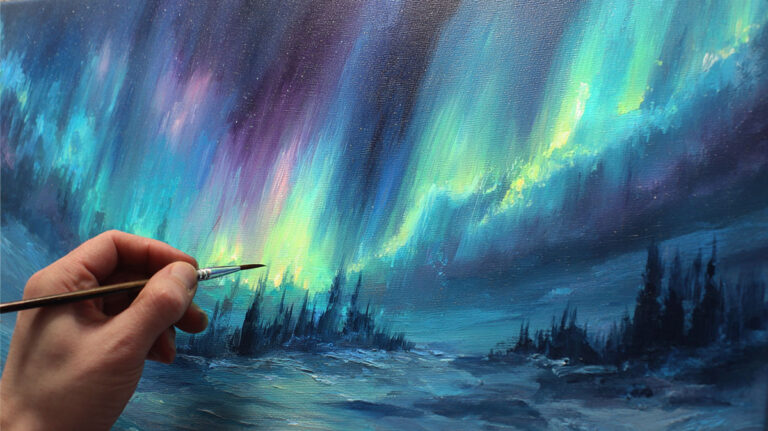
Fresh petals catch morning light differently than any other subject in art. Learning how to paint flowers transforms your understanding of color, form, and natural beauty in ways that surprise even experienced artists.
Botanical art challenges painters with complex petal structures, translucent surfaces, and subtle color variations that shift with changing light. Many artists avoid floral subjects because they seem too delicate or complicated.
This guide breaks down flower painting into manageable techniques that work across all painting mediums. You’ll master petal anatomy, color mixing for realistic blooms, and brush techniques that capture both roses and daisies with equal confidence.
Whether you prefer watercolor painting, acrylic painting, or oil painting, these methods adapt to your chosen medium. By the end, you’ll paint convincing sunflowers, peonies, and garden scenes that capture the natural beauty of blooming flowers.
Understanding Flower Structure and Form

Breaking Down Basic Flower Anatomy
Petal shapes vary dramatically between flower types. Roses display overlapping, curved petals that spiral outward from the center. Sunflowers feature long, narrow petals radiating from a complex center.
Each bloom has distinct anatomical features you need to observe carefully. The pistils and stamens create the flower’s reproductive center, often contrasting sharply with surrounding petals.
Daisies showcase simple petal arrangements around flat, circular centers. Peonies present layers upon layers of ruffled petals that seem to multiply infinitely.
Stem and Leaf Connection Points
Stems don’t just hold flowers up randomly. They connect at specific angles that affect how light hits different petal surfaces.
Most flowers attach at slight angles, never perfectly vertical. This natural tilt creates interesting shadow patterns across the bloom.
Leaf placement follows predictable growth patterns. Study how leaves emerge from stems at regular intervals, creating rhythm in your overall composition.
Observing Light and Shadow on Flowers
Light behavior on petals differs from other surfaces. Thin petals allow light to pass through, creating translucent effects that glow from within.
Overlapping petals cast soft shadows on underlying layers. These shadows aren’t harsh black lines but subtle value shifts.
Petal surfaces reflect light differently depending on their texture. Smooth tulip petals create sharp highlights, while velvety pansies diffuse light softly.
Creating Depth with Shadow Patterns
Cast shadows from petals create depth and dimension in your flower studies. Front petals cast shadows on those behind them, establishing clear spatial relationships.
Morning light creates different shadow patterns than afternoon light. Side lighting reveals petal structure most clearly.
Shadow colors aren’t just gray. They contain reflected light from surrounding petals, adding subtle color variations throughout the bloom.
Understanding Color Variations in Blooms
Single petals often contain multiple hues. Rose petals shift from deep red at edges to pale pink near the base.
Edge variations occur naturally in many flowers. Tulip edges may darken while centers remain bright, creating natural contrast.
Lighting changes how we perceive flower colors throughout the day. Early morning light appears cooler, while evening light warms all colors.
Color Mixing for Realistic Flowers

Creating Natural Petal Colors
Soft pinks require careful color mixing to avoid muddy results. Start with white and add tiny amounts of cadmium red or alizarin crimson.
Never use pink straight from the tube if you want realistic rose colors. Mix your own using white, red, and a touch of yellow for warmth.
Bright yellows work well for sunflowers and daisies. Cadmium yellow provides the intensity needed for vibrant blooms.
Orange flower tones need careful balance. Mix yellow and red gradually, testing colors on your palette first.
Working with Color Temperature
Sunlit petal areas require warm colors. Add yellow or red undertones to your basic petal mixture.
Shadow areas need cooler versions of the same colors. Add tiny amounts of blue or purple to your warm mixtures.
Color harmony across your painting prevents colors from fighting each other. Keep warm and cool temperatures consistent with your lighting setup.
Temperature shifts create the illusion of form on curved petal surfaces. Warm areas appear to come forward while cool areas recede.
Purple and Blue Flower Techniques
Purple flowers challenge many painters because purple appears muddy easily. Use ultramarine blue and alizarin crimson for clean purples.
Avoid mixing purple with yellow, which creates brown instantly. Keep your purple mixtures clean by using only red and blue.
Blue flowers like hydrangeas need subtle color variations. Mix different blues rather than using one flat color across all petals.
Violet undertones appear in many white flowers. Add tiny amounts of purple to white for realistic white petal colors.
Pure White Petals Without Flatness
White flowers aren’t actually white. They contain subtle tints of surrounding colors.
Reflected light from nearby objects affects white petal colors. Green leaves cast green light onto white petals, creating subtle color shifts.
Shadow areas on white petals contain purple, blue, or gray undertones. Pure white only appears in the brightest highlights.
Mix white petal colors using white plus tiny amounts of yellow, blue, or purple depending on your lighting conditions.
Basic Painting Techniques for Flowers

Starting with Simple Shapes
Block in your flower shapes first before adding any details. Think of roses as circular shapes, daisies as star patterns.
Work from general shapes to specific details. Don’t jump into individual petals until you’ve established the overall flower structure.
Gesture and movement matter more than perfect accuracy in early stages. Capture the flower’s essential character first.
Use simple geometric shapes to plan your composition. Triangles, circles, and ovals help organize complex flower arrangements.
Establishing Major Color Areas
Place your darkest darks and lightest lights early in the painting process. These establish your value scale immediately.
Don’t paint individual petals yet. Focus on large areas of light, medium, and dark values.
Color temperature patterns need establishment before detail work begins. Decide where warm and cool areas will appear.
Block in background colors that support your flowers rather than compete with them. Backgrounds should push flowers forward visually.
Building Up Petal Layers
Paint background petals first, then work forward through middle layers to foreground petals. This creates natural overlap effects.
Each layer should be slightly more detailed than the previous layer. Background petals remain soft while foreground petals become sharp and detailed.
Overlapping edges require careful observation. Some edges disappear completely while others remain crisp and defined.
Lost and found edges create natural-looking petal transitions. Not every petal edge needs sharp definition.
Brush Techniques for Different Effects
Dry brush techniques work well for texture on rough petal surfaces. Load your brush lightly and drag across the surface.
Wet-on-wet blending creates soft petal edges and smooth color transitions. Work quickly while paint remains workable.
Scumbling produces broken color effects perfect for aged or weathered petals. Apply paint with broken, irregular strokes.
Small detail brushes handle stamens, pollen, and final petal edge refinements. Keep these brushes clean for precise work.
Working with Different Painting Mediums
Watercolor painting requires working light to dark. Build up petal colors gradually through transparent layers.
Acrylic painting allows corrections and overpainting. You can adjust colors and values as you work.
Oil painting provides the longest working time for blending. Perfect for smooth petal transitions and subtle color shifts.
Each medium requires different brush handling and timing. Learn your chosen medium’s strengths for flower painting specifically.
Painting Different Types of Blooming Flowers
Roses in Full Bloom

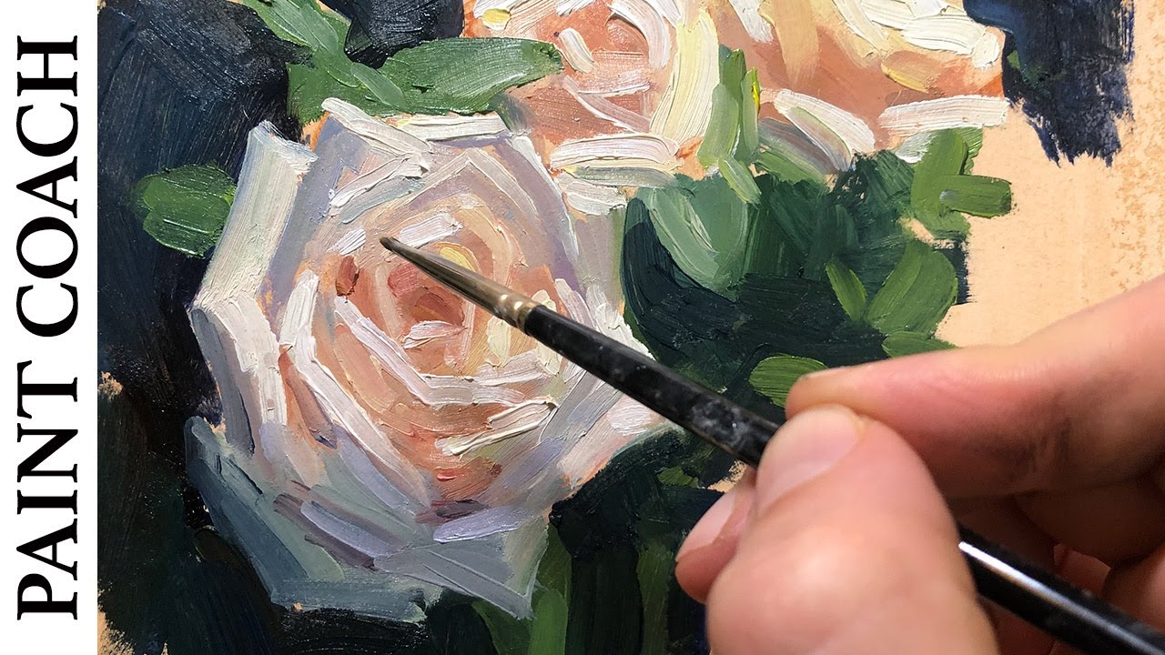
Rose petal spirals create the most challenging flower structure to paint. Each petal curves around the previous one, forming natural geometric patterns.
Start with the outer petals first. These larger petals establish the rose’s overall size and shape before you tackle interior details.
Soft, ruffled edges distinguish roses from other flowers. Use a dry brush technique to create these irregular, organic petal boundaries.
Color layers build gradually from dark red centers to pale pink outer edges. This natural color gradation gives roses their dimensional quality.
Understanding Rose Structure
The center of a rose remains darkest. Light rarely penetrates the tightly packed inner petals completely.
Overlapping petals create complex shadow patterns. Each petal casts subtle shadows on neighboring petals, building natural depth.
Avoid painting every single petal individually. Group similar petals together to maintain the rose’s overall unity.
Fresh roses display different petal arrangements than aged blooms. Study your reference carefully to capture the specific growth stage.
Sunflowers and Daisy-Type Flowers
Radiating petal patterns make sunflowers easier to paint than roses. Petals extend outward from a central point like spokes on a wheel.
Individual petals vary in width and length. No two petals should look exactly identical in your painting.
Flower centers contain intricate detail patterns. Sunflower centers show spiral arrangements of seeds and tiny florets.
Paint centers after completing all surrounding petals. This sequence prevents smudging and maintains clean color separation.
Creating Convincing Centers
Daisy centers appear simple but contain complex color variations. Mix yellows, oranges, and browns for realistic center colors.
Texture variations distinguish different flower centers. Sunflower centers display rough, bumpy surfaces while daisy centers remain relatively smooth.
Use small brushes for center details. Work systematically from one side to the other rather than jumping around randomly.
Centers should contrast with surrounding petals to create visual interest and natural focal points.
Complex Blooms Like Peonies and Poppies

Peony petals multiply exponentially, creating layers upon layers of ruffled tissue. Simplify these complex arrangements into manageable groups.
Don’t attempt to paint every visible petal. Focus on major petal masses and suggest smaller details through brushwork.
Tissue-paper effects characterize poppy petals. These thin, translucent petals require careful handling of transparent color layers.
Poppies wilt quickly, making photo references essential for detailed study work.
Managing Complex Overlaps
Complex flowers require systematic approaches. Work from back to front, establishing each layer before moving forward.
Petal transparency creates interesting color interactions. Underlying petals show through upper layers, creating rich color mixtures.
Lost and found edges prevent complex flowers from becoming confusing visual tangles. Some petal edges disappear while others remain clearly defined.
Group similar petals together using consistent color and value relationships throughout your painting.
Adding Depth and Dimension

Creating Foreground, Middle Ground, and Background
Color intensity changes with distance. Foreground flowers display bright, saturated colors while background blooms appear grayed and muted.
Sharp details belong in the foreground only. Background elements remain soft and less defined.
Size relationships establish spatial depth. Closer flowers appear larger while distant blooms become progressively smaller.
Atmospheric perspective affects flower colors just like landscape elements. Cool colors recede while warm colors advance.
Using Edge Quality for Depth
Sharp edges bring elements forward visually. Reserve your crispest edges for the most important foreground flowers.
Soft edges push elements backward in space. Background flowers need gentler, less defined boundaries.
Contrast levels vary with spatial position. Foreground elements display strong light-dark contrasts while background elements show reduced contrast.
Mix hard and soft edges within single flowers to create natural-looking dimensional effects.
Working with Negative Space
Background colors define flower edges as much as the flowers themselves. Paint backgrounds carefully to support your main subjects.
Negative spaces between petals create interesting shapes. These spaces deserve as much attention as the petals themselves.
Air circulation between flower elements prevents paintings from appearing flat and cramped. Leave breathing room around major blooms.
Dark backgrounds make light flowers pop forward dramatically. Light backgrounds create subtler spatial effects.
Balancing Positive and Negative Areas
Avoid filling every inch of your canvas with flower details. Empty spaces provide visual rest areas for viewers.
Space and balance work together to create harmonious compositions. Neither positive nor negative areas should overwhelm the other.
Vary negative space sizes throughout your painting. Large and small empty areas create visual rhythm and movement.
Consider negative shapes as carefully as positive flower shapes during your initial composition planning.
Adding Supporting Elements
Leaves and foliage provide color contrast and support flower subjects. Green leaves make red flowers appear more vibrant.
Vary leaf sizes, shapes, and colors to avoid monotonous repetition. Different leaf types add visual interest.
Buds and unopened flowers suggest growth and natural development. Include various bloom stages for realistic garden scenes.
Stems and branches create directional lines that guide viewer attention through your composition.
Advanced Techniques for Realistic Results
Capturing Petal Transparency
Glazing techniques work perfectly for thin, translucent petals. Apply transparent color layers over dried underpainting.
Allow each glaze layer to dry completely before applying the next layer. Wet glazes over wet paint create muddy results.
Light transmission through petals creates glowing effects. Observe how backlighting reveals petal structure and creates luminous colors.
Transparent petals show underlying colors and textures. Paint supporting elements before adding transparent overlays.
Layering for Depth Effects
Build color depth gradually through multiple transparent layers. This approach creates richer, more complex colors than single opaque applications.
Vary glaze colors slightly between layers. Pure repetition creates flat, lifeless effects.
Drying time between layers affects final results. Rush the process and colors become muddy and dull.
Test glaze effects on separate paper before applying to your final painting. Some color combinations produce unexpected results.
Creating Texture on Flower Surfaces
Smooth petal surfaces like tulips require careful brush control. Avoid visible brushstrokes that interrupt the smooth surface illusion.
Velvety textures on pansies need broken color application. Use dry brush techniques to suggest fuzzy surface textures.
Waxy surfaces on lilies reflect light differently than matte surfaces. Study how light behavior changes with surface texture variations.
Surface texture affects how colors appear. Rough surfaces scatter light while smooth surfaces create clear reflections.
Handling Difficult Lighting Situations
Backlighting creates dramatic silhouette effects but makes color observation challenging. Work from photo references for consistent lighting.
Dappled light through leaves creates complex light patterns on flower surfaces. Simplify these patterns rather than copying every detail.
Strong directional lighting produces harsh shadows and bright highlights. Soften these extremes slightly for more natural-looking results.
Overcast lighting reduces contrast but reveals subtle color variations more clearly. Both lighting conditions offer unique advantages.
Working with Chiaroscuro Effects
Strong light-dark contrasts create dramatic flower studies. Use this technique sparingly for maximum impact.
Light source positioning determines shadow patterns and highlight placement. Consistent lighting prevents confusing spatial relationships.
Reflected light in shadow areas prevents shadows from becoming dead black holes. Add subtle warm or cool light bounces.
Contrast levels should support your artistic intention rather than simply copying photographic references exactly.
Common Painting Problems and Solutions
Avoiding Flat, Lifeless Flowers
Flat flowers lack dimensional quality because they’re missing proper light and shadow relationships. Every curved petal surface needs gradual value transitions.
Add form by observing how light wraps around curved petal surfaces. Light areas advance while shadow areas recede naturally.
Curved petal surfaces require careful observation of how light behaves on rounded forms. Practice painting simple cylinders and spheres before tackling complex petal shapes.
Dead, lifeless flowers result from using flat, even colors across entire petals. Real petals contain subtle color variations throughout their surfaces.
Creating Natural Edge Variations
Edge quality makes the difference between amateur and professional flower paintings. Vary your edges from sharp to completely lost.
Not every petal edge should receive the same treatment. Some edges disappear into shadows while others catch bright light and remain crisp.
Hard edges bring elements forward in space. Soft edges push elements backward, creating natural depth illusions.
Study how edges behave in your reference photos. Sharp focus areas contain hard edges while out-of-focus areas show soft edges.
Using Color Temperature Changes
Temperature shifts across petal surfaces create convincing dimensional effects. Warm colors advance while cool colors recede.
Shadow areas typically appear cooler than lit areas. Add subtle blue or purple undertones to shadow mixtures.
Reflected light in shadows often appears warmer than the main shadow color. Look for these subtle warm bounces in deep shadow areas.
Consistent temperature relationships throughout your painting create believable lighting effects.
Fixing Muddy or Dull Colors
Muddy colors result from overmixing or combining too many different pigments. Keep color mixtures simple and clean.
Clean your brush between different color families. Dirty brushes contaminate fresh colors instantly.
Fresh paint mixes produce brighter, cleaner colors than paint that’s been sitting on your palette for hours. Mix colors as needed.
Avoid mixing complementary colors directly on your canvas. These combinations create gray, muddy results.
Keeping Colors Bright and Clean
Color intensity diminishes when you add too many different pigments to a mixture. Limit mixtures to two or three colors maximum.
Use high-quality pigments that maintain their intensity when mixed. Cheap paints often contain fillers that dull color mixtures.
Palette knife mixing keeps colors cleaner than brush mixing. Knives don’t retain previous color contamination like brushes do.
Test color mixtures on scrap paper before applying them to your painting. Some combinations look different when dry.
Working Within Paint Drying Times
Paint consistency affects how colors blend and layer. Thick paint stays workable longer than thin paint applications.
Plan your painting sequence around drying times. Work wet-into-wet for smooth blends, wet-over-dry for clean layers.
Acrylic paint dries quickly, limiting blending time. Work in small sections or use slow-drying mediums to extend working time.
Oil paint remains workable for hours or days, allowing extensive blending and reworking opportunities.
When to Scrape Off and Start Over
Failed sections sometimes need complete removal rather than attempted fixes. Scrape off wet paint with a palette knife.
Don’t waste time trying to fix fundamentally flawed color relationships. Fresh starts often produce better results faster.
Paint scraping works best while paint remains wet. Dried paint requires sanding or chemical removal methods.
Learn to recognize when a section isn’t working early in the process. Early corrections prevent larger problems later.
Managing Paint Application
Thick paint applications work well for textured effects but make smooth blending difficult. Adjust paint thickness for your intended effects.
Thin paint flows better but provides less coverage. Build up thin layers gradually for smooth, even coverage.
Brush loading affects paint application consistency. Consistent brush loading creates even paint layers throughout your painting.
Practice consistent brush pressure and movement patterns. Erratic brushwork creates distracting surface variations.
Finishing Touches and Final Details
Adding the Smallest Details
Pollen and stamen details require steady hands and small brushes. Work systematically rather than randomly dotting color around.
Mix special colors for these tiny details. Pollen often appears bright yellow or orange against darker flower centers.
Dewdrops create sparkling focal points but should be used sparingly. Too many dewdrops look artificial and distracting.
Save the smallest details for last when all major color and value relationships are established.
Creating Convincing Water Effects
Water droplets follow predictable light behavior patterns. The top surface catches highlights while the bottom edge shows reflected colors.
Shadow shapes beneath dewdrops anchor them to petal surfaces convincingly. Without these shadows, droplets appear to float unnaturally.
Transparency effects in water droplets magnify underlying petal colors and textures. Study how water acts as a natural magnifying lens.
Use clean brushes for water effects. Any color contamination ruins the crystal-clear appearance of fresh dewdrops.
Surface Texture Refinements
Petal surfaces display subtle texture variations that separate amateur from professional work. Observe these textures carefully in your references.
Smooth tulip petals require invisible brushwork. Rough sunflower petals benefit from visible brush texture that suggests surface roughness.
Texture consistency throughout similar elements maintains painting unity. All rose petals should share similar surface treatments.
Avoid overworking texture effects. Subtle suggestions often work better than heavy-handed texture applications.
Final Color Accents
Tiny color accents can transform ordinary flower paintings into exceptional ones. Look for opportunities to add small touches of pure color.
Bright highlights on petal edges catch viewer attention and add sparkle to your painting. Use these accents sparingly for maximum impact.
Color echoes throughout your painting create unity and sophisticated color relationships. Repeat small amounts of key colors in different areas.
Final color touches should support your overall color harmony rather than compete with it.
Unifying Your Painting
Overall color relationships matter more than individual flower accuracy. Step back frequently to assess total color harmony.
Check that your value scale spans from light to dark effectively. Weak value ranges produce flat, boring paintings.
Harsh transitions between different areas can be softened with gentle blending or intermediate color steps.
Balance visual weights throughout your composition. Heavy, dark areas need counterbalancing light areas.
Making Final Adjustments
Critical evaluation requires stepping away from your painting for fresh perspective. Distance reveals problems invisible up close.
Final adjustments should be minimal and purposeful. Overworking destroys the freshness that makes flower paintings appealing.
Highlight placement affects the entire painting’s success. Move or adjust highlights that fight with your intended focal point.
Trust your instincts about when the painting feels finished. Continuing past the optimal stopping point usually damages the work.
Knowing When to Stop
Overworking kills the spontaneous quality that makes flower paintings successful. Learn to recognize when enough detail is enough.
Perfect accuracy isn’t always the goal. Artistic interpretation often produces more engaging results than photographic copying.
Step back and evaluate your painting’s overall success rather than focusing on small problem areas that viewers won’t notice.
Fresh paint quality deteriorates with excessive reworking. Preserve areas that work well while fixing only genuine problems.
Protecting Wet Paint
Wet paint protection prevents accidental damage to finished work. Cover wet paintings or move them to safe drying locations.
Dust and debris stick to wet paint surfaces permanently. Clean studio environments protect your investment in time and materials.
Drying time varies with paint thickness, humidity, and temperature. Allow adequate drying before handling or transporting paintings.
Proper storage prevents damage during the vulnerable drying period when paintings remain susceptible to surface damage.
FAQ on How To Paint Flowers
What’s the best painting medium for flowers?
Watercolor painting works well for delicate petals with transparent effects. Acrylic painting allows corrections and quick drying. Oil painting provides extended blending time for smooth petal transitions. Choose based on your experience level and desired effects.
How do I mix realistic flower colors?
Start with primary colors and mix gradually. Add white for soft pinks, yellow for warmth. Avoid straight-from-tube colors. Test mixtures on palette first. Study your flower reference for color temperature variations in shadows and highlights throughout petals.
Which brushes work best for flower painting?
Round brushes handle petal curves and details. Flat brushes work for broad color areas. Small liner brushes create stamens and fine details. Fan brushes suggest texture on rough surfaces. Natural bristles hold more paint; synthetics work well for sharp details.
How do I paint white flowers without them looking flat?
White flowers contain subtle color variations from reflected light. Add tiny amounts of yellow, blue, or purple to white. Shadow areas need cooler undertones. Highlights remain pure white only in brightest spots. Study how surrounding colors affect white petals.
What’s the secret to painting realistic rose petals?
Understand rose petal spirals and overlapping patterns. Start with outer petals, work inward. Use gradation from dark centers to light edges. Vary edge quality – some sharp, others soft. Build form through careful light and shadow observation.
How do I create depth in flower paintings?
Use atmospheric perspective – distant flowers appear cooler and softer. Foreground blooms show sharp details and warm colors. Vary edge quality throughout. Overlap petals and flowers. Control contrast levels for spatial depth effects.
Should I paint from photos or live flowers?
Fresh flowers provide accurate colors and dimensional observation. Photos offer consistent lighting and extended working time. Combine both approaches – study live flowers for understanding, use photos for detailed reference. Flowers wilt quickly, making photos necessary for longer painting sessions.
How do I paint flower centers and stamens?
Paint flower centers after completing surrounding petals. Use small brushes for pollen and stamen details. Vary colors within centers – not flat yellow. Create texture variations for different flower types. Sunflower centers need rough texture; daisy centers remain smoother.
What colors should I avoid mixing for flowers?
Avoid mixing complementary colors directly – they create muddy grays. Don’t combine too many pigments in single mixtures. Yellow and purple make brown instantly. Keep mixtures simple with two or three colors maximum. Clean brushes between different color families to prevent contamination.
How do I know when my flower painting is finished?
Step back frequently for overall assessment. Avoid overworking areas that already function well. Final details should support main focal points, not compete. Trust instincts about completion. Fresh paint quality deteriorates with excessive reworking and refinement attempts.
Conclusion
Mastering how to paint flowers requires patience, observation, and consistent practice with different bloom types. Each flower presents unique challenges that build your artistic skills progressively.
Your botanical art journey starts with understanding basic petal anatomy and progresses through complex color mixing techniques. Roses, sunflowers, and peonies each teach different lessons about shape, texture, and light behavior.
Garden scenes become achievable once you master individual flower studies. Combine multiple bloom types using proper perspective and atmospheric perspective principles.
Remember that artistic expression matters more than photographic accuracy. Your unique interpretation of chrysanthemums or orchids adds personal voice to your floral artwork.
Start with simple daisies before attempting complex peonies. Practice gesture drawing to capture each bloom’s essential character quickly.
Fresh flowers provide the best learning opportunities, but photo references offer consistency for longer painting sessions. Combine both approaches for optimal results.