Nothing screams “amateur” louder than flat, lifeless trees that look like green lollipops stuck on brown sticks.
Learning how to paint trees in acrylic transforms your landscape paintings from obvious beginner work into convincing, natural scenes that viewers actually believe.
Most painters struggle with trees because they focus on individual leaves instead of understanding how trees really grow and catch light.
The difference between awkward tree painting and realistic results comes down to mastering a few key techniques.
This guide covers everything from mixing natural greens to creating believable bark texture.
You’ll learn how tree structure works, how to layer foliage that has actual depth, and how to avoid the common mistakes that make painted trees look artificial.
By the end, you’ll paint trees that integrate seamlessly into your acrylic landscapes, with proper proportions, convincing colors, and the kind of realistic detail that makes viewers stop and look twice.
Understanding Tree Structure and Anatomy

How Trees Actually Grow
Most painters mess up because they don’t get how trees really work. Real trees taper from thick bases to thin tops-not the other way around.
The trunk gets narrower as it goes up. Every branch does the same thing.
Trunk Tapering Principles
Start with a wide base and gradually narrow it. Think of it like an upside-down ice cream cone.
Avoid making perfectly straight lines. Trees grow with slight curves and imperfections.
Branch Distribution Patterns
Branches don’t all sprout from the same height. They alternate and spiral around the trunk as they climb higher.
Lower branches are thicker and longer. Upper branches get progressively smaller and more delicate.
Branches fork into smaller branches, then into twigs. Each division gets thinner than the last.
Root System Basics
Visible roots flare out from the base. They’re thicker near the trunk and taper as they extend outward.
Most root systems spread wider than the tree’s canopy. Even when you can’t see them all, hint at this spread in your composition.
Different Tree Types and Their Shapes
Deciduous Tree Characteristics
Oak trees have thick, gnarled trunks with wide-spreading crowns. Their branches grow in irregular patterns that create interesting negative spaces.
Maple trees tend to have straighter trunks with branches that form more symmetrical shapes. The bark is smoother than oak but still has visible texture.
Birch trees are slender with white bark marked by dark horizontal lines. Their branches are delicate and often droop slightly.
Coniferous Tree Forms
Pine trees have straight trunks with branches that angle slightly downward. The overall shape is triangular.
Spruce trees are similar but their branches often curve upward at the tips. The silhouette is more of a spear shape.
Cedar trees can be quite different-some are tall and narrow, others spread wide with multiple trunks.
Palm and Tropical Variations
Palm trunks are usually curved or leaning. They don’t taper much from bottom to top.
The fronds (not really leaves) emerge from the top in a spray pattern. Each frond arcs gracefully downward.
Light and Shadow on Trees

Where Shadows Naturally Fall
The trunk always has a light side and a shadow side. The light source determines which is which.
Branches cast shadows on the trunk and on each other. This creates a complex pattern of light and dark areas.
Foliage creates dappled shadows-patches of light and shadow that dance across surfaces below.
Highlight Placement on Bark
Bark catches light on its raised surfaces. The grooves and crevices stay darker.
Don’t make highlights too bright unless you’re painting wet bark after rain. Dry bark is more muted.
The brightest highlights usually appear on the side facing your light source, about one-third of the way around the trunk from the edge.
Foliage Light Patterns
Individual leaf clusters have their own light and shadow sides. Some face the light, others turn away from it.
The overall canopy has a light side and shadow side too. This larger pattern helps define the tree’s three-dimensional form.
Painting Realistic Tree Trunks and Branches

Starting with Basic Trunk Structure
Sketching Proportions Correctly
Measure your reference carefully. Most beginner mistakes happen right here at the sketch stage.
Tree trunks are rarely perfectly vertical. Look for the slight lean or curve that makes them feel natural.
Use loose, confident strokes for your initial sketch. Don’t get caught up in details yet.
Base Color Application
Start with a middle tone – not too light, not too dark. You’ll add lights and darks on top of this.
Mix your base color from earth tones: burnt umber, raw sienna, and a touch of your background color. Avoid using straight browns from the tube.
Apply this base color with vertical strokes that follow the trunk’s direction.
Avoiding Perfectly Straight Lines
Real tree trunks have bumps, indentations, and slight curves. Even the straightest trees have character.
Vary your brushstrokes as you paint. Let some areas be thicker than others.
Use the side of your brush occasionally instead of just the tip. This creates more natural-looking line quality.
Creating Convincing Bark Texture

Vertical Stroke Techniques
Load your brush with a slightly darker version of your base color. Drag it vertically down the trunk with uneven pressure.
Let the brush skip and catch to create natural texture breaks. Don’t fill in every gap-the eye will complete the pattern.
Vary the length of your strokes. Some bark patterns have long continuous lines, others break up into shorter segments.
Adding Horizontal Cracks
Many trees have horizontal cracks or ridges in their bark. Paint these with quick, broken strokes.
Don’t make them all the same size or spacing. Nature is irregular.
Some horizontal marks should be darker (cracks), others lighter (raised ridges catching light).
Color Variation Methods
Real bark isn’t one flat color. Mix in grays, purples, and even greens for moss or lichen.
Add warmer colors where light hits directly. Cooler colors work well in shadow areas.
Dab in small amounts of different colors while the base is still slightly wet. This creates subtle blending.
Using Palette Knife Effects
A palette knife can create excellent bark texture effects. Scrape it lightly over wet paint to reveal the color underneath.
Try pressing the knife edge into wet paint, then lifting straight up. This creates crack-like marks.
Don’t overdo palette knife work. Use it sparingly for accent areas.
Branch Work That Looks Natural

Tapering Technique for Branches
Every branch starts thick where it meets the trunk and gets thinner as it extends outward.
Use more pressure at the base of your brushstroke, then gradually lighten pressure as you paint toward the tip.
Practice this motion on a separate canvas first. The movement should feel natural and confident.
Connection Points Between Trunk and Branches
Branches don’t just stick onto trunks like lollipops on sticks. They grow out from inside the trunk.
Paint a slight bulge or swelling where major branches connect. This shows how the wood flows from trunk into branch.
The bark pattern should continue around these connection points, not stop abruptly.
Small Twig Details
Add the smallest twigs last, when everything else is dry. Use a liner brush or the tip of a round brush.
Keep twig colors muted-they’re usually darker than the main branches. Mix in some of your background color.
Don’t paint every single twig you see in your reference. Suggest them with quick, confident strokes and let the viewer’s eye fill in the rest.
Mastering Foliage Techniques
Basic Leaf Cluster Methods
Dabbing Technique with Round Brush
Load a medium round brush with your foliage color. Hold it perpendicular to the canvas and dab straight down.
Vary the pressure to create different sized “leaf clusters.” Light dabs make smaller clusters, heavier dabs make larger ones.
Don’t space your dabs evenly. Cluster some together, leave gaps between others.
Rotate your brush slightly between dabs to avoid repetitive marks. Nature doesn’t repeat itself exactly.
Dry Brush Foliage Effects
Load your brush with paint, then wipe most of it off on a paper towel. The remaining paint should barely color the bristles.
Lightly scrub this dry brush across the canvas. The broken, scratchy marks look remarkably like distant foliage.
This technique works best for background trees or areas where you want to suggest leaves without painting individual clusters.
Scumbling for Distant Leaves
Scumbling means applying paint in loose, circular motions. It’s perfect for soft, distant foliage effects.
Use a large, soft brush and barely load it with paint. Make loose circular movements over areas where you want foliage.
Build up several layers of scumbling with slightly different colors. This creates depth and richness.
Creating Depth in Tree Canopies

Background Foliage First
Start with the farthest foliage areas. These should be cooler and less detailed than foreground leaves.
Mix your background green with a touch of blue or purple to push it into the distance. Atmospheric perspective affects trees too.
Keep background areas soft and simple. Don’t add individual leaf details here.
Middle Ground Leaf Clusters
These areas have more definition than background foliage but less than foreground areas. Use medium-sized dabs with your round brush.
Vary your green mixtures to create interest. Add yellows, oranges, or blues to your base green.
Some clusters should overlap others to show depth. Paint the back clusters first, then overlap with front ones.
Foreground Detail Work
This is where you can add your most detailed leaf work. Individual leaves, sharp edges, and bright highlights belong here.
Use smaller brushes for precise work. A liner brush works well for individual leaves and stems.
Don’t overwork foreground areas. A few well-placed details are more effective than trying to paint every leaf.
Negative Space Importance
The gaps between leaf clusters are just as important as the leaves themselves. These negative shapes let light show through.
Paint sky color into some gaps. Other gaps might show more distant foliage or trunk sections.
Vary the size and shape of your negative spaces. Regular patterns look artificial.
Seasonal Foliage Variations

Spring Fresh Green Techniques
Spring greens are bright and yellow-based. Mix sap green with cadmium yellow and a touch of white.
New leaves are smaller and more delicate than summer foliage. Use lighter touches with your brush.
Some areas might still show bare branches with just a few emerging leaves. Don’t fill every space with green.
Summer Full Canopy Methods
Summer foliage is the fullest and darkest. Use deeper greens mixed with earth tones.
Layer different green mixtures to show the density of full summer growth. Some areas will be quite dark where leaves overlap heavily.
Add variety with different green temperatures. Some areas warmer (more yellow), others cooler (more blue).
Fall Color Blending
Autumn foliage uses warm colors: yellows, oranges, reds, and purples. But don’t forget that some leaves stay green.
Blend warm colors while they’re still wet for natural-looking transitions. Real autumn leaves show gradual color changes, not sharp divisions.
Mix your bright autumn colors with a little brown or gray to keep them from looking artificial.
Winter Bare Branch Work
Winter trees show their structure clearly. This is when good branch drawing really shows.
Paint the sky first, then add branches over it. This makes the branches appear to be in front of the sky.
Use cooler colors for winter branches – add blues and purples to your browns. The cold affects color temperature.
Add just a few remaining leaves clinging to branches. These should be brown and weathered-looking.
Color Mixing for Natural-Looking Trees

Green Mixing Fundamentals
Avoiding Tube Green Mistakes
Straight-from-the-tube greens scream “beginner mistake.” They’re too intense and artificial for realistic tree painting.
Sap green and viridian are useful starting points, but they need serious modification. Never use them alone.
Mix your greens from primary colors when possible. Blue plus yellow gives you more control over temperature and intensity.
Warm vs Cool Green Balance
Warm greens lean toward yellow. They work well for sunlit foliage and spring growth.
Cool greens have more blue in them. Perfect for shadow areas and distant trees affected by atmospheric perspective.
Switch between warm and cool greens throughout your tree to create visual interest and depth.
Adding Earth Tones to Greens
Raw umber knocks down green intensity without muddying it completely. Just a tiny amount makes greens look more natural.
Burnt sienna adds warmth to greens, perfect for autumn foliage or sun-struck areas. Mix it sparingly.
Yellow ochre creates muted, realistic greens that work beautifully for background trees.
Bark Color Recipes
Basic Brown Mixing
Forget basic brown tubes. Mix browns from complementary colors like orange and blue.
Raw umber plus burnt sienna creates rich, warm bark tones. Add white for lighter areas, ultramarine blue for cooler shadows.
Vary your brown mixtures even within the same tree trunk. Real bark has subtle color shifts.
Gray Bark Variations
Some trees, like birch and eucalyptus, have gray or white bark. Mix these from ultramarine blue, burnt umber, and white.
Add tiny amounts of yellow ochre to warm up your grays. Pure gray looks lifeless.
Birch bark needs delicate handling. The white isn’t pure white-it’s a warm, creamy tone with subtle shadows.
Adding Moss and Lichen Colors
Old trees often have patches of moss or lichen growing on their bark. These add interesting color variation.
Mix moss green from viridian, yellow ochre, and a touch of white. Keep it muted and grayish.
Lichen can be painted with pale yellow-greens or even orange-grays, depending on the species.
Atmospheric Color Changes
Distance Color Shifts
Trees get bluer and lighter as they recede into the distance. This follows basic aerial perspective rules.
Add more white and ultramarine blue to your tree colors for distant specimens. The effect should be subtle, not dramatic.
Very distant trees might appear almost purple or gray-blue, especially in misty conditions.
Time of Day Effects
Morning light is cool and clean. Use cooler green mixtures and clean, crisp shadows.
Midday sun creates strong contrast between light and shadow areas. Your lights get warmer, shadows cooler.
Evening light warms everything up. Add orange and red tones even to your green mixtures.
Weather Influence on Colors
Overcast skies make everything cooler and more muted. Reduce color intensity across your entire tree.
Rain darkens bark colors and makes foliage appear more saturated. Wet bark is darker and more reflective than dry bark.
Snow changes everything-it reflects light upward, illuminating areas that would normally be in shadow.
Advanced Techniques for Realism

Light Filtering Through Leaves
Dappled Light Effects
Light filtering through leaves creates complex patterns of light and shadow. Don’t try to copy every spot-suggest the overall effect.
Use warm colors for the light spots and cooler colors for the shadowed areas. This temperature difference helps sell the lighting.
Vary the size and intensity of your dappled light areas. Some spots should be bright, others just slightly lighter than the surrounding shadow.
Rim Lighting on Foliage
When strong light comes from behind foliage, the edges glow with rim lighting. This effect makes trees look three-dimensional.
Paint these light edges with warm, bright colors-yellows and yellow-greens work well. Keep the rim lighting thin and precise.
Don’t rim-light every leaf cluster. Choose strategic areas where the effect will have the most impact.
Cast Shadow Techniques
Trees cast shadows on the ground, on buildings, and on other trees. These shadows help anchor your trees in the scene.
Cast shadows are cooler and darker than the objects casting them. Mix in blue or purple with your shadow colors.
Shadow shapes follow the form of whatever surface they fall on. Shadows on grass look different from shadows on pavement.
Weather and Environmental Effects

Wind-Blown Appearance
Wind makes foliage cluster toward the downwind side of branches. Paint fewer leaves on the upwind side.
Branch tips should bend slightly in the wind direction. Rigid trees look unnatural.
Use directional brushstrokes that follow the wind movement. This adds energy to your painting.
Rain-Soaked Bark
Wet bark is much darker than dry bark. Deepen all your bark tones for rain effects.
Add subtle reflections where water might collect in bark grooves. Don’t overdo these-they should be barely visible.
Wet trees often appear more saturated in color overall. Increase the intensity of your mixtures slightly.
Snow on Branches
Snow collects on the top surfaces of branches and in the crooks where branches meet. Paint it with slightly blue-tinted white.
Don’t outline snow areas with dark lines. Let them blend naturally with the branch colors.
Snow weighs down smaller branches, making them droop more than usual.
Fine Detail Work
Individual Leaf Painting
Save individual leaf details for key focal areas only. You can’t paint every leaf without making your painting look tight and overworked.
Use a small round brush or liner brush for individual leaves. Keep the brushwork loose and confident even at this small scale.
Vary leaf sizes, angles, and colors even within the same cluster. Uniformity kills realism.
Small Branch Additions
Add small branches last, over dry foliage areas. These help connect different leaf clusters convincingly.
Use a darker color than your main foliage for these small branches. They’re usually in shadow.
Keep small branch additions minimal. A few well-placed ones are more effective than many.
Texture Refinements
Step back frequently to check your texture work. It’s easy to overwork areas when you’re focused close-up.
Add final texture details with dry brush techniques or palette knife work. These finishing touches should be subtle, not obvious.
Some areas benefit from smooth, simple treatment. Not every surface needs heavy texture.
Common Mistakes and How to Fix Them

Proportion Problems
Trunk Too Thick or Thin
The most common mistake? Making trunks way too thick for the tree’s height. Study your references carefully.
A good rule of thumb: the trunk diameter should be roughly 1/8 to 1/6 of the tree’s total height for most mature trees.
If your trunk looks wrong, don’t try to fix it with paint. Start over with a better sketch.
Branches All Same Size
Real trees have branches of many different sizes. Don’t make them all the same thickness.
Main branches are thick, secondary branches are medium, twigs are thin. This hierarchy creates believable structure.
If your branches look uniform, add some variety by painting over some with background color to make them thinner.
Foliage Overwhelming Trunk
Beginning painters often hide the entire trunk under heavy foliage. Real trees show glimpses of their structure.
Leave some trunk and major branches visible even through full summer foliage. These structural elements are important.
If you’ve covered too much, use a small brush to “cut back” some foliage areas with background color.
Color Issues
Too Bright or Artificial Greens
Neon-bright greens destroy realism instantly. Real foliage is more muted than you think.
Mix gray or brown into overly bright greens to tone them down. A little raw umber works wonders for this.
Study your reference photos carefully. Note how even bright sunlit leaves are less intense than tube greens.
Flat, Monotone Bark
Using one brown color for entire trunks makes them look like cardboard tubes. Real bark has subtle color variations.
Add purples, grays, and oranges to your bark mixtures. Even small amounts make a huge difference.
If your trunk looks flat, glaze thin layers of different colors over the dry base coat.
Poor Light-Shadow Contrast
Weak contrast makes trees look flat and lifeless. You need strong lights and darks.
Shadows should be much darker than you initially think. Don’t be afraid to go really dark in shadow areas.
If your contrast is weak, darken your shadow areas first. It’s easier than trying to make lights lighter.
Texture Troubles
Overworked Foliage
The biggest foliage mistake is trying to paint every single leaf. This creates stiff, unnatural-looking trees.
Suggest leaf masses with broad strokes, then add just a few individual leaf details in key areas.
If you’ve overworked an area, let it dry completely, then glaze over with a larger brush to soften the details.
Smooth, Unrealistic Bark
Bark without texture looks like smooth plastic pipes. Real bark has grooves, bumps, and surface variations.
Add texture while your base coat is still slightly damp. The paint will blend naturally for realistic effects.
Use vertical brushstrokes that follow the bark’s natural growth patterns. Horizontal strokes look wrong.
Lack of Depth in Canopy
Flat foliage areas make trees look like green cutouts pasted onto your canvas. Real tree canopies have dimensional depth.
Vary your green values from light to dark within the same tree. This suggests overlapping leaf masses.
Paint background areas first, then build forward with overlapping layers. Each layer should be slightly different in color and value.
Putting Trees in Landscapes

Tree Placement in Compositions
Foreground Tree Considerations
Foreground trees demand the most detail and strongest contrast. They anchor your entire landscape painting and draw the viewer’s eye first.
Place them off-center for better balance in your composition. Dead center placement looks static and boring.
Use the full range of your palette here. Brightest highlights, darkest shadows, warmest and coolest colors all belong in foreground elements.
Background Tree Simplification
Background trees need less detail and softer edges. Think of them as simple shapes rather than collections of individual leaves.
Cool down your colors as trees recede into the distance. Add blues and purples to push them back visually.
Keep brushwork loose and impressionistic for distant trees. The eye expects less definition in background elements.
Creating Effective Tree Groupings
Odd Numbers Work Better
Group trees in clusters of three, five, or seven. Even numbers tend to look formal and artificial in natural settings.
Vary the heights and species within each group. Monotonous repetition kills visual interest quickly.
Leave breathing room between groups. Cramming too many trees together creates visual chaos.
Overlapping for Depth
Let trees overlap each other to show depth relationships. The tree in front should be more detailed and higher in contrast.
Paint background trees first, then add foreground trees on top. This layering approach prevents muddy colors.
Use atmospheric perspective to separate overlapping trees. Farther trees get cooler and lighter.
Scale and Perspective Rules
Size Relationships with Other Elements
Trees in the distance appear smaller than foreground trees. This seems obvious, but many painters get the proportions wrong.
A distant tree that’s actually 60 feet tall might appear smaller than a nearby bush in your painting. Trust what you see, not what you know.
Compare tree sizes to other landscape elements like buildings, people, or cars. These relationships help establish believable scale.
Aerial Perspective Effects
Distant trees lose contrast and color intensity. They appear grayer and softer than nearby trees.
Warm colors advance, cool colors recede. Use this principle to place trees at different distances in your landscape.
The effect is subtle in clear weather but dramatic in misty or hazy conditions.
Overlapping Techniques
When trees overlap, the one in front should have sharper edges and more detail. The background tree gets softer treatment.
Don’t outline overlapping edges with dark lines. Let color and value changes define the separation.
Sometimes you’ll lose part of a background tree completely behind a foreground one. That’s fine-it adds realism.
Connecting Trees to Their Environment

Ground Plane Integration
Trees don’t float above the ground. They need to connect convincingly to the earth beneath them.
Paint shadows and root flare areas where trees meet the ground. This anchors them in the landscape.
Grass or undergrowth often grows differently around tree bases. Show these transition areas in your painting.
Root Area Treatment
Visible roots should follow the form of the ground plane. They dip into hollows and rise over bumps.
Use cooler, darker colors for root areas that are typically in shadow. Root systems create their own microenvironments with different lighting.
Don’t paint every visible root. Suggest the major ones and let the viewer’s eye fill in the rest.
Shadow Casting on Surroundings
Tree shadows fall on everything around them: grass, buildings, other trees, water surfaces.
Shadow shapes change depending on what surface they hit. Shadows on flat ground look different from shadows on hillsides.
Make cast shadows cooler than the objects casting them. Add blue or purple to your shadow mixtures.
Environmental Context Factors
Seasonal Setting Consistency
Spring landscapes need consistent fresh green tones throughout. Don’t mix autumn leaves with spring grass colors.
Summer settings allow for the fullest, darkest tree colors. Everything should feel lush and abundant.
Winter scenes require muted, cooler colors across all elements, not just the trees.
Lighting Consistency Across Scene
Your light source affects every element in the painting, not just the trees. Shadows should all point the same direction.
Color temperature should be consistent throughout the scene. If your trees have warm light, your buildings should too.
Check that your lightest lights and darkest darks work together across the entire landscape composition.
Weather Pattern Integration
Stormy skies call for darker, more dramatic tree colors. Everything should feel moody and intense.
Bright, clear weather allows for more saturated colors and sharper contrast throughout the scene.
Misty conditions require softer edges and reduced contrast on all landscape elements, not just distant ones.
Advanced Landscape Integration

Creating Visual Flow
Use directional lines to guide the viewer’s eye through your landscape. Tree branches can point toward important areas.
Roads, streams, or fence lines work with tree placement to create movement through the composition.
Avoid placing trees that block important sight lines or break up pleasing flow patterns.
Establishing Focal Points
Your main tree should support, not compete with, your primary focal point. Place it strategically.
Use trees to frame interesting background elements like distant mountains or buildings.
Sometimes the tree itself becomes the focal point. In that case, simplify everything else to support it.
Color Echo Techniques
Repeat tree colors in other landscape elements for unity. A touch of tree green in the sky or distant hills ties things together.
Echo your bark colors in rocks, building materials, or foreground elements.
These color relationships create harmony without being obvious or heavy-handed.
FAQ on How To Paint Trees In Acrylic
What colors do I need to paint realistic trees?
You need more than just green and brown. Mix your own greens from primary colors like ultramarine blue and cadmium yellow. Add raw umber, burnt sienna, and white for bark tones. Include purple and orange for natural color variations.
How do I avoid painting trees that look flat?
Create depth with overlapping branches and varying value ranges. Use atmospheric perspective to make distant trees cooler and lighter. Layer foliage from background to foreground, with the most detail in front areas.
What’s the best way to paint tree bark texture?
Use vertical brushstrokes with your flat brush, then add horizontal cracks. Dry brush techniques work well for rough bark texture. Vary your pressure and let the brush skip naturally across the canvas surface.
How do I make tree foliage look natural instead of like blobs?
Use the dabbing technique with a round brush instead of painting solid shapes. Vary your green mixtures and leave negative spaces between leaf clusters. Don’t try to paint individual leaves everywhere.
What brushes work best for painting trees?
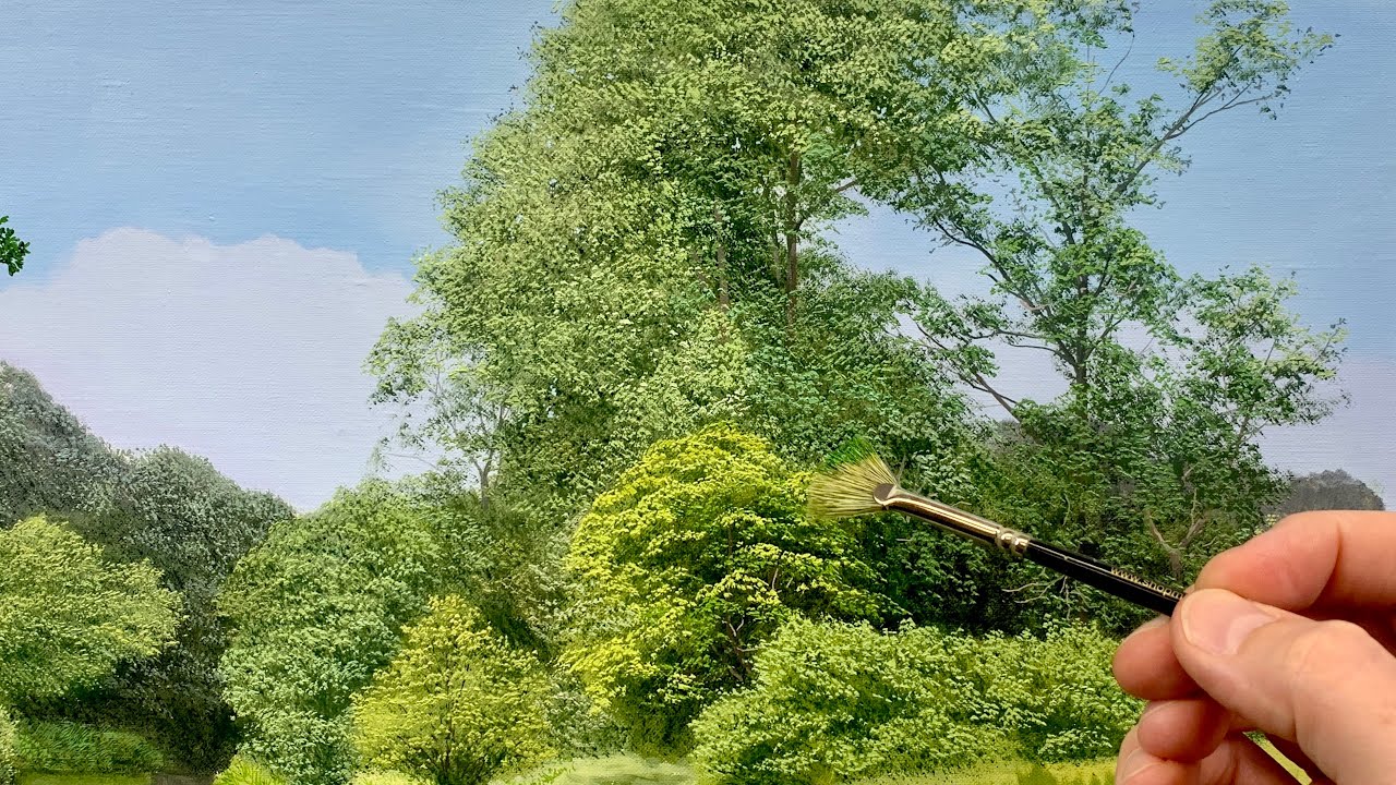
You need flat brushes for trunks, round brushes for foliage, and liner brushes for small branches. A fan brush creates excellent texture effects for distant trees and fine detail work.
How do I paint trees in different seasons?
Spring uses bright yellow-greens, summer has the darkest greens, fall needs warm oranges and reds mixed with remaining greens. Winter trees show bare branch structure with cooler color temperatures throughout.
Should I sketch trees before painting them?
Yes, but keep it simple. Focus on basic shapes and trunk proportions rather than details. Use light pencil marks that won’t show through your acrylic paint layers. Good structure prevents major proportion problems later.
How do I paint convincing tree shadows?
Make cast shadows cooler and darker than the tree itself. Add blue or purple to your shadow mixtures. Shadow shapes follow the ground plane form and point away from your light source direction.
What’s the biggest mistake beginners make with tree painting?
Making trunks too thick for the tree height and using tube greens straight from the container. Study real proportions and always modify your greens with earth tones for natural-looking results.
How do I integrate trees into landscape compositions?
Place trees off-center for better balance in your composition. Use overlapping to show depth relationships. Make sure your tree colors and lighting match the rest of your landscape painting consistently.
Conclusion
Mastering how to paint trees in acrylic requires patience and practice, but these techniques will dramatically improve your landscape paintings. The key is understanding tree anatomy before you pick up your brush.
Remember that successful tree painting starts with proper color theory and realistic proportions. Don’t rush the process-build up your foliage layers gradually.
Practice these techniques on small canvases first. Work on bark texture separately from foliage until both feel natural.
Your acrylic painting supplies matter too. Quality brushes and properly mixed colors make the difference between amateur and professional-looking results.
Start with simple tree studies before attempting complex forest scenes. Master one technique at a time rather than trying everything at once.
Most importantly, paint from life when possible. En plein air painting teaches you how light actually hits trees throughout the day.
With consistent practice, your painted trees will transform from obvious beginner work into convincing natural elements that anchor your landscape compositions beautifully.