Walk past any LED screen on Carnaby Street and you might miss the art entirely.
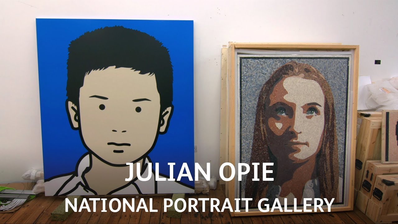
Julian Opie turned contemporary portraiture into something closer to airport signage. His work strips faces down to button eyes and single lines. Yet somehow everyone stays recognizable.
Born in London in 1958, Opie studied under Michael Craig-Martin at Goldsmiths during the early 1980s. He emerged as a key figure in the New British Sculpture movement, but his path diverged quickly into digital territory.
His portraits appear on album covers, building facades, and gallery walls. Blur’s 2000 album cover made him a household name. U2 hired him for their Vertigo tour backdrop.
This guide examines Opie’s techniques, major works, and lasting influence on contemporary art. You’ll see how he connects pop art traditions with digital-age aesthetics, and why his simplified portraits resonate across cultures.
Identity Snapshot
Full Name: Julian Opie
Born: 1958, London, England
Primary Roles: Visual artist, sculptor, digital artist, printmaker
Nationality: British
Movement: New British Sculpture, Contemporary art
Associated With: Pop art, Minimalism
Mediums: Auto paint on aluminum, vinyl on aluminum, LED screens, LCD displays, screen print, inkjet on canvas, powder-coated aluminum, lenticular prints, 3D printing
Signature Traits: Black outline technique, flat color application, reduced visual elements, computer-generated imagery, digital portraiture
Iconography/Motifs: Walking figures, simplified portraits, urban landscapes, birds, cars, architectural elements
Geographic Anchors: London (birthplace, current studio), Oxford (raised), Rome (Sargant Fellow, 1994)
Education: Goldsmiths, University of London (1979-1982)
Mentor: Michael Craig-Martin (conceptual artist)
Gallery Representation: Lisson Gallery (London), Cristea Roberts Gallery (exclusive worldwide publisher of editions)
Collections: National Portrait Gallery London, Tate Britain, Museum of Modern Art New York, Victoria & Albert Museum, National Gallery of Victoria Melbourne, Stedelijk Museum Amsterdam, British Council, Israel Museum Jerusalem
Market Signals: Record sale £160,750 for “Walking in Sadang-Dong in the Rain” (Seoul Auction, March 2021), commissioned portraits start at £25,000 for sitting fee
What Sets The Artist Apart
Julian Opie strips contemporary life down to sign language.
His portraits reduce faces to button eyes and single-line mouths. Yet each one stays recognizable. That’s the weird tension in his work.
Where Andy Warhol flattened celebrity into commodity, Opie flattens everyone into icons.
He treats a Polish shop assistant the same way he treats rock stars. Democracy through reduction. His walking figures loop endlessly on LED screens in public spaces, mimicking the pedestrian flow around them.
The work sits somewhere between airport signage and Egyptian hieroglyphs.
Both systems communicate instantly across language barriers. Opie’s visual language pulls from traffic signs, Japanese woodblock prints, and Renaissance portraiture all at once. He’s less interested in personal expression than in how images function.
His paintings don’t look painted.
They look printed, machined, industrial. That’s intentional. The hand disappears. What remains is pure visual information, delivered with the efficiency of a corporate logo.
Origins & Formation
Early Education (1972-1982)
Opie grew up in Oxford after being born in London.
He attended The Dragon School, then Magdalen College School from 1972 to 1977. Standard British boarding school training. Nothing in that background predicted the digital minimalist he’d become.
Goldsmiths College (1979-1982)
The real formation happened at Goldsmiths.
Michael Craig-Martin taught him. Craig-Martin was pushing conceptual approaches, asking what makes something art in the first place. That questioning stuck. Opie graduated in 1982 into a moment when British sculpture was getting aggressive, ironic, and willing to steal from anywhere.
The atmosphere was anti-establishment.
Old categories meant nothing. Opie started with painted steel sculptures that referenced famous artworks but deflated them. Tongue-in-cheek copies. Early work explored domestic appliances, office furniture, geometric shapes. All rendered in cut steel with bright industrial finishes.
He was already thinking about how objects sit in space and how we read them.
Rome Fellowship (1994)
The Sargant Fellowship at The British School at Rome gave him breathing room.
Distance from London. Time to see classical portraiture and ancient Roman sculpture firsthand. Egyptian art too. He started connecting contemporary simplification with ancient reduction techniques.
Those hieroglyphs weren’t primitive.
They were sophisticated communication systems. Opie realized his minimalism had ancient precedent.
Movement & Context
New British Sculpture

Opie gets grouped with New British Sculpture alongside Anish Kapoor and Tony Cragg.
That’s accurate but incomplete. Where Kapoor went for sublime materials and metaphysical weight, Opie stayed flat and informational. Cragg stacked found objects into organic forms. Opie cut steel into appliances.
The movement shared an attitude more than a style.
They all rejected traditional bronze casting and marble carving. They used industrial materials and fabrication methods. But Opie diverged early into digital representation while others stayed material-focused.
Pop Art Inheritance

His debt to pop art runs deep.
Roy Lichtenstein‘s thick black outlines and Ben-Day dots clearly influenced the portrait work. Warhol‘s silkscreen repetition and celebrity focus echo through Opie’s commissioned portraits and album covers.
But Opie updates pop for the digital age.
Where Warhol mechanized painting with silkscreen, Opie uses actual computers. Where Lichtenstein referenced printed comics, Opie references LED displays and traffic signage. The content stays contemporary. Urban crowds. Walking figures. Information overload reduced to clean symbols.
Minimalism Meets Digital

The minimalism connection matters too.
Donald Judd’s industrial fabrication. Frank Stella’s flat surfaces and hard edges. But minimalism usually meant abstract geometry. Opie applies that reduction to figurative subjects.
He’s making minimalist portraits, which sounds contradictory.
Portraits traditionally capture psychological depth, individual character, inner life. Minimalist art eliminates exactly those qualities. Opie forces the contradiction to work by finding what stays recognizable when everything else gets stripped away.
Comparative Positioning
Compare him to Patrick Nagel.
Both work in flat colors and clean lines. Both reduce faces to essential features. But Nagel’s 1980s commercial illustration stayed decorative, aimed at magazines and posters. Opie’s work operates in gallery contexts and engages art history more deliberately.
Or compare to Alex Katz.
Katz also simplifies portraits with flat color areas and hard edges. But Katz paints with visible brushwork and keeps more facial detail. His surfaces look painted. Opie’s look printed, computer-generated, mechanical. The hand stays visible in Katz. It disappears in Opie.
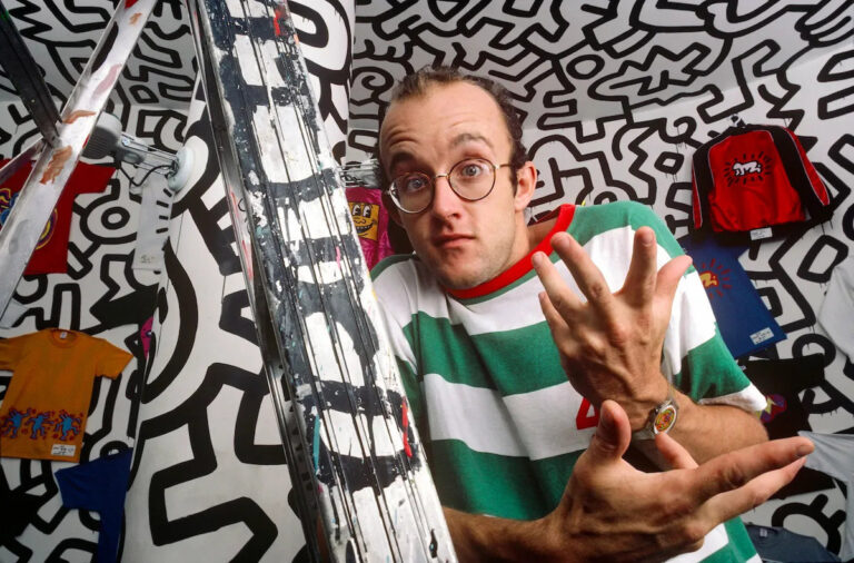
Against Keith Haring, another useful contrast.
Both use bold outlines and simple figures. Both reference public signage and street culture. But Haring’s line stays gestural, drawn, energetic. Opie’s line is controlled, vectorized, deliberate. Haring broadcasts activism. Opie observes urban experience.
Materials, Techniques, and Process
Supports & Surfaces
Opie works primarily on aluminum panels.
Not canvas. The aluminum gives perfectly flat, rigid surfaces that accept auto paint cleanly. He also uses wooden stretchers covered in vinyl, powder-coated steel sculptures, and acrylic panels. Everything industrial. Nothing that looks handmade.
For prints, he uses paper, but also mounts prints on acrylic, dibond, or glass.
The supports aren’t neutral. They signal manufacturing, not craft.
Auto Paint Application
Auto paint gives him that corporate smoothness.
It’s the same paint used on cars. Perfectly even coverage, high gloss, industrial durability. Applied by spray, not brush. The surface shows zero texture. Zero gesture. It reads as product, not painting.
This connects to color theory through pure hue delivery.
The flat colors don’t mix or grade. Each area stays a single hue at full intensity. No atmospheric perspective. No chiaroscuro. Just clean color contrast.
Vinyl Technique
For large-scale works, vinyl gets cut and applied to aluminum backing.
This is essentially giant sticker art. The vinyl gets plotted by computer-controlled cutters. Perfect edges every time. The technique comes straight from signage industry. Road signs. Billboard graphics. Corporate logos.
Opie executed works for Tate Modern and Sadler’s Wells using this method.
The vinyl can be removed, repositioned, replaced. Modular. Temporary. Not sacred. It challenges painting’s traditional permanence.
Digital Process
Everything starts with photographs.
Opie sets up a camera on street corners, traffic islands, studios. He shoots his surroundings. People walking. Faces. Landscapes. Buildings. Then he imports the photos into computer software. He traces over them, reducing detail progressively.
The tracing isn’t automatic.
He decides what stays, what goes. Eyes become circles. Noses reduce to two dots or simple wedges. Mouths become lines. Hair becomes solid shapes. Clothing loses folds and becomes flat color zones. The process is subtractive. Keep removing until it almost breaks, then stop.
This creates vector graphics.
Infinitely scalable. The same image works as a small print or a building-sized vinyl installation. No loss of quality. That’s the power of vector over raster.
LED & LCD Technology
The animated works use LED screens.
Light Emitting Diode displays. The same technology as Times Square billboards or airport information boards. The screens show continuous loops. Walking figures. Dancing figures. Moving landscapes. The animation isn’t smooth like film. It’s deliberately choppy, emphasizing the grid of lights.
For smaller animated works, he uses LCD screens.
Liquid Crystal Display. These get mounted in custom powder-coated frames. The animations loop endlessly. Suzanne Walking (2002). Christine Blinking (1999). Shaida Walking (2015). The figures stride in place forever. Sisyphean but somehow optimistic.
Screen Printing
For edition prints, he uses silkscreen.
This is traditional printmaking tech but applied to digital imagery. The thick black outlines and flat color areas translate perfectly to screen print. Each color needs a separate screen. Registration must be perfect. The prints often get mounted on acrylic or wood panels, blurring the line between print and painting.
Cristea Roberts Gallery publishes all his editions.
They handle the production, quality control, distribution. This separates edition work from unique pieces. The editions democratize access while maintaining print market structure.
Lenticular Printing
Some works use lenticular printing.
This creates illusion of movement as the viewer moves. The artist makes a sequence of drawings, like animation frames. These get layered under a ribbed lens surface. As you walk past, the figure appears to move. But stand still and it freezes.
Walking in London series uses this technique.
It’s a Victorian magic trick updated for contemporary art. The tech is cheap and common but gets repurposed for gallery contexts.
3D Printing (Recent Works)
In 2012, Opie started using 3D printers for portrait sculptures.
The printer builds up the head in layers. Then Opie hand-paints them. He found this scary at first until he compared it to ancient Egyptian death masks. Similar process. Build structure, add surface.
The 3D heads have more detail than his flat portraits.
They exist in actual space, cast shadows, require viewing from multiple angles. But they maintain his simplified aesthetic. Features stay reduced. Eyes stay simple. The sculptures feel like his 2D figures extruded into three dimensions.
Studio Practice
Opie’s studio operates partly like a design office.
Digital files get sent to fabricators. Vinyl gets cut in Sweden. Mosaics get made in Rome. LEDs might come from Barcelona. This distributed production model treats artworks like product design. The artist controls the image file but doesn’t personally fabricate every piece.
That bothers some people.
It’s a contemporary art question that goes back to conceptual art. Who’s the author when the artist doesn’t touch the object? Opie follows precedents from Sol LeWitt’s wall drawings (made by assistants) and Warhol’s Factory model. The idea and design are the art. Execution is production.
Themes, Subjects, and Iconography
Walking Figures

The walking people define Opie’s public profile.
These animated LED figures stride endlessly in place. He films models on treadmills at various speeds. Then he selects video frames that capture the gait naturally. Each frame gets hand-drawn in his simplified style. Strung together, they create looping animations.
The walks have personality despite reduction.
Suzanne’s stride reads as feminine, sensuous. Julian’s walk is heavier, more cumbersome. The figures communicate individual character through movement alone. Posture. Weight shift. Stride length. All preserved in minimal line drawing.
These get installed on busy streets.
Carnaby Street in London. Indianapolis Cultural Trail. The LED figures walk among actual pedestrians. They mirror the crowd. They’re part of the urban information flow, like crossing signals or store signs.
Portrait Types
Opie’s portrait subjects come from everywhere.
Rock musicians (Blur, Bryan Adams, U2). Inventors (Sir James Dyson). His family (wife Aniela, daughters). Polish shop assistants (Muliati). Swiss collectors (Ruth Smoking series). Commissioned portraits of bankers and oligarchs. Studio workers. Anonymous street walkers.
The treatment equalizes everyone.
Rich collector or shop worker, everyone gets the same reduction. Button eyes. Simple outline. Flat color background. This creates visual democracy. Everyone becomes an icon. Everyone gets the same graphic treatment as a celebrity.
The backgrounds matter.
Opie never repeats background colors. Each portrait gets its own unique hue. That’s how they stay distinguishable. Not through facial detail but through color coding. It’s almost like filing system logic applied to portraiture.
Urban Landscapes
Cities appear frequently.
Not as atmospheric impressions but as architectural information. Buildings flatten into facades. Windows become grids. Streets become linear paths. Trees reduce to lollipop shapes. Cars become simple side-view silhouettes.
He shoots from taxi windows, train platforms, street corners.
Old Street in London appears repeatedly. So do French villages. Japanese intersections. Korean districts. The locations get identified in titles but the imagery stays generic enough to read universally. Any city. Every city.
The composition often uses linear perspective.
Roads recede to vanishing points. This creates depth in otherwise flat imagery. The perspective follows rules but gets simplified. No atmospheric perspective. No detail gradation. Just geometry.
Animals

Birds, sheep, cows, deer appear as recurring subjects.
The animals get the same graphic reduction as people. Clean outlines. Flat colors. No fur texture. No feather detail. Just essential shapes that communicate “bird” or “cow.”
Small Birds (2020) shows pigeons, gulls, ducks, hens, magpies.
All urban birds. The ones we ignore daily. Opie noticed his daughters’ farm toy animals inspired some animal work. The toys were “images and objects” simultaneously. He liked that doubled quality. Something that pictures an animal while being an object itself.
Cars & Driving
The “Imagine You Are…” series focuses on driving experiences.
Empty roads stretch ahead. Dashboards frame the view. Racing helmets appear. Formula One driver Jacques Villeneuve shows up. The works reference video game landscapes and racing simulators. First-person perspective. The viewer becomes driver.
This connects to contemporary experience.
We spend hours looking through windshields. The framed view. The road ahead. Traffic as visual flow. Opie documents this modern reality without judgment. Just observation.
Compositional Schemes
Egyptian hieroglyph arrangements influence his figure groupings.
Overlapping profiles. Figures in rows. Side-view walking poses. The ancient systems weren’t primitive. They were sophisticated information design. Opie recognizes that and applies similar logic.
Greek vase painting also shows up.
Black figure technique. Red figure technique. Silhouettes in profile. Decorative bands. Frieze arrangements. These classical formats get updated for LED screens and vinyl panels but the underlying structure stays ancient.
Notable Works
Blur: The Best Of (2000)

Medium: Color print on paper
Size: Three editions (small, medium, large)
Current Location: National Portrait Gallery London (medium set), Blur owns small set
Visual Signature: Four portraits in grid arrangement. Band members (Damon Albarn, Graham Coxon, Alex James, Dave Rowntree) each reduced to button eyes, simple outlines, individual background colors. Pure Warhol homage but digital not silkscreen.
Why It Matters: Made Opie a household name. Won Music Week CADS award. Brought contemporary art aesthetic to mass audience through album packaging. The cover had no text on front. Title printed on spine only. Limited edition had embossed band name. Visual confidence that commercial design rarely permits.
Related Works: Sir James Dyson portrait (2010), Bryan Adams series (2003)
Shaida Walking (2015)

Medium: LED double-sided monolith, continuous computer animation
Size: 210 x 90 x 24 cm
Current Location: Carnaby Street, London (permanent installation)
Visual Signature: Looping animation of walking woman. Seven frames cycle endlessly. Black outline. Minimal detail. Movement reads as natural despite reduction. Figure strides through shopping crowd 24/7.
Why It Matters: Defines Opie’s public art approach. Integrates contemporary art into urban flow. The figure becomes part of street signage ecosystem. Free access. Democratic engagement. No gallery admission needed.
Related Works: Suzanne Walking (2002), Julian Walking series, Ann Dancing (2007, Indianapolis)
Ruth Smoking Series (2006)

Medium: Screen print on paper
Various Sizes
Visual Signature: Swiss collector Ruth in multiple poses. Cigarette as recurring prop. High color saturation. Each print different pose but same reduction level. Simple outlines. Flat color zones. The cigarette adds diagonal line that breaks composition.
Why It Matters: Shows portrait as extended series. One subject, multiple variations. Explores how minimal changes (head tilt, arm position) create different reading. The smoking adds contemporary social marker. Less acceptable now than 2006. Time-stamps the work culturally.
Related Works: Aniela nude series, commissioned portraits
U2 Vertigo Tour Backdrop (2006)

Medium: LED projection, continuous animation
Large Scale: Stadium-sized
Visual Signature: Walking figure in white short-sleeve shirt and black trousers. Animation syncs to music tempo. Massive scale visible across arena. Opie aesthetic meets rock spectacle.
Why It Matters: Expanded his reach into entertainment industry. Showed how his visual language works at any scale. From print to building-sized projection. Vector graphics advantage. The figure matched rock energy through simple movement, not complexity.
Related Works: Bryan Adams monument Indianapolis (2006), Blur album cover
Imagine You Are Driving (Fast)/Jacques/Helmet (2002)
Medium: Digital print
Visual Signature: Formula One driver Jacques Villeneuve next to empty racing track. First-person perspective. The helmet partially obscures face. Road stretches ahead. Video game aesthetic meets portrait.
Why It Matters: Combines landscape, portrait, and movement themes. Shows influence of gaming culture on contemporary vision. The partial face obscurity through helmet adds mystery unusual in Opie’s direct portraits.
Related Works: “Imagine You Are…” series, driving landscapes
This Is Shahnoza Series (2006)

Medium: Screen print, various
Visual Signature: Nine life-size images of pole dancer Shahnoza in different poses. Each position frozen. Dance movement broken into static frames. Pink background in several versions. Athletic poses reduced to clean outlines.
Why It Matters: Challenges high art / low culture boundaries. Pole dancing as legitimate subject. The athletic skill gets documented. Movement vocabulary preserved through sequential positions. Related to Eadweard Muybridge motion studies but stylistically opposite.
Related Works: Dancing figure animations, movement studies
Walking in Sadang-Dong in the Rain (2021)

Medium: Not specified
Size: Not specified
Current Location: Private collection
Visual Signature: Not directly viewed but presumably urban walking figures in rain
Why It Matters: Holds Opie’s auction record at £160,750 (Seoul Auction, March 2021). Shows strong Asian market for his work. Rain suggests environmental detail unusual in his reduction, or possibly simpler rain indication through minimal marks.
Related Works: Walking in London series, urban crowd scenes
Exhibitions, Collections, and Provenance Highlights
Major Solo Exhibitions

La Llotja, Palma (2024)
Galleri F15, Norway (2023)
Mango Museum, Changsha, China (2023)
He Art Museum, Shenzhen, China (2022)
Pitzhanger Manor, London (2021)
Berardo Museum, Lisbon, Portugal (2020)
Tokyo Opera City Art Gallery, Japan (2019)
National Gallery of Victoria, Melbourne, Australia (2018)
National Portrait Gallery, London (2017)
Fundacion Bancaja, Valencia, Spain (2017)
Fosun Foundation, Shanghai, China (2017)
Suwon Ipark Museum of Art, Korea (2017)
Kunsthalle Helsinki, Finland (2015)
Museum of Contemporary Art Krakow, Poland (2014)
Institut Valencia d’Art Modern, Spain (2010)
Museum of Applied Arts, Vienna (2008)
Collections With Depth
National Portrait Gallery, London: Six portraits including Blur band members, Sir James Dyson, self-portrait on LCD screen
Tate, London: More than two dozen works across portraits, landscapes, other subjects
Museum of Modern Art, New York: Six works
Victoria & Albert Museum, London
National Gallery of Victoria, Melbourne, Australia
Stedelijk Museum, Amsterdam
British Council
Arts Council, England
Israel Museum, Jerusalem
Takamatsu City Museum of Art, Japan
Albertina, Vienna
Essl Collection, Vienna
IVAM, Valencia, Spain
ICA Boston, USA
Corporate Collections
Daimler Chrysler, Berlin
UBS Art Collection
Deutsche Bank, Frankfurt
Public Installations
Carnaby Street, London (Shaida Walking, 2015)
Indianapolis Cultural Trail (Ann Dancing, 2007)
Eden Project, Cornwall (Crowd. 4., LED monolith)
City Hall Park, New York (2004)
Dentsu Building, Tokyo (2002)
Mori Building, Omotesando Hills, Japan (2006)
River Vltava, Prague (2007)
Phoenix Art Museum, USA (2007)
Dublin City Gallery, Ireland (2008)
Seoul Square, South Korea (2009)
Regent’s Place, London (2011)
Calgary, Canada (2012)
Lindo Wing, St Mary’s Hospital, London (2012)
SMETS, Belgium (permanent)
PKZ, Zurich (permanent)
Arendt and Medernach, Luxembourg (permanent)
Tower 535, Causeway Bay, Hong Kong (permanent)
Gallery Representation

Lisson Gallery (London) – Primary representation
Cristea Roberts Gallery (London) – Exclusive worldwide publisher of editions
Kukje Gallery (Seoul)
Alan Cristea Gallery (historical editions)
Multiple galleries for regional exhibition
Notable Commissions
Royal Opera House: Set design for Wayne McGregor’s ballet “Infra” (2008)
U2: LED projection for Vertigo World Tour (2006)
Blur: Album cover “The Best Of” (2000)
National Portrait Gallery: Sir James Dyson portrait (2010)
Magdalen College School, Oxford: Digital screen showing running children in uniform (2019)
Bryan Adams: Monument in Indianapolis (2006)
Catalogue Raisonne
“Julian Opie: The Complete Editions” published by Alan Cristea Gallery in volumes covering different periods. Volume 2 covers 2012-2015. This provides systematic documentation of edition works with publication details, dimensions, print methods, edition sizes.
Market & Reception
Auction Performance
Record Price: £160,750 for “Walking in Sadang-Dong in the Rain” (Seoul Auction, March 2021)
Secondary High: £159,207 for “Woman Posing in Underwear 1” (Christie’s New York)
Notable Sale: £104,809 for complete “New York Couples” series set (Christie’s New York, July 2022)
Notable Sale: £87,500 for “Female Nude Standing Hands Behind” (Sotheby’s London, February 2020)
Notable Sale: £67,250 for “Damon Albarn” portrait (Sotheby’s, November 2010)
Blur Portraits: Individual band member portraits sell in £30,000-70,000 range depending on condition and edition
Bryan Adams Series: “Bryan, Rockstar” variants sell £35,000-40,000 range
Market Pattern
Average auction value grew 19% between 2017-2022.
Last 36 months show approximately 75 lots sold yearly. Sell-through rate of 82.6% indicates strong collector demand. Works rarely go unsold. This stability suggests solid market foundation, not speculative bubble.
Walking scenes command highest prices.
Animated LED works and large vinyl installations bring premium pricing. Small edition prints stay accessible entry point for collectors. Market segments effectively across price levels.
Strong Asian market presence.
Seoul, Hong Kong, and Chinese auction houses feature his work regularly. The record price came from Seoul. Asian contemporary art collectors embrace his visual simplification and technological integration. The work translates across cultures easily. Universal visual language pays off commercially.
Commission Structure
Opie charges £25,000 sitting fee to be model for one day.
Resulting artworks available for purchase around £45,000 for full-length work (2012 pricing). This patron/artist model echoes Renaissance portrait traditions. Wealthy collectors get documented in Opie’s style. They get personal icon treatment. The price creates exclusivity while democratizing the aesthetic through reproductions and public installations.
Authentication
Computer files provide primary authentication.
Works trace back to digital originals in artist’s archive. Edition prints numbered and signed. Gallery certificates from Lisson Gallery or Cristea Roberts. For vinyl installations and LED works, fabrication records document production. The digital process actually simplifies authentication compared to traditional painting. Less forgery risk. Files either match or don’t. Binary not subjective.
Critical Reception
Critics split on Opie’s work.
Some praise the visual intelligence and contemporary relevance. The work captures digital age experience. Others call it “slight and ultimately commercial, if not actually kitsch” (Christopher Allen, The Australian). The “limited repertoire of tricks” criticism appears repeatedly. Fair point. The style stays consistent. But consistency could signal vision rather than limitation.
The work succeeds commercially in ways that make some critics suspicious.
Album covers. Stage sets. Public installations. Corporate collections. This broad appeal gets read as populist in the negative sense. Not serious. But pop art faced identical criticism. Commercial success doesn’t automatically mean artistic failure. The work can function in both contexts.
Influence & Legacy
Influenced By (Upstream)
Michael Craig-Martin: Direct mentor at Goldsmiths. Conceptual approach. Questions about art definitions. Craig-Martin’s “An Oak Tree” (1973) asks what makes something art. That thinking shaped Opie’s willingness to use non-traditional methods.
Andy Warhol: Silkscreen repetition. Celebrity democratization. Factory production model. Commercial art crossing into gallery context. Warhol proved you could be serious artist while doing album covers and advertisements.
Roy Lichtenstein: Ben-Day dots. Comic book aesthetics. Thick black outlines. Taking low culture sources and elevating through art context. Lichtenstein’s reduction strategies directly inform Opie’s approach.
Japanese Woodblock Prints: Hiroshige and Utamaro. Flat color areas. Clean outlines. Profile views. Landscape simplification. The Japanese aesthetic of reduction as sophistication not primitiveness. Maximum impact through minimum means.
Egyptian Hieroglyphs: Profile view conventions. Information design. Symbolic rather than naturalistic representation. Communication clarity over realistic depiction. Ancient precedent for contemporary practice.
Egon Schiele: Line quality. Figure drawing reduction. Psychological presence through minimal means. Though Schiele’s expressionist angst differs totally from Opie’s cool observation, the linear economy connects them.
Vincent van Gogh: Surprisingly, Opie references Van Gogh’s drawings. The reed pen work. Bold outlines. Simplified forms. Not the painted impasto but the drawn reduction.
Traffic Signs & Public Signage: Possibly the most important influence. How information gets communicated instantly. Universal visual language that crosses culture and language. Opie treats faces like road signs. Immediate recognition without detail.
Video Game Graphics: Early computer game landscapes. Simple geometry. Limited color palettes. The aesthetic of technological limitation becoming style choice.
Influenced (Downstream)
Digital Portrait Artists: Whole generation of digital artists work in simplified portrait mode. Instagram filters that turn photos into line drawings. Apps that “Opie-fy” selfies. His style gets copied, borrowed, referenced constantly in digital illustration.
Contemporary Figurative Painters: Artists working in flat color and hard edge figuration. The permission to stay simple. Not every portrait needs psychological depth or technical virtuosity.
Public Art Approaches: LED installations in urban spaces. Art that functions as signage. Work that integrates into architectural contexts rather than demanding special gallery environments. Opie showed this could work commercially and critically.
Commercial Design: His success with Blur album influenced how designers approach artist collaborations. The work proved contemporary art aesthetics could succeed in mass market applications. Record labels, fashion brands, tech companies all started hiring fine artists for commercial projects.
Animation Artists: Using simple line and flat color for motion graphics. The walking figure animations influenced motion design, advertising animation, broadcast graphics. The style proliferated across media.
Cross-Domain Impact
Music Industry: Album covers shifted toward visual art collaborations. Opie’s Blur cover opened doors for other artists. The music world became legitimate client base for contemporary art.
Architecture: Integration of art into building facades. LED screens as architectural elements. Opie’s public installations showed how art could function as urban furniture, not separate sculpture.
Technology Design: Interface designers noticed his reduction strategies. How to communicate with minimal visual information. Icon design. App interfaces. The same questions Opie asks in art apply to UX design.
Fashion: His graphic aesthetic appeared in clothing prints, runway projections, fashion advertising. The clean lines and bold colors translate to textile design.
Theater & Performance: Beyond the Opera House commission, his approach to representing movement influenced stage design and projection design. How to abstract human motion while keeping it readable.
How to Recognize An Opie At A Glance

Black outline dominance: Thick black contours define every form. No soft edges. No gradation. Just hard separation between shapes.
Button eyes: Faces feature simple circles or dots for eyes. No iris detail. No eyelid modeling. Just pure black circles on skin-tone field.
Single-line mouths: Lips become one curved line, sometimes with smaller line below. No teeth. No interior. Minimal expression through minimal means.
Flat, unmodulated color: Each area stays single hue. No brushwork visible. Auto paint or vinyl application. Surface reads as manufactured not painted.
Profile or frontal views: Rarely three-quarter view. Usually straight-on face or perfect side profile. Egyptian hieroglyph viewing conventions.
No texture indication: Clothing, hair, skin all rendered as smooth colored zones. Fabric folds eliminated. Hair becomes solid shape. Material distinction comes through color choice not texture rendering.
Walking figures in profile: LED or vinyl figures stride endlessly. Side view. Arms and legs in walking motion. Simplified to essential gesture. Loop creates perpetual motion.
Aluminum or industrial supports: Not canvas. Metal panels. Vinyl on aluminum. LED screens. Acrylic mounting. Gallery labels might say “auto paint on aluminum” or “vinyl on wooden stretcher.”
Computer precision: Nothing looks hand-drawn. Perfect curves. Perfect registration between color areas. No drips, no accidents, no improvisation. Edges align perfectly.
Unique background colors: In portrait series, each subject gets different solid color background. Bright, saturated hues. This coding system identifies individuals.
Scale flexibility: Same image might appear as small print, mid-size panel, or building-sized installation. Vector graphics scale without degradation. Check if work exists in multiple sizes.
Animation loops: If it’s moving, it loops. Short sequences repeat endlessly. No beginning, no end. Perpetual present tense.
Urban subjects: Cities, crowds, cars, buildings. Rarely nature unless domesticated (parks, cows, birds). Contemporary life as content.
Signature usually minimal: Look for Julian Opie signature but it won’t dominate. Often appears small and integrated into composition. Sometimes on reverse or in digital file metadata.
Date often included: Works typically titled with year. Helps track stylistic development and edition variations.
Movement suggestion: Even static works often imply motion. Walking, driving, dancing. The subjects do things. Not passive portrait sitting.
FAQ on Julian Opie
What is Julian Opie known for?
Julian Opie is known for simplified portraits and walking figures rendered in black outlines with flat colors. His style combines pop art with minimalism, creating instantly recognizable digital artwork that appears on LED screens, album covers, and public installations worldwide.
What technique does Julian Opie use?
Opie photographs subjects, then traces them digitally, removing detail progressively. He uses auto paint on aluminum, vinyl applications, LED screens, and screen printing. The computer-generated imagery creates vector graphics that scale from small prints to building-sized installations without quality loss.
What inspired Julian Opie’s style?
Egyptian hieroglyphs, Japanese woodblock prints, traffic signs, and pop art influenced his visual language. His mentor Michael Craig-Martin at Goldsmiths encouraged conceptual approaches. The clean reduction mirrors how public signage communicates instantly across language barriers.
How much does a Julian Opie cost?
Commissioned portraits start at £25,000 sitting fee plus £45,000 for finished work. His auction record reached £160,750 for “Walking in Sadang-Dong in the Rain” at Seoul Auction in 2021. Edition prints offer more accessible entry points for collectors.
Did Julian Opie design the Blur album cover?
Yes. Opie created the cover for Blur’s 2000 “Best Of” album, featuring digital portraits of all four band members in his signature style. He won a Music Week CADS award for the design. The National Portrait Gallery London now holds the medium-sized set.
Where can I see Julian Opie’s work?
His work appears at the National Portrait Gallery London, Tate Britain, Museum of Modern Art New York, and National Gallery of Victoria Melbourne. Public installations include Shaida Walking on London’s Carnaby Street and Ann Dancing on Indianapolis Cultural Trail.
What movement is Julian Opie associated with?
Opie belongs to the New British Sculpture movement alongside Anish Kapoor and Tony Cragg. His work bridges contemporary art with digital media, connecting minimalism and pop art traditions through modern technology and simplified forms.
How does Julian Opie create walking animations?
He films models on treadmills at various speeds, selects key frames capturing natural gait, then hand-draws each frame in simplified style. These get programmed into LED displays as continuous loops. The animation emphasizes individual movement patterns despite minimal detail.
What materials does Julian Opie use?
Aluminum panels, vinyl, powder-coated steel, LED screens, LCD displays, acrylic, and screen print paper. Auto paint provides perfectly smooth surfaces. The industrial materials signal manufacturing rather than handcraft, eliminating visible brushwork or texture entirely.
Who taught Julian Opie?
Michael Craig-Martin taught Opie at Goldsmiths, University of London from 1979 to 1982. Craig-Martin, a conceptual artist known for fostering Young British Artists, encouraged questioning what defines art. This mentorship shaped Opie’s willingness to embrace non-traditional methods and digital technology.
Conclusion
Julian Opie transformed how we see contemporary portraits by stripping them to essentials. His work proves that reduction can amplify recognition rather than diminish it.
From Blur album covers to LED installations on Carnaby Street, his visual language crosses boundaries between gallery contexts and urban spaces. The black outlines and flat color application work equally well on screen prints and building facades.
His influence extends beyond fine art into commercial design, animation, and public space planning. Artists working in digital portraiture, graphic design, and motion graphics all borrow from his simplified aesthetic.
The work challenges traditional painting mediums by embracing vinyl, aluminum, and LED technology. Yet it connects directly to ancient Egyptian hieroglyphs and Japanese woodblock prints.
That tension between old and new defines his lasting contribution.