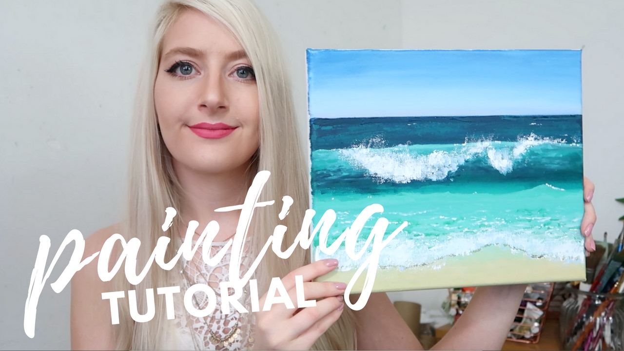
That perfect wave crashes differently every time, but most painters keep making the same flat mistakes. Learning how to paint ocean waves transforms static blue shapes into living, breathing water.
Real waves follow specific patterns of light, shadow, and movement that separate convincing seascapes from amateur attempts.
Understanding wave anatomy, color theory, and proper brushwork techniques creates the difference between painted water and actual-looking surf.
This guide covers essential wave painting fundamentals through advanced realism methods. You’ll master realistic water colors, foam texture creation, and lighting effects that make waves feel three-dimensional.
Professional techniques from marine art masters provide the foundation for believable ocean scenes. From calm morning swells to stormy breaking waves, these methods work across all painting mediums and skill levels.
Color Theory for Realistic Ocean Water

Water isn’t just blue. That’s the first thing most painters learn when they try realistic seascape art.
Understanding Base Water Colors
Deep ocean blues form the foundation, but they shift dramatically based on conditions. In shallow coastal waters, greens dominate the palette. These aren’t random choices.
The water reflects what’s above it. A stormy gray sky creates entirely different ocean colors than a bright afternoon sun.
Understanding color theory helps you mix these variations naturally. Start with primary colors and work toward the subtle shifts you see in real waves.
Transparent areas need special attention. Where light penetrates the wave face, colors become luminous and complex.
Color Temperature in Water
Ocean temperatures aren’t about degrees. They’re about warm and cool hues that make waves feel real.
Cool blues work for deep water areas. But wave faces catching sunlight need warmer influences.
Color contrast creates the drama you see in breaking waves. The dark trough against bright foam makes both elements pop.
Complementary colors appear naturally in ocean scenes. Orange sunlight on blue water creates instant visual interest.
Foam and Spray Colors
White foam isn’t actually white. Look closer and you’ll see hints of blue, gray, and even pink.
Shadow areas within foam structures need secondary colors to feel three-dimensional. Pure white foam looks flat and artificial.
The trick is mixing transparent spray effects. These areas blend the background colors with white, creating believable depth.
Wet sand interactions add another layer. The colors shift where foam meets shore, creating natural transitions.
Essential Brushwork Techniques
Your brush becomes the wave. The motion you make directly translates to the water’s movement on canvas.
Creating Water Movement

Horizontal strokes work for calm surfaces. But waves need curves that follow their natural contours.
Watercolor painting techniques excel at capturing fluid motion. The medium naturally creates the soft edges waves need.
For acrylic painting, work quickly before the paint starts to set. Waves require blending while the colors are still workable.
Vertical brush techniques create convincing spray and droplets. These quick, upward motions mimic how water actually moves through air.
Brush Selection for Wave Effects
Flat brushes handle large wave faces efficiently. Their broad edges create smooth water surfaces in single strokes.
Round brushes work better for wave details and foam patterns. They give you more control over curved lines and organic shapes.
Fan brushes create instant foam texture. A few quick dabs produce the bubble patterns you see in real waves.
Oil painting allows the longest working time. You can blend and adjust wave forms until they feel right.
Blending Techniques for Realistic Water
Wet-on-wet blending creates the smooth transitions waves need. Apply wet paint into other wet paint for seamless color shifts.
Wet-on-dry techniques work for sharp wave edges. The crest line needs definition that only crisp edges can provide.
Scumbling adds surface texture to rough water. Drag a dry brush over the underlying color to suggest water movement.
Feathering helps distant waves fade naturally. Soften edges as waves recede toward the horizon.
Light and Shadow in Wave Painting

Light transforms ordinary water into living, breathing waves. Without proper lighting, even perfect colors and brushwork fall flat.
Understanding Light Sources
Direct sunlight creates the most dramatic wave effects. The strong light source produces clear highlights and deep shadows.
Diffused light through clouds softens everything. These conditions require subtler value changes and gentler transitions.
Backlighting through wave faces creates magical transparency effects. The water glows from within when light passes through thin sections.
Reflected light bounces everywhere in ocean scenes. Sand, sky, and other waves all contribute secondary illumination.
Shadow Patterns in Waves
Cast shadows from wave crests create the deep troughs you see in rough seas. These shadows use cool colors and darker values.
Self-shadows within wave curves give them three-dimensional form. Every wave face has areas where light can’t reach directly.
Shadow colors aren’t just darker versions of the lit areas. They shift toward cooler temperatures and often pick up reflected colors from surrounding elements.
The contrast between light and shadow sells the wave’s volume and power.
Value Relationships in Ocean Scenes
Dark values anchor your deep water areas. These provide the foundation that makes lighter elements stand out.
Mid-tones handle most of the wave faces and water surfaces. Getting these right creates believable water that doesn’t compete with highlights.
Light values go to foam, spray, and direct reflections. Use them sparingly for maximum impact.
Atmospheric perspective lightens distant waves. The farther back they are, the closer they get to the sky’s value.
Creating Depth Through Light
Linear perspective makes waves smaller as they recede. But light perspective makes them lighter and less contrasted too.
Foreground waves get the strongest light and shadow contrasts. Background waves fade toward middle values.
Color temperature shifts with distance. Warm lights in foreground waves cool down as they approach the horizon.
The interplay between form and light creates convincing three-dimensional waves on a flat surface.
Composition and Perspective

Wave placement makes or breaks your seascape. Random waves look chaotic, but planned waves create natural rhythm.
Wave Placement and Visual Flow
Vary wave heights to avoid monotony. Real oceans never create identical waves in perfect rows.
Space wave sets unevenly across your canvas. Groups of larger waves followed by smaller ones mimic actual ocean patterns.
Leading lines from wave crests guide viewer attention through your composition. Use these natural curves to create visual pathways.
Balance active water areas with calmer sections. Too much turbulence everywhere exhausts the eye.
Creating Focal Points with Waves
Breaking waves make powerful main subjects. Their dramatic foam and spray naturally draw attention.
Use emphasis through contrast. The brightest foam against the darkest water creates instant focal points.
Color intensity guides the eye effectively. Save your most saturated blues and greens for key wave faces.
Visual hierarchy keeps viewers engaged. Primary waves dominate, secondary waves support, background waves fade.
Perspective in Ocean Scenes
Using vanishing points makes wave perspective believable. Distant waves converge toward the horizon just like roads do.
Wave size diminishing creates depth automatically. Foreground waves tower while background waves barely break the surface.
Detail reduction sells distance effectively. Sharp foam patterns up close become soft suggestions far away.
Scale relationships between waves establish convincing depth. Each wave should be proportionally smaller than the one in front of it.
Specific Wave Painting Approaches
Different wave conditions require completely different painting strategies. A calm morning and a storm demand opposite techniques.
Calm Ocean Surfaces

Subtle ripple patterns replace dramatic breaking waves. These gentle movements still need careful observation.
Mirror-like reflections dominate calm water painting. The water becomes a window to the sky above.
Watercolor techniques excel in calm conditions. The medium’s natural flow mimics peaceful water movement.
Gentle swells create barely visible rhythm across the surface. These undulations add life without drama.
Moderate Wave Activity
Rolling wave formations provide the classic seascape look. These waves break gently without violent spray.
Moderate foam development requires careful observation. Too little looks fake, too much appears stormy.
Balanced movement keeps the painting dynamic but peaceful. The water flows without overwhelming the viewer.
Varied wave patterns prevent monotony. Mix wave heights, speeds, and breaking stages throughout your composition.
Stormy Seas and Large Waves
Dramatic wave heights demand bold painting approaches. These conditions test every technical skill.
Heavy foam and spray patterns cover large canvas areas. Plan these white spaces carefully in your initial sketch.
Oil painting methods handle storm conditions well. The slow drying time allows complex blending of turbulent water.
Power and energy representation requires confident brushstrokes. Tentative marks can’t capture storm force.
Key Storm Wave Elements:
- Towering wave heights that dwarf other elements
- Wind-torn spray streaming horizontally
- Deep shadow troughs between massive swells
- Chaotic foam patterns breaking in multiple directions
Common Mistakes and How to Fix Them
Every wave painter makes these errors. Recognizing them early saves hours of frustration.
Color Problems and Solutions
Overly blue water plagues beginning painters. Real ocean water contains greens, grays, and earth tones.
Mix warmer influences into your blues. Add tiny amounts of raw sienna or burnt umber to break the artificial look.
Flat, monotone water lacks convincing depth. Color temperature changes create three-dimensional forms.
Cool shadows and warm highlights separate wave faces naturally. This temperature shift sells the wave’s volume.
Quick Color Fixes:
- Add complementary touches – orange hints in blue water
- Vary saturation levels – pure color only in key areas
- Include reflected colors – sky, sand, and nearby objects influence water hue
- Temperature progression – warm foreground cooling toward background
Form and Movement Issues
Static-looking waves kill the ocean’s energy. Movement must flow through every wave form.
Curved brush strokes following wave contours create natural flow. Straight lines make water look rigid.
Incorrect wave anatomy confuses viewers. Study real wave photographs to understand breaking patterns.
Proportion problems destroy believability. Waves that are too large or small for their distance look fake.
Technical Execution Problems
Muddy color mixing ruins ocean clarity. Clean brushes between color changes prevent unwanted mixing.
Overworking paint creates dead, lifeless surfaces. Know when to stop and let the brushstrokes show.
Lost edges need recovery techniques. Soften hard transitions with clean, damp brushes while paint remains workable.
Texture inconsistency breaks the illusion. Maintain similar handling throughout related wave areas.
Professional Problem-Solving Tips:
- Step back frequently – distance reveals problems close viewing misses
- Check value relationships – squint to see if light and dark patterns work
- Compare to reference photos – but don’t copy every detail
- Paint wave studies – practice individual waves before full compositions
Fixing Foam Pattern Mistakes
Unnatural foam distribution looks artificial. Real foam follows wave physics, not random placement.
Study breaking wave photos to understand where foam actually forms. It’s not just white paint scattered randomly.
Foam that’s too white appears pasted on. Mix subtle color variations into your white areas.
Hard foam edges need softening. Real foam has both sharp and soft transitions depending on the wave’s energy.
Advanced Techniques for Realism
Master painters separate from beginners through subtle details. These advanced methods create waves that feel alive on canvas.
Atmospheric Effects in Ocean Scenes
Mist and spray hang in the air above breaking waves. This atmospheric moisture softens distant elements naturally.
Heat shimmer over warm water creates subtle distortions. These effects add believability to sunny seascapes.
Distance haze lightens far waves progressively. Each wave layer becomes slightly more muted than the one in front.
Weather condition representation requires careful observation. Storm approaches, clearing skies, and calm conditions each demand different atmospheric treatments.
Creating Convincing Mist Effects:
- Dry brush technique for light spray patterns
- Glazing layers to build transparent mist
- Soft edge blending where mist meets clear air
- Value gradation from dense to dispersed areas
Water Transparency Techniques
Seeing through wave faces creates magical depth. This transparency effect separates amateur from professional work.
Refraction distortion bends underwater images naturally. Objects below the surface appear shifted from their actual positions.
Aerial perspective principles apply underwater too. Deeper elements become cooler and less contrasted.
Depth indication through water requires understanding light penetration. Deeper areas shift toward cooler blues and greens.
Advanced Glazing for Water Effects
Glazing techniques build water depth through transparent layers. Each glaze adds complexity without muddying colors.
Transparent darks in wave troughs create convincing depth. Mix glazing medium with dark colors for luminous shadows.
Multiple glaze layers simulate water’s natural transparency. Build these effects gradually for maximum realism.
Color temperature shifts happen naturally through glazing. Cool glazes over warm underpainting create natural water effects.
Surface Detail Development
Individual droplet painting requires patience and precision. These micro-details sell the illusion of splashing water.
Foam bubble patterns follow physical laws. Study real foam to understand how bubbles cluster and separate.
Surface tension effects create distinctive water behaviors. Droplets bead differently on various surfaces.
Texture techniques vary across the wave surface. Smooth faces contrast with rough foam areas.
Micro-Detail Hierarchy:
- Primary foam masses – largest bubble groups
- Secondary spray patterns – medium-sized droplets
- Fine mist effects – smallest water particles
- Individual highlights – pinpoint light reflections
Light Refraction and Reflection
Complex light behavior in water creates multiple reflection types. Direct, scattered, and refracted light all contribute to realism.
Chiaroscuro effects work powerfully in wave painting. Strong light and shadow contrasts emphasize wave volume.
Caustic patterns from light focusing through water add authenticity. These dancing light patches appear on sandy bottoms.
Multiple light sources complicate but enrich wave scenes. Sun, sky, and reflected light from surrounding elements interact constantly.
Advanced Color Mixing for Water
Temperature variations within single waves create three-dimensional forms. Cool shadows transition to warm highlights naturally.
Tertiary color mixtures create subtle water variations. These complex hues avoid the artificial look of pure colors.
Optical mixing through broken color techniques mimics water’s shimmering quality. Small color notes blend visually rather than physically.
Monochromatic schemes with temperature shifts create unified but varied water surfaces.
Perspective Distortion in Water
Wave perspective follows unique rules. Water surfaces curve and tilt, creating complex perspective challenges.
Foreshortening effects apply to wave faces and foam patterns. Distant foam appears compressed vertically.
Multiple perspective systems work simultaneously. Each wave face has its own orientation and perspective requirements.
Curved perspective better represents wave surfaces than linear systems. Water rarely follows straight perspective lines.
Professional Finishing Touches
Edge variation throughout the painting maintains visual interest. Mix hard, soft, and lost edges strategically.
Sfumato techniques soften distant elements naturally. Leonardo’s method works perfectly for atmospheric wave effects.
Final detail work focuses viewer attention. Strategic highlights and accents guide the eye through the composition.
Quality control through systematic evaluation catches problems before they become unfixable. Step back frequently during advanced work.
Master-Level Checklist:
- Atmospheric consistency – all elements affected equally by conditions
- Light logic – shadows and highlights follow consistent light sources
- Color harmony – all hues work together despite complexity
- Edge relationships – varied but purposeful edge treatments
- Detail hierarchy – important areas get more attention than secondary ones
Working with Master Techniques
Study Claude Monet’s water series for atmospheric handling. His approach to reflected light revolutionized seascape painting.
J.M.W. Turner’s storm techniques demonstrate dramatic wave energy capture. His bold approach inspires powerful seascape compositions.
Contemporary hyperrealism methods push detail to photographic levels. These approaches require different skills than traditional techniques.
En plein air painting develops direct observation skills. Working from life teaches subtleties no photograph captures.
Integration of Multiple Techniques
Layered approach combines multiple advanced methods seamlessly. Each technique supports others rather than competing for attention.
Technical mastery serves artistic vision, not the reverse. Advanced methods enhance expression rather than showing off skill.
Selective application prevents overworking. Use advanced techniques only where they strengthen the overall painting.
Personal style emerges through consistent technical choices. Develop signature approaches to advanced realism effects.
FAQ on How To Paint Ocean Waves
What colors do I mix for realistic ocean water?
Start with ultramarine blue and prussian blue as your base. Add raw sienna or burnt umber to break the artificial blue look.
Mix in greens for shallow water areas. Tertiary colors create more natural variations than pure hues alone.
Which painting medium works best for waves?
Oil painting offers the longest working time for blending wave transitions. Watercolor techniques naturally capture fluid movement.
Acrylic painting requires quick work before colors dry. Each medium has advantages depending on your preferred working style.
How do I paint convincing foam and spray?
Real foam isn’t pure white. Mix subtle blues, grays, and warm tints into your white areas.
Use stippling techniques for bubble texture. Fan brushes create instant foam patterns with quick dabbing motions across wave crests.
What brushes should I use for wave painting?
Flat brushes handle large wave faces efficiently. Round brushes work better for curved lines and foam details.
Fan brushes excel at creating foam texture. Liner brushes add fine spray details and wave edge definition.
How do I create depth in ocean scenes?
Atmospheric perspective lightens distant waves progressively. Cool colors recede while warm colors advance naturally.
Wave size reduction with distance sells depth automatically. Make background waves proportionally smaller than foreground elements.
What’s the biggest mistake in wave painting?
Making water too blue destroys realism. Real ocean water reflects sky colors, contains greens, and shows temperature variations.
Flat, monotone water lacks convincing three-dimensional form. Vary your color temperatures throughout each wave face.
How do I paint transparent wave faces?
Glazing techniques build transparency through multiple thin layers. Start with darker undertones and glaze lighter colors over them.
Refraction effects bend underwater images naturally. Study how objects appear distorted through real wave faces.
Should I paint waves from photos or life?
En plein air painting teaches wave movement that photos can’t capture. Live observation shows how waves actually behave.
Photo references work for color studies and specific wave anatomy. Combine both approaches for complete understanding.
How do I fix muddy wave colors?
Clean brushes between color changes to prevent unwanted mixing. Use separate brushes for warm and cool color families.
Overworking paint creates dead surfaces. Know when to stop and let individual brushstrokes show through.
What lighting makes waves look most realistic?
Strong directional light creates clear highlights and shadows that define wave volume. Side lighting shows three-dimensional form best.
Chiaroscuro effects with dramatic light-dark contrasts emphasize wave power and movement naturally.
Conclusion
Mastering how to paint ocean waves requires understanding both technical skills and natural wave behavior. These methods work across different painting styles and experience levels.
Practice with individual wave studies before attempting full seascapes. Build your skills gradually through focused exercises.
Color mixing remains the foundation of convincing water effects. Temperature variations and reflected hues create believable ocean surfaces.
Brushwork techniques translate directly to wave movement on canvas. Your hand motion becomes the water’s energy.
Light and shadow relationships define three-dimensional wave forms. Study how real waves catch and block light throughout different conditions.
Composition principles guide viewer attention through your ocean scenes. Balance active and calm areas for visual interest.
Advanced techniques like aerial perspective and transparency effects separate professional results from amateur attempts. These skills develop through consistent practice.
Start with simple wave forms and progress toward complex breaking patterns. Each painting teaches new lessons about water behavior and realistic representation.