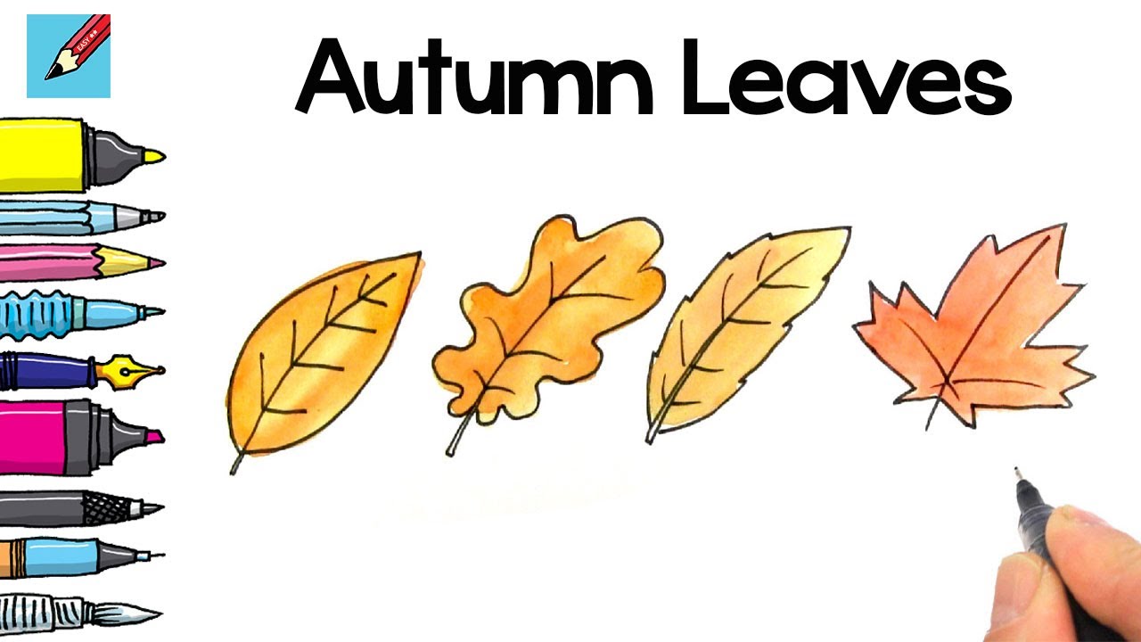
October’s first crisp morning reveals nature’s most spectacular color display. Every maple, oak, and birch transforms into a living canvas of burnt sienna, cadmium orange, and golden ochre.
Learning how to paint autumn leaves captures these fleeting moments forever. But most painters struggle with muddy colors and flat, lifeless foliage.
This guide solves those problems with proven techniques from professional artists. You’ll master warm color mixing, understand leaf anatomy, and create paintings that glow with autumn’s natural radiance.
We’ll cover everything from selecting the right painting mediums to advanced color theory applications. You’ll learn specific methods for painting maple clusters, oak leaf textures, and compelling autumn compositions.
By the end, you’ll confidently capture autumn’s warmth using watercolor, acrylic, or oil techniques that bring seasonal beauty to life on canvas.
Essential Materials and Tools for Autumn Leaf Painting

Paint Selection and Quality
The right pigments make all the difference when capturing autumn’s warmth. Cadmium orange forms the backbone of most fall palettes.
Acrylic painting offers beginners the perfect starting point. It dries quickly and blends easily for those first autumn studies.
Oil painting gives you more working time. Professional artists often prefer oils for their rich, buttery texture when layering warm autumn hues.
Watercolor painting creates luminous effects. The transparent quality mimics how light filters through autumn leaves naturally.
Core Warm Pigments
Your palette needs these essential colors:
- Cadmium yellow light
- Cadmium orange
- Alizarin crimson
- Burnt sienna
- Raw umber
- Yellow ochre
Different painting mediums each bring unique advantages. Acrylics work for quick studies while oils allow extensive blending.
Brush Types and Techniques
Flat brushes handle broad leaf shapes perfectly. Size 6 and 10 flats cover most maple and oak leaf forms.
Round brushes add fine details like leaf veins. A size 2 round works for most detail work.
Fan brushes create amazing texture effects. They’re perfect for suggesting clusters of distant leaves.
Specialized Tools
Filbert brushes combine the best of rounds and flats. Their curved edges work well for natural leaf curves.
Liner brushes handle the finest details. Use them for individual leaf veins and stems.
Natural bristles hold more paint than synthetic ones. But synthetic brushes clean easier with acrylics.
Surface Preparation
Canvas boards work great for practice studies. They’re cheap and you can experiment freely.
Stretched canvas gives a more professional feel. Prime it properly with gesso for best results.
Watercolor paper needs different consideration. Cold press paper holds pigment better for loose autumn washes.
Priming Basics
Priming a canvas seals the surface. Two thin coats work better than one thick application.
Let each coat dry completely. Rushed priming leads to paint absorption issues later.
Tinted grounds can help establish warm undertones. Try a light sienna or ochre base for autumn scenes.
Observing and Sketching Real Autumn Leaves
Field Study Techniques
Get outside while the colors peak. October usually offers the best variety in most regions.
Bring a small sketchbook and basic drawing materials. Simple pencil sketches capture more than photos sometimes.
Look for leaves at different stages. Green ones turning yellow show the progression beautifully.
Quick Gesture Sketching
Start with the overall shape. Don’t worry about details initially.
Gesture drawing captures the leaf’s essential character. Spend 30 seconds to 2 minutes per sketch.
Focus on proportions first. Is the leaf wider than it is long? Where’s the widest point?
Recording Color Notes
Write color descriptions next to sketches. “Warm yellow-green with orange edges” helps later in the studio.
Note the light conditions too. Morning light differs dramatically from afternoon sun.
Take photos as backup, but don’t rely on them entirely. Your eye sees subtleties cameras miss.
Analyzing Leaf Structure
Every leaf type has distinctive characteristics. Maple leaves show pointed lobes with sharp divisions.
Oak leaves feature rounded lobes. Their edges create gentler curves than maples.
Birch leaves are simple ovals. But their golden yellow color makes up for basic shapes.
Understanding Light Patterns
Notice how light hits different leaf surfaces. Smooth leaves reflect light differently than textured ones.
Backlighting creates magical effects. Leaves glow like stained glass windows when lit from behind.
Study shadow patterns on individual leaves. The vein structure creates subtle value changes.
Identifying Leaf Varieties
Cherry leaves turn brilliant reds. Their serrated edges catch light in interesting ways.
Ash trees produce compound leaves. Each leaflet changes color at different rates.
Hickory leaves create beautiful yellow displays. They’re compound like ash but with fewer leaflets.
Creating Reference Materials
Build a collection of pressed leaves. They preserve color better than you might expect.
Arrange them on white paper for clear visibility. This helps with proportion studies later.
Photography Tips
Use diffused light for accurate color capture. Direct sunlight creates harsh shadows and color casts.
Photograph leaves against neutral backgrounds. White or gray paper eliminates distractions.
Take multiple shots at different angles. Side lighting reveals texture details you’ll need later.
Building Visual Libraries
Group references by color families. Reds together, yellows together, and so on.
Keep notes about where and when you found each specimen. This builds your understanding of seasonal timing.
Sketch from life whenever possible. Photos help, but direct observation teaches more about color theory.
Basic Leaf Painting Techniques

Establishing Leaf Shapes
Start with simple geometric forms. Most leaves fit into ovals, triangles, or heart shapes initially.
Block in basic shapes before adding any details. This establishes proper proportions from the start.
Work from general to specific. Big shapes first, then smaller divisions and details.
Proportional Relationships
Measure width against length using your brush handle. This old artist trick maintains accurate proportions.
Look for the widest point on each leaf. It’s rarely in the center.
Consider how leaves overlap in clusters. Front leaves hide portions of back ones.
Layering Colors for Depth
Underpainting establishes the basic color temperature. Use warm yellows and oranges for autumn foundations.
Build color intensity gradually. It’s easier to add warmth than remove it.
Mix colors on the canvas, not just the palette. This creates more natural variations.
Temperature Variations
Even warm autumn colors have temperature differences. Some oranges lean toward red, others toward yellow.
Cool spots appear in shadows. Add small amounts of complementary colors for realistic shadow areas.
The color wheel guides these decisions. Opposite colors create vibrant contrasts when used sparingly.
Blending Strategies
Wet-into-wet blending creates soft transitions. This works especially well with oils and watercolors.
Dry brush techniques add texture. Drag paint lightly over dry areas for rough leaf surfaces.
Scumbling creates broken color effects. It’s perfect for weathered autumn leaves.
Creating Texture and Surface Interest
Real leaves aren’t perfectly smooth. Age and weather create surface variations.
Stippling with a dry brush suggests leaf texture. Dab the brush rather than stroking it.
Scraping paint with palette knives reveals underlying colors. This mimics natural wear patterns.
Advanced Texture Methods
Sponges create interesting organic textures. Natural sponges work better than synthetic ones.
Salt creates texture effects in watercolors. Sprinkle it into wet washes for crystalline patterns.
Masking fluid preserves light areas in watercolors. Use it for leaf highlights and vein patterns.
Surface Variety Techniques
Vary your brush pressure throughout each leaf. Light pressure for delicate areas, firm pressure for bold statements.
Mix textures within single leaves. Smooth areas contrast beautifully with textured sections.
Consider the leaf’s age and condition. Fresh leaves differ from dried, weathered ones in both color and texture.
Advanced Warm Color Applications

Temperature Variations Within Warm Hues
Not all warm colors feel equally hot. Cadmium red burns hotter than alizarin crimson, even though both are red.
Understanding color temperature changes everything about autumn painting. Cool yellows lean toward green while warm yellows push toward orange.
Hot vs Cool Warm Colors
Vermillion contains more yellow than pure red. This makes it feel warmer despite being technically red.
Raw umber cools down any warm mixture. Add tiny amounts to prevent colors from becoming too intense.
Burnt sienna works as both warm and cool depending on context. Against orange, it appears cool. Next to purple, it looks warm.
Creating Atmospheric Perspective
Distance cools colors naturally. Background leaves need slightly cooler versions of foreground hues.
Atmospheric perspective affects autumn scenes dramatically. Far hills appear bluer even when covered in orange maples.
Layer transparent glazes to suggest depth. Each glaze subtly shifts temperature and creates convincing distance.
Light Effects on Autumn Leaves
Backlighting transforms ordinary leaves into glowing jewels. The light passes through translucent leaf tissue, intensifying warm colors.
Side lighting reveals leaf texture and form. It creates strong value contrasts between lit and shadowed areas.
Morning light tends cooler than afternoon sun. This affects your color choices significantly when painting specific times of day.
Reflected Light Phenomena
Warm light bounces between clustered leaves. This creates subtle secondary illumination on shadowed surfaces.
Ground reflection adds warmth to leaf undersides. Fallen leaves often reflect amber light upward onto hanging branches.
Multiple light sources complicate color relationships. Indoor lighting mixed with window light creates complex color temperatures.
Seasonal Light Quality
October light differs from September’s brightness. The sun angle changes, affecting how colors appear in nature.
Overcast days intensify autumn colors. Diffused light eliminates harsh shadows and makes hues appear more saturated.
Color Harmony and Balance
Complementary colors intensify each other when used strategically. Orange leaves pop against blue skies naturally.
Avoid muddy mixing by understanding color relationships. Too many colors mixed together create gray, not rich browns.
Keep some areas pure and intense. Balance these with neutralized areas for visual rest.
Warm Color Schemes
Analogous color schemes use neighboring warm colors. Yellow, orange, and red create natural autumn harmony.
Monochromatic schemes explore single color families. All reds or all oranges can work beautifully.
Temperature variations prevent monotony within single-color schemes. Hot oranges mixed with cooler oranges add interest.
Painting Different Types of Autumn Leaves
Maple Leaves

Maple leaf structure features five pointed lobes with sharp divisions. Each lobe tapers to a distinct point.
The leaf stem attaches at a deep notch between the bottom lobes. This creates the maple’s characteristic heart-shaped base.
Sugar maples turn brilliant orange and red. Their color progression often starts at leaf edges and works inward.
Color Progression Patterns
Green chlorophyll breaks down first along leaf margins. This reveals underlying yellow and orange pigments gradually.
Red pigments develop independently in response to cool nights. They appear as veins and patches throughout the leaf.
Norwegian maples hold green longer than sugar maples. When they finally turn, the change happens quickly and uniformly.
Painting Maple Clusters
Overlap leaves convincingly by understanding their growth patterns. Newer leaves grow above older ones on branches.
Vary leaf sizes within clusters. Not every leaf reaches full size before autumn arrives.
Show some leaves curling or damaged. Perfect leaves rarely exist in nature, especially late in the season.
Oak Leaves
Oak leaves feature rounded lobes without sharp points. The curves create gentler, more flowing shapes than maples.
White oak leaves show deeper indentations between lobes. Red oak lobes are shallower with bristle-tipped points.
Oak color schemes lean toward browns and bronzes. They rarely achieve the brilliant reds of maples.
Distinctive Oak Characteristics
Thick leaf substance gives oaks different light-transmission qualities. They appear less translucent than thinner maple leaves.
Oak leaves often persist through winter. This creates interesting compositional opportunities with snow or bare branches.
Leaf texture varies between oak species. Some feel smooth while others show rough, papery surfaces.
Bronze and Brown Palettes
Mix burnt umber with orange for rich oak browns. Add yellow ochre for lighter bronze tones.
Raw sienna creates perfect oak shadows. It’s warm enough to suggest autumn while remaining appropriately subdued.
Avoid pure browns from tubes. Mixed browns look more natural and integrate better with surrounding colors.
Other Common Autumn Trees

Birch leaves create perfect ovals with serrated edges. Their golden yellow provides strong color contrast in mixed forests.
Cherry tree leaves turn deep red early in autumn. They’re often the first to change in September.
Ash trees produce compound leaves with multiple leaflets. Each leaflet changes color independently, creating complex patterns.
Specialized Leaf Types
Tulip tree leaves have distinctive four-lobed shapes. They turn clear yellow, almost glowing in autumn light.
Sassafras produces three different leaf shapes on the same tree. Some are simple ovals, others mitten-shaped with one or two thumbs.
Sweet gum leaves resemble stars with five to seven pointed lobes. They offer brilliant red and orange displays.
Compositional Strategies for Autumn Scenes

Single Leaf Studies
Close-up compositions focus attention on individual leaf characteristics. Fill the entire picture plane with one magnificent specimen.
Background selection makes or breaks single leaf paintings. Neutral colors let the leaf dominate without competition.
Dark backgrounds intensify autumn colors through strong contrast. Light backgrounds create softer, more subtle relationships.
Creating Strong Focal Points
Position the main leaf using the rule of thirds. Avoid centering it exactly in the composition.
Value contrast draws attention effectively. Place the lightest light against the darkest dark at your focal point.
Color intensity also creates emphasis. Reserve your most vibrant hues for the most important areas.
Lighting Single Leaves
Side lighting reveals leaf structure and creates dramatic shadows. The interplay of light and shadow adds visual interest.
Backlighting simplifies leaf forms into silhouettes. This emphasizes shape over surface detail.
Multiple light sources complicate shadows but create rich, complex lighting effects worth exploring.
Leaf Clusters and Branches
Overlapping creates depth in leaf groupings. Front leaves hide portions of background leaves naturally.
Vary leaf orientations within clusters. Some face forward, others turn sideways or curl backward.
Size variation suggests depth through aerial perspective. Smaller leaves appear more distant.
Visual Flow Patterns
Eye movement through compositions follows connecting elements. Branch structures guide viewers through leaf clusters naturally.
Rhythm develops through repeated leaf shapes and colors. Vary the intervals to prevent monotony.
Directional lines lead eyes around paintings. Branch angles and leaf orientations create these invisible pathways.
Depth Creation Techniques
Overlap leaves at various depths. Some touch the picture plane while others recede into shadows.
Color temperature shifts suggest spatial recession. Warmer colors advance while cooler ones recede.
Value gradation from light to dark creates three-dimensional form on flat surfaces.
Ground-Level Autumn Compositions

Fallen leaf arrangements offer rich compositional possibilities. Nature creates abstract patterns we can interpret artistically.
Horizontal formats suit ground-level scenes naturally. They emphasize the spread of fallen leaves across forest floors.
Earth tones provide perfect foils for bright autumn colors. Burnt umber and raw sienna ground compositions effectively.
Creating Depth in Horizontal Scenes
Linear perspective applies to ground planes. Leaves appear smaller and closer together as they recede.
Texture gradation suggests distance. Sharp details in foreground leaves contrast with simplified background areas.
Atmospheric effects soften distant elements. Far leaves become less distinct and slightly cooler in temperature.
Integrating Vertical Elements
Tree trunks provide strong vertical balance in horizontal compositions. They anchor leaf arrangements to specific places.
Shadow patterns from overhead branches add visual interest to ground compositions. They break up large areas of similar color.
Rocks or fallen logs create additional compositional anchors. These elements provide scale reference and structural support.
Troubleshooting Common Painting Problems
Color Mixing Issues
Muddy autumn colors happen when too many pigments get mixed together. Limit your mixtures to three colors maximum.
Gray undertones kill the warmth in autumn scenes. This usually results from mixing complementary colors in equal proportions.
Avoiding Muddy Colors

Start with primary colors and mix from there. Cadmium yellow, alizarin crimson, and ultramarine blue create clean secondaries.
Clean your brush between color applications. Leftover paint on brushes contaminates fresh mixtures.
Mix warm grays using burnt umber and ultramarine blue instead of black and white. This maintains color temperature consistency.
Maintaining Color Vibrancy
Secondary colors mixed from primaries appear more vibrant than tube secondaries. The mixing process creates subtle variations.
Reserve pure colors for your most important focal areas. Mix everything else to varying degrees.
Add small amounts of complementary colors to shadows rather than using black. This maintains color richness in dark areas.
Correcting Dull Passages
Glazing with transparent warm colors revives dull areas. Use medium to thin the paint for proper transparency.
Color intensity can be restored by adding pure pigment selectively. Focus on key areas rather than the entire painting.
Scumbling light colors over dark areas creates luminous effects. This technique works especially well with autumn highlights.
Form and Structure Problems
Flat-looking leaves lack proper value relationships. Strong lights and darks create dimensional form.
Edge quality determines whether leaves look natural or artificial. Vary hard and soft edges throughout each leaf.
Most beginners make leaves too symmetrical. Real leaves show imperfections and irregular growth patterns.
Creating Believable Shapes
Study real leaf anatomy before painting. Understanding the underlying structure prevents generic leaf shapes.
Observe how leaves curve and twist naturally. They’re rarely perfectly flat against the picture plane.
Use foreshortening to suggest leaves turning away from the viewer. This adds dimensional complexity.
Improving Edge Definition
Soft edges suggest areas where forms turn away from light. Hard edges emphasize areas of strong contrast.
Lost and found edges create visual interest. Some leaf edges disappear into shadows or background colors.
Vary brushwork along edges. Broken, textured edges often look more natural than smooth, perfect ones.
Lighting and Contrast Issues
Insufficient contrast makes paintings appear weak and unfinished. Push your lights lighter and darks darker.
Warm highlights and cool shadows create convincing light effects. Avoid using the same temperature for both.
Multiple light sources confuse the lighting scheme. Choose one primary light source and stick with it consistently.
Balance and Visual Weight
Asymmetrical balance often works better than symmetrical arrangements in natural scenes.
Heavy colors like dark reds carry more visual weight than light yellows. Balance warm darks with larger areas of light colors.
Consider the rule of thirds when placing major elements. This creates more dynamic compositions than centering everything.
Temperature Consistency
Cool colors recede while warm colors advance. Use this principle to create spatial depth in leaf clusters.
Consistent light temperature throughout the painting creates believable illumination. Don’t mix cool sunlight with warm shadows.
Color psychology affects emotional response. Warm autumn colors generally create positive, energetic feelings.
Finishing Techniques and Final Details

Adding Convincing Details
Leaf vein patterns follow specific botanical rules. Main veins radiate from the stem attachment point outward.
Secondary veins branch from primary ones at consistent angles. Study real leaves to understand these patterns.
Surface imperfections make leaves look authentic. Small holes, brown spots, and torn edges add realism.
Vein Structure Patterns
Maple leaves show palmate venation with veins radiating like fingers. Each lobe has its own primary vein.
Oak leaf veins branch more irregularly than maples. They create complex secondary patterns within each lobe.
Simple leaves like birch show pinnate venation. One central vein with smaller branches extending outward.
Natural Wear Effects
Autumn leaves often show insect damage. Small holes and chewed edges tell stories of the growing season.
Brown spots develop from age and disease. These add visual interest and authenticity to painted leaves.
Curled edges result from moisture loss. Show this by varying the contour lines along leaf margins.
Final Color Adjustments
Color harmony throughout the painting creates unity. Adjust individual areas to support the overall color scheme.
Temperature adjustments in final stages can dramatically improve paintings. Warm up shadows or cool down overly hot highlights.
Intensity modifications help direct attention. Reduce color saturation in less important areas.
Unifying Color Temperature
Glazes create overall color harmony. Thin, transparent layers tie disparate colors together effectively.
Reflected colors appear throughout nature. Add hints of sky color to leaf shadows and ground reflection to undersides.
Atmospheric effects unify distant elements. Slightly cool and lighten background colors for spatial consistency.
Final Highlight Placement
Reserve your brightest highlights for the most important focal areas. These draw the eye naturally.
Chiaroscuro effects create drama. Strong light-dark contrasts add impact to key areas.
Edge highlights often appear on backlit leaves. These thin lines of light separate leaves from dark backgrounds.
Presentation and Preservation
Varnishing protects oil paintings from dust and UV damage. Gloss varnish intensifies colors while matte varnish reduces reflections.
Acrylic paintings need varnish too. Removable varnishes allow future cleaning and restoration if needed.
Frame selection affects color perception. Warm wood tones complement autumn colors better than cool metals.
Varnish Application Tips
Wait for complete drying before varnishing. Oil paintings need six months to a year for thorough curing.
Apply varnish evenly using cross-hatch brush strokes. Work in sections to maintain wet edges.
Two thin coats work better than one thick application. This prevents runs and ensures even coverage.
Photography for Documentation
Diffused lighting prevents harsh reflections when photographing finished work. Overcast days provide ideal conditions.
Photograph from directly in front to avoid perspective distortion. Keep the camera parallel to the painting surface.
Color correction may be needed in post-processing. Compare prints to the original for accuracy assessment.
FAQ on How To Paint Autumn Leaves
What colors do I need to paint autumn leaves?
Essential colors include cadmium orange, alizarin crimson, cadmium yellow, burnt sienna, and raw umber. These primary colors and earth tones create realistic autumn palettes.
Add yellow ochre for subtle variations. Avoid using too many tube colors, as mixing creates more natural-looking hues than pre-made autumn shades.
Which painting medium works best for autumn leaves?
Acrylic painting suits beginners due to fast drying times and easy cleanup. Oil painting allows extended blending for smooth color transitions.
Watercolor painting creates luminous, translucent effects perfect for backlit leaves. Each medium offers unique advantages for different artistic goals.
How do I avoid muddy autumn colors?
Limit color mixtures to three pigments maximum. Clean brushes between applications to prevent color contamination.
Use complementary colors sparingly in shadows rather than mixing them equally. This maintains color vibrancy while creating realistic shadow tones.
What brush types work best for leaf painting?
Flat brushes handle broad leaf shapes effectively. Round brushes add fine details like veins and stems.
Fan brushes create texture effects for distant foliage clusters. Filbert brushes combine both functions with their curved edges.
How do I create realistic leaf textures?
Use dry brush techniques for rough leaf surfaces. Stipple with partially loaded brushes to suggest natural texture variations.
Layer colors wet-into-dry for crisp edges. Vary brush pressure throughout each leaf to create surface interest and authenticity.
What’s the secret to painting convincing leaf clusters?
Overlap leaves at different depths using proper size relationships. Front leaves appear larger and more detailed than background ones.
Vary leaf orientations within clusters. Some face forward while others turn sideways or curl backward naturally.
How do I mix realistic browns for oak leaves?
Combine burnt umber with cadmium orange for warm oak browns. Add yellow ochre for lighter bronze variations.
Avoid tube browns when possible. Hand-mixed browns integrate better with surrounding warm colors and appear more natural.
Should I paint from photos or real leaves?
Direct observation teaches more about color theory and natural color relationships. Photos serve as helpful references but can flatten colors.
Combine both methods. Sketch from life to understand structure, then use photos for detailed reference work in the studio.
How do I create depth in autumn leaf paintings?
Use atmospheric perspective with cooler, lighter colors for distant elements. Warm colors advance while cool colors recede naturally.
Overlap forms and vary detail levels. Sharp focus in foregrounds contrasts with softer, simplified background areas effectively.
What common mistakes should I avoid?
Don’t make all leaves the same size or orientation. Natural variation prevents artificial-looking compositions.
Avoid overworking wet paint, which creates muddy colors. Let layers dry between applications for cleaner color separations.
Conclusion
Mastering how to paint autumn leaves transforms your artistic abilities and seasonal artwork. These techniques work across different painting styles from realism to impressionism.
Understanding tertiary colors and proper color harmony prevents muddy mixtures. Your warm palette will sing with authentic autumn brilliance.
Practice with different leaf species builds confidence. Maple clusters teach overlapping while oak leaves develop texture skills.
Remember that great painters like Claude Monet and Vincent van Gogh captured autumn’s magic through direct observation. Study real leaves whenever possible.
Start simple with single leaf studies before attempting complex compositions. Build your skills gradually using proper brush techniques and color mixing methods.
Your autumn paintings will improve dramatically with consistent practice and attention to natural color relationships.