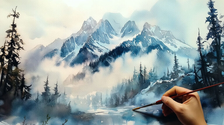
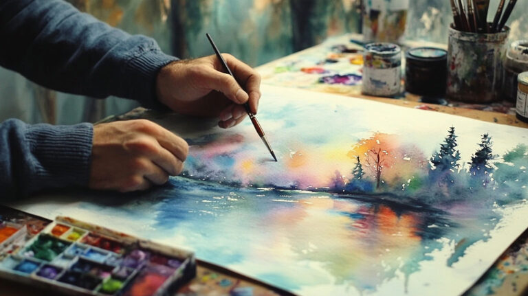
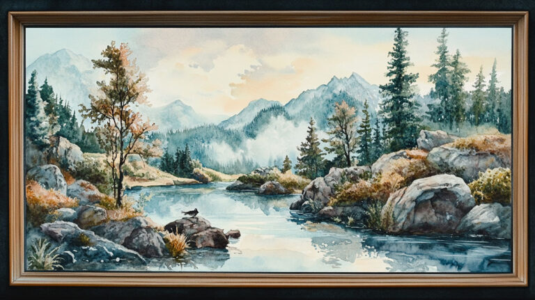
Watercolor is one of the few painting mediums that rewards letting go of control.
Whether you’re picking up a brush for the first time or looking to push past the same subjects you’ve been painting for years, finding the right watercolor painting ideas makes a real difference.
This guide covers everything from simple beginner subjects and floral painting to abstract techniques, loose portraits, and unexpected ideas like urban sketching and food illustration.
You’ll also find practical guidance on limited palette painting, sketchbook practice, and skill-building exercises that actually work.
What Is Watercolor Painting

Watercolor painting is a water-soluble medium where pigment suspended in a gum arabic binder is applied to paper, creating translucent layers that let the white of the paper show through as light.
Unlike oil painting or acrylic painting, watercolor relies on transparency rather than opacity. You work light to dark. Mistakes are tricky to cover. That unpredictability is actually what draws so many people to it.
The global watercolor market was valued at approximately $3.14 billion in 2024, growing at a CAGR of 5.32% through 2035 (MRFR, 2024). A lot of that growth is coming from hobbyists, not professionals.
The medium has roots going back centuries. Albrecht Durer used watercolor for nature sketches in the 1490s. J.M.W. Turner pushed it toward atmospheric abstraction in the 1800s. Today it sits somewhere between a fine art tradition and an accessible weekend hobby.
What makes it useful as a starting point for ideas: the techniques are stackable. A beginner can paint a clean flat wash. An advanced painter can layer glazes, use masking fluid, and combine wet-on-wet blooms in the same piece. The ideas in this guide work across both ends of that spectrum.
| Skill Level | Typical Subjects | Core Technique | Mechanical Goal |
|---|---|---|---|
| Beginner | High-Contrast Still Life: Lemons, single florals, and basic geometric shapes. | The Wash: Mastering flat and graded washes, and basic wet-on-wet control. | Water Control: Learning the exact ratio of water-to-pigment to avoid “backruns” or puddling. |
| Intermediate | Structured Environments: Landscapes, complex botanicals, and loose portraits. | Glazing & Layering: Building depth through transparent “filters” and negative painting (painting the space around an object). | Value Management: Developing the ability to build dark tones without losing the luminosity of the paper. |
| Advanced | Technical Narratives: Figures, complex architecture, and experimental mixed media. | Advanced Texture: Precision masking, “lifting” highlights, and dry brush techniques for realistic grit and light. | Efficiency & Detail: Executing surgical details while maintaining the “spontaneous” look that defines professional watercolor. |
Beginner Watercolor Painting Ideas
The best beginner subjects share one thing: forgiving shapes. If a lemon goes slightly lopsided, it still looks like a lemon. The same can’t be said for a face.
The beginner segment of the watercolor market has seen significant growth driven by affordable starter kits and the explosion of online tutorials (DataIntelo, 2024). More people are picking up the medium than ever, mostly starting with simple, low-pressure subjects.
Simple Objects and Still Life
Best starting subjects:
- Lemons, limes, or oranges (round shapes, simple shadows)
- Single succulents (repeating geometric forms)
- Glass jars or mugs (practice light and reflection)
- Eggs on a flat surface (value practice with minimal color mixing)
The trick with still life painting at the beginner level is keeping the palette small. Two or three colors mixed well beats six colors mixed poorly.
Winsor and Newton’s Cotman range is what most beginners reach for first. It’s forgiving, consistent, and cheap enough that you won’t panic about wasting paint.
Easy Floral Watercolor Ideas

Flowers are probably the single most searched watercolor subject online. And for good reason: loose florals hide technical weaknesses really well.
Loose peony: wet the whole shape, drop in quinacridone rose and ultramarine, let it bloom. Done in five minutes.
Simple lavender sprigs: short upward strokes with a round brush, varying pressure. Good for practicing line control.
Cherry blossom branches: ink lines first, then soft pink blooms wet-on-wet. The contrast between crisp line and soft wash is what makes these satisfying. Georgia O’Keeffe’s early watercolor florals from the 1910s are worth looking at if you want to understand how simple forms can carry a full composition.
Want more depth on how to paint flowers in watercolor? The layering approach makes a real difference in how finished the result looks.
Beginner Landscape Ideas
Landscapes are forgiving because imperfection reads as atmosphere. A slightly uneven treeline just looks like real trees.
Three-layer approach that actually works:
- Sky wash first, while paper is wet
- Midground shapes second, once sky is dry
- Foreground detail last, darkest values
Sunrise and sunset scenes are good early projects because warm-to-cool gradients are practical color theory in action. Cadmium Yellow into Quinacridone Orange into Cerulean Blue. Simple, and visually strong.
Nature and Landscape Watercolor Ideas
Nature is watercolor’s home territory. The medium handles atmospheric effects, soft edges, and unpredictable organic shapes better than almost anything else.
Landscape painting has been the dominant subject in watercolor since at least the 18th century. Paul Sandby, considered the father of English watercolor, built his reputation almost entirely on landscape subjects. Turner took that tradition and pushed it toward pure light and atmosphere.
Mountain and Sky Watercolor Ideas

Mountains reward painters who understand atmospheric perspective. Distant peaks go blue-grey and soft. Close peaks go dark and detailed. Getting that transition right is most of the work.
| Mountain Element | Color Approach | Technique | Mechanical Logic |
|---|---|---|---|
| Distant Peaks | Ultramarine + White Space: High blue bias to mimic “Atmospheric Perspective.” | Wet-on-Wet: Soft, blurred edges that suggest a loss of detail due to distance and haze. | The blue wavelength scatters more in the atmosphere; soft edges prevent the peak from “jumping” forward in the composition. |
| Mid-Range Slopes | Payne’s Gray + Burnt Sienna: A “Granulating Gray” that suggests stone and soil. | Wet-on-Dry: Allows for harder edges and “scumbled” textures to represent rocky outcrops. | Using sedimentary pigments here creates a “grit” that the eye interprets as physical geological texture without painting every rock. |
| Foreground Snow | Reserved White Paper: Using the maximum “luminosity” of the substrate. | Masking/Negative: Protecting the paper with fluid or painting the dark shadows *around* the snow. | White paint is opaque and “heavy”; reserved paper reflects light through the fibers, creating a much more realistic “brilliant” snow effect. |
| Sky | Cerulean Blue: A cool, light blue that feels “airy” and expansive. | Graduated Wash: Heaviest at the top (zenith), fading to nearly white at the horizon. | Mimics the actual physics of the sky, where the atmosphere is densest (and therefore lighter) at the horizon line. |
For painting mountains in watercolor, the most common beginner mistake is making every peak the same value. Vary the darks, and the composition immediately improves.
Floral and Botanical Watercolor Ideas
Botanical illustration is one of the oldest applications of watercolor. Durer’s Young Hare (1502) and his plant studies show the medium’s capacity for both precision and naturalism at the same time.
Two distinct directions here:
Loose floral style (think impressionist florals, Georgia O’Keeffe’s early works): wet-on-wet blooms, minimal detail, color doing most of the work.
Botanical illustration style: dry brush, multiple thin layers, controlled edges. Closer to scientific drawing than painting. Takes longer but the results are striking.
Autumn leaf painting sits right between the two. You can go loose with a wet wash of Burnt Sienna and Raw Umber, or go precise with individual vein details. Trying both on the same sheet is a good exercise. Here’s a practical guide on how to paint autumn leaves with watercolor if you want the step-by-step.
Ocean and Water Watercolor Ideas

Water is one of the trickier subjects because it reflects everything around it. The color of water is mostly the color of what’s above and beside it.
Winslow Homer painted ocean scenes with watercolor that still hold up as some of the most direct, technically impressive work in the medium. His approach was bold, direct strokes that didn’t overwork the paint.
Ocean painting approaches that work:
- Reserve white paper for foam and wave crests (or use masking fluid)
- Use wet-on-wet technique for deep water areas to get soft, blended depth
- Add darker values in the wave shadow underneath the crest
Thomas Moran’s watercolors of the American West, including dramatic seascape-adjacent work, are worth studying for how he handled scale and light. His work was powerful enough that Congress used it when establishing Yellowstone as a national park.
More on how to paint water in watercolor if you want to get into the specifics of wave structure.
Abstract Watercolor Painting Ideas
Abstract watercolor is the medium at its most honest. You stop fighting the paint’s natural behavior and start working with it.
Wassily Kandinsky explored watercolor extensively in his early abstract work. His loose, color-driven compositions from around 1910 are probably the best argument that abstraction and watercolor are a natural pair.
Wet-on-Wet Abstract Ideas
Wet the paper first. Completely. Then drop color in and walk away.
That’s the core of wet-on-wet abstract work. The paint moves where the water takes it. You can guide it slightly with a tilted board or a breath, but mostly you’re setting conditions and letting physics do the composition.
Color combinations worth trying:
- Indigo + Burnt Sienna (granulates beautifully, creates dark organic blooms)
- Quinacridone Rose + Ultramarine (clean purples with soft edges)
- Lemon Yellow + Sap Green + a touch of Payne’s Gray (forest floor feel)
According to WiseGuy Reports (2024), the watercolor paints market is projected to hit $3.5 billion by 2035, partly driven by growing interest in expressive and therapeutic uses of the medium. Abstract watercolor sits right at that intersection.
Texture-Based Abstract Techniques
Salt is the most accessible texture tool in watercolor. Sprinkle coarse sea salt onto a wet wash and it pulls pigment toward each grain, leaving starburst patterns once dry. Coarse salt makes larger blooms. Fine table salt makes subtle sparkles. Results vary with paper, paint brand, and how wet the wash is when you apply it.
Rubbing alcohol does the opposite: dropped onto wet paint, it pushes pigment away, leaving circular void patterns. Good for galaxy paintings, cosmic backgrounds, and abstract compositions where you want organic circular forms.
Plastic wrap laid over a wet wash and left to dry creates marbled, angular patterns. Pull it off once the paint is dry to reveal the texture underneath.
Quick-reference: texture techniques and their effects
| Tool | Mechanical Effect | Professional Best For |
|---|---|---|
| Coarse Salt | Desiccation Blooms: Salt crystals pull water and pigment toward them, leaving “starburst” patterns of light behind. | Creating organic “grit” for snowy landscapes, crystalline textures in stone, or “dappled” light in forest floors. |
| Rubbing Alcohol | Chemical Repulsion: The alcohol is less dense than water and “pushes” the pigment away, creating hard-edged circular “voids.” | Deep-space nebulae, “bokeh” light effects in backgrounds, and cellular or biological textures in abstract work. |
| Plastic Wrap | Capillary Channels: The folds in the plastic force water and pigment into “crevices,” creating sharp, angular, crystalline shapes. | Mimicking the look of jagged ice, shattered glass, shimmering water surfaces, or rugged architectural stone. |
| Masking Fluid | Hydrophobic Barrier: A liquid latex that creates a waterproof seal, preventing any pigment from reaching the paper fibers. | Saving “razor-sharp” highlights, fine white hair/fur, electrical wires in cityscapes, or crisp snow on branches. |
Color Field and Geometric Abstract Ideas
Tape is underrated in watercolor. Masking tape applied to dry paper, painted over, and removed leaves crisp white geometric lines. The contrast between loose, organic washes and those clean edges is genuinely striking.
Mark Rothko‘s large color field work in oils is worth referencing here, even though he wasn’t a watercolorist. His approach to saturated color blocks and soft edges translates directly to what you can do with wet-on-wet watercolor on a larger sheet.
For structured geometric abstract work, Piet Mondrian‘s compositions offer a reference point. Horizontal and vertical tape lines, saturated primary color washes in the sections. Clean, graphic, and doable with basic materials.
Watercolor Portrait and Figure Ideas

Portrait painting is where watercolor gets tricky fast. The medium doesn’t forgive overworking. You put down a wash, and ideally you don’t touch it again.
That said, loose watercolor portraits are one of the most popular subjects on platforms like Skillshare and Pinterest right now. The aesthetic of slightly unfinished, expressive faces with visible brushwork and color bleed is genuinely appealing.
Loose Portrait Ideas

The goal with a loose portrait isn’t photographic accuracy. It’s capturing enough of the structure that the viewer’s brain fills in the rest.
What to focus on:
- The shadow side of the face, not the lit side
- Eyebrow line and nose shadow as key structural markers
- Leaving light areas completely unpainted
- Letting edges go soft or lost intentionally
Working from reference photos is fine. Most professionals do it. The mistake is trying to copy every detail instead of using the reference to understand light direction and value structure.
For more on how to paint a portrait with watercolor, including how to structure the initial sketch, the approach matters as much as the execution.
Skin Tone Mixing for Watercolor Portraits
This trips up more painters than almost any other technical challenge. Skin in watercolor is never one flat color. It shifts warm in highlights, cool in shadows, and picks up ambient color from the environment around it.
A starting point that works across many skin tones: Yellow Ochre as the base, a touch of Burnt Sienna for warmth, and a small amount of Ultramarine Blue to cool the mix when needed.
Shadow colors are usually cooler than highlight colors. Adding Ultramarine Blue or a purple mix to your base tone for shadow areas gives the face more dimension than just adding more of the same pigment at higher concentration.
Learning to mix skin tones takes practice, but the principle is consistent: start muted, build in layers, and use the paper’s white for your lightest values.
Malcom T. Liepke’s figurative work is worth looking at for how he handles flesh tones with apparent looseness that’s actually very deliberate. His palette is warm and limited.
Silhouette and Single-Feature Portrait Ideas
Not every portrait needs a full face. Silhouettes, close-cropped eyes, hands, or a profile with detailed background work can be just as compelling and are much more forgiving technically.
Single-feature studies are excellent practice. Paint just the eye, or just the lips, at a large scale. It forces you to really look at the structure rather than relying on the overall face shape to carry the image.
The negative shape approach to portrait painting, where you paint the shadows and leave the lit areas as reserved paper, often produces more interesting results than direct painting of the light areas.
Seasonal and Holiday Watercolor Ideas
Seasonal subjects are consistently the most searched watercolor content online. People look for specific, timely ideas and they want them to feel achievable in an afternoon.
The seasonal structure also gives daily practice painters an easy framework. One month, one seasonal theme, thirty small paintings. It’s how a lot of hobbyists build consistency.
Winter and Christmas Watercolor Ideas

Winter palette: Payne’s Gray, Cerulean Blue, Ultramarine, and reserved white paper.
Subject ideas that work well:
- Pine branches with snow (salt technique for snowflakes)
- Lit candles against dark background (strong contrast, great value practice)
- Snow globes (wet-on-wet interior scene, crisp outer edge)
- Winter forest at dusk (negative painting, cool grays)
Night sky painting works particularly well in winter. Deep Prussian Blue or Indigo washes, salt or alcohol drops for stars, and a warm yellow glow near the horizon for a village or campfire. The color contrast between warm light and cold dark sky does a lot of the visual work.
Spring and Summer Watercolor Ideas

Spring is all about soft color, delicate edges, and the wet-on-wet technique used at its most uncontrolled.
Cherry blossoms are probably the most painted spring subject in watercolor. The approach is counterintuitive for beginners: the branches go in last, over the blooms, not first. Ink or a fine liner works well for the branch structure once the pink washes are dry.
Here is a dedicated guide on how to paint cherry blossoms in watercolor if that subject appeals to you.
Summer ideas shift warmer. Tropical subjects (hibiscus, palm leaves, citrus slices) use high-chroma yellows, oranges, and greens. These are good for practicing saturated, clean washes without muddying the color.
A study published in the American Psychiatric Association’s resources (2023) found that visual art-making, including watercolor, helped participants reduce emotional distress and improve quality of life. The seasonal rhythm of painting gives that benefit a consistent structure across the year.
Autumn Watercolor Ideas

Autumn is arguably the best season for watercolor. Burnt Sienna, Raw Umber, Cadmium Orange, and Deep Red. The palette almost paints itself.
Strong autumn subjects:
- Pumpkins on a wooden surface (great still life composition)
- Loose autumn foliage with backwash technique for texture
- Misty forest scenes using wet-on-wet for atmosphere
For landscape painting in autumn specifically, the key is value contrast between the warm lit leaves and the cooler, darker shadows underneath. Getting that right is what separates a flat autumn scene from one that feels three-dimensional.
Watercolor Ideas Using Limited Palettes
A limited palette forces better decisions. When you can’t reach for a new color, you learn what the colors you already have can actually do.
Watercolor artist Sarah Yeoman describes working with three colors this way: it lets you stop thinking about color and start thinking about shape, value, and light versus dark. That shift in focus is genuinely useful.
Monochromatic and Two-Color Ideas
Monochromatic painting means one pigment, diluted to different strengths. Payne’s Gray is the obvious choice. It’s cool, granulating, and has a huge value range. But Burnt Sienna, Indigo, and even Sap Green work well for this.
Two-color palettes are more interesting than they sound. Ultramarine Blue and Burnt Sienna mix to make near-blacks, warm browns, and cool blue-grays. The full range of a landscape is possible with just those two pigments.
Combinations worth trying:
- Ultramarine Blue + Burnt Sienna (landscapes, portraits, architecture)
- Indigo + Quinacridone Rose (florals, abstract, skin tones)
- Payne’s Gray + any warm hue (creates instant temperature contrast)
Split-Primary Palette Ideas
The split-primary palette uses six colors instead of three: a warm and cool version of each primary.
Standard split-primary setup:
| Primary | Warm Version (Leans toward Red/Orange) | Cool Version (Leans toward Blue/Green) |
|---|---|---|
| Yellow | Yellow Ochre / Cad. Yellow: Earthy or sunny; these contain a hint of red bias, making them perfect for “golden hour” light. | Lemon / Hansa Yellow: Crisp and acidic; these lean toward green, ideal for bright spring foliage. |
| Red | Cadmium / Pyrrole Red: High-intensity, “fire” reds that lean toward orange. Very opaque and powerful. | Quin. Rose / Alizarin: These lean toward violet; essential for mixing clean purples and “cool” shadows. |
| Blue | Ultramarine Blue: A deep, violet-leaning blue. It is “warm” for a blue because it sits closer to the red side of the wheel. | Cerulean / Phthalo Blue: Green-leaning “ice” blues. High-staining and perfect for clear skies or tropical water. |
This setup lets you mix clean secondary colors (warm yellow + warm red = bright orange) while avoiding muddy neutrals. Understanding primary colors, secondary colors, and complementary colors makes the split-primary approach click much faster.
The global online art courses market was valued at $2.34 billion in 2024, growing at a CAGR of 11.2% (Business Research Insights, 2024). A lot of that content is color theory and palette instruction. The demand exists because color mixing is where most watercolor painters get stuck.
Color Harmony Ideas for Watercolor

Picking subjects that naturally suit a limited palette makes the whole process easier.
Autumn scenes: Burnt Sienna, Raw Umber, Cadmium Orange. Three colors, total harmony, no muddy mixes.
Coastal scenes: Cerulean Blue, Yellow Ochre, a single warm accent. The cool-warm contrast does the compositional work.
Daniel Smith’s Primatek pigments, particularly Serpentine, Hematite, and Goethite, are worth trying for limited palette work. They granulate in ways that create texture automatically.
The principle of analogous color schemes and monochromatic color schemes applies directly here. And understanding color harmony as a concept, not just a feeling, is what separates painters who get consistent results from those who get lucky occasionally.
Watercolor Ideas for Specific Formats and Sizes
The format you paint in shapes the kind of work you make. A sketchbook page invites experimentation. A full sheet demands commitment.
Most watercolor painters stick to one or two formats by habit. Deliberately working outside your usual size is one of the fastest ways to break a creative rut.
Sketchbook Watercolor Ideas
Daily sketchbook practice is how most watercolorists actually improve. Not through big finished paintings but through small, fast studies done regularly.
The Moleskine Art Watercolor Album (200gsm cold press, 72 pages) and Strathmore 400 Series watercolor pads are the two most reached-for options for portable daily practice. Both handle wet-on-wet reasonably well without excessive buckling.
Good daily sketchbook subjects:
- Your morning coffee cup (10-minute study, value practice)
- A single plant or leaf from outside
- Quick color mixing swatches alongside a painted swatch of each mix
- Five-minute gesture studies of people in cafes
Jenna Rainey’s Everyday Watercolor Sketchbook (2022) is built around this idea: forty sheets of Italian paper with prompts and QR codes linking to technique tutorials. The structure helps people who struggle with blank-page paralysis.
Small Format: Cards, Tags, and Miniatures
Small format forces economy. You can’t overwork a 3×4 inch painting.
Greeting card size (A6 or 4×6 inches) is great for botanical subjects, single flowers, or simple landscapes. One or two colors maximum. Quick, satisfying, and genuinely useful as finished pieces to give away.
Cold press vs. hot press paper matters more at small scale. Hot press gives crisper edges and works better for detailed miniature work. Cold press has more texture but is more forgiving for loose studies. Understanding the difference between cold press and hot press watercolor paper saves a lot of frustration when results don’t match expectations.
Large Format and Series-Based Ideas
Large format watercolor (half sheet or full sheet, 15×22 or 22×30 inches) changes how you work physically. Bigger brushes, more water, fewer details. A lot of painters find it freeing.
Series format: paint twelve botanicals using the same limited palette and composition structure. Or twelve cityscapes from the same city. The constraint of a series builds consistency and makes a body of work that actually hangs together.
Mark Rothko worked in series. David Hockney‘s iPad paintings of the Yorkshire landscape, done in repeated passes over the same scenes across seasons, show what a series approach produces over time. The format doesn’t need to be traditional.
For reference on how to prevent watercolor paper warping at larger sizes, paper weight is the main factor. 300gsm (140lb) is the minimum. Arches 640gsm barely moves even when soaked.
Watercolor Ideas for Practice and Skill Building
Most painters want to improve. Few spend time on deliberate practice. There’s a difference between painting pictures and building specific skills, and the painters who improve fastest understand that difference.
The online art courses market, which includes watercolor instruction, was valued at $2.34 billion in 2024 and is projected to reach $6.23 billion by 2033 (Business Research Insights, 2024). That growth reflects how many people are actively looking for structured skill development, not just inspiration.
Wash and Gradient Control
Flat washes and graduated wash technique are boring to practice and important to master. Almost every watercolor painting needs both.
Flat wash: consistent pigment load, board tilted slightly, work wet edge down the paper without going back. If you have streaks, your paint-to-water ratio is off or you went back into a drying edge.
Graduated wash: start with pure pigment, add more water with each stroke going down. The color gets lighter as you move toward the bottom. Doing this on a timed schedule (paint one side of a paper this way every day for a week) makes the muscle memory stick.
Building your value scale in watercolor is a foundational exercise. Payne’s Gray from pure pigment to almost-clear water, in seven or nine steps. Once you can do that reliably, mixing any value in any color becomes much easier.
Texture and Technique Studies
Dedicate a full sheet to one technique. Just that. No subject, no composition, just technique exploration.
Good single-session technique studies:
- Salt texture technique: three different salts, three different paper wetnesses, document which combination gives which result
- Dry brush technique: almost-dry brush, rough paper, different pressure levels
- Lifting technique: tissue, dry brush, damp brush, each lifting from different wetness stages
Schmincke Horadam pigments granulate differently from Daniel Smith on rough paper. Testing your specific materials is more useful than following generic technique guides.
Speed Painting and Timed Studies
Ten-minute studies are underrated. The time limit stops you from overworking the paint.
Set a timer. Pick a simple subject (a mug, a leaf, a window). Paint it in ten minutes. Do it every day for two weeks.
What happens: you stop trying to fix things and start accepting first marks. That acceptance is the most important thing in watercolor. The wet-on-wet approach especially benefits from this discipline because overworking wet paint is how most beginners ruin otherwise good passages.
Daily practice framework used by many working watercolorists:
| Session Type | Duration | Focus | Mechanical Outcome |
|---|---|---|---|
| Timed Sketch | 10–15 min | Speed & Confidence: Accepting the first mark without over-correcting. | Intuition: Trains the brain to simplify complex forms into essential silhouettes-perfect for rapid “concept ideation.” |
| Technique Study | 20–30 min | Isolation: Mastering a single variable (e.g., salt, glazing, or “dry brush”). | Reference Library: Creates a physical “swatch” or sample board that you can refer back to for professional e-commerce renders. |
| Finished Painting | 1–2 hrs | Process Mastery: Combining all phases from the “transfer” to the final “detail lifting.” | Portfolio Asset: A high-resolution result ready for scanning, framing, or client presentation. |
Unique and Unexpected Watercolor Ideas
At some point, painting the same florals and landscapes stops feeling interesting. That’s a good sign. It means you’re ready for subjects that require more observation and less formula.
The watercolor paints market is growing partly because of this shift. Online sales are growing at an estimated 15% year-over-year as more artists experiment beyond traditional subjects (Archive Market Research, 2024). People are buying more paint because they’re trying more things.
Urban Sketching and Architecture

Urban sketching with watercolor is one of the most active creative communities globally. The Urban Sketchers network has chapters in dozens of cities and publishes work that ranges from tight architectural studies to loose impressionistic street scenes.
The approach that works for architecture: ink lines first with a fine liner or brush pen, then loose watercolor washes over the top. The ink provides structure. The watercolor provides atmosphere. Getting the linear perspective right in the ink sketch saves a lot of problems later.
Paul Wang, a Daniel Smith-sponsored urban sketching artist based in Singapore, uses quick expressive color blocks to capture architecture on location, sometimes in under fifteen minutes per piece. His approach is worth studying for how little information is actually needed to read a building.
Food Illustration Watercolor Ideas
Food illustration is a different kind of watercolor challenge. Less water, more pigment, tighter control. It rewards careful observation of color variation within a single subject.
Good starting food subjects:
- Citrus slices (cross-section, clean geometric structure)
- Croissants or pastries (warm ochres, good shadow practice)
- Sushi (interesting shapes, high color contrast)
The trick with food is to paint the shadow shapes first and let them dry completely before adding local color on top. Reversing that order creates muddy results that can’t be fixed. The glazing technique in watercolor is essential here.
Galaxy and Cosmic Watercolor Ideas
Galaxy paintings are probably the most shared beginner watercolor content on social media. They’re accessible, visually dramatic, and actually teach useful skills.
Deep blues and purples wet-on-wet as the base. Salt or alcohol drops while wet for star-field effects. A white gel pen or white gouache for bright foreground stars once dry.
The color psychology at work is straightforward: deep Ultramarine and Dioxazine Violet create a sense of depth and space that other color combinations don’t. Understanding color psychology in art makes it easier to make deliberate choices rather than just hoping the painting feels right.
Watercolor Maps and Typography Ideas
Painted maps are an unusual but genuinely satisfying watercolor project. A hand-painted map of a neighborhood, city, or imaginary place combines geography, composition, and color blocking in one project.
Approach: sketch the outlines lightly in pencil, use flat washes of different colors for different regions or zones, add detail with a fine brush once the washes are dry.
Typography combined with watercolor (painted lettering with watercolor backgrounds, or watercolor letters on dry paper) is another direction that sits between illustration and painting. It’s a practical skill for anyone interested in card-making, print design, or just visual journaling.
Joan Miro’s work, which combined organic painted shapes with graphic elements, is a useful reference for how watercolor-adjacent work can push beyond pure subject-matter painting into something more compositionally experimental.
FAQ on Watercolor Painting Ideas
What are good watercolor painting ideas for beginners?
Start with simple subjects: lemons, succulents, single flowers, or color wash backgrounds.
These keep shapes forgiving and palette small. Wet-on-wet florals and basic landscape studies are reliable first projects that build core brush control without overwhelming you.
What subjects work best for watercolor painting?
Nature subjects dominate for good reason. Florals, landscapes, and botanicals suit the medium’s soft edges and transparency.
Portraits, food illustration, urban scenes, and abstract painting also work well once you understand basic paint consistency and layering technique.
How do I get watercolor painting ideas when I feel stuck?
Limit your palette to two colors and paint whatever is in front of you.
Constraints remove decision fatigue fast. Daily sketchbook practice, even ten minutes, keeps ideas moving. Studying famous watercolor paintings also resets your eye for what’s possible.
What is the easiest watercolor painting idea for absolute beginners?
A wet-on-wet color wash with two analogous colors. Wet the paper, drop in paint, tilt the board, and let it bloom.
No drawing skills needed. It teaches paint flow and water control, which are the two things beginners need most.
What watercolor techniques should I learn first?
Flat wash, graduated wash, and wet-on-wet. Those three cover most of what watercolor requires at any level.
Once those feel reliable, add dry brush technique and basic layering. Masking fluid and glazing come after, not before.
What paper should I use for watercolor painting ideas?
Cold press, 300gsm minimum. Arches and Fabriano are the standard benchmarks.
Thin paper buckles badly and fights wet techniques. For daily sketchbook practice, Strathmore 400 Series is reliable without being expensive. Paper quality affects results more than most beginners expect.
Can I do abstract watercolor painting as a beginner?
Yes. Abstract subjects are actually forgiving because there’s no “wrong” result.
Wet-on-wet blooms, salt texture, and alcohol drop techniques produce abstract watercolor results with minimal skill required. They also teach how paint behaves, which transfers directly to representational painting later.
How do I choose a color palette for watercolor painting?
Start with a split-primary setup: warm and cool versions of each primary color.
That gives you six pigments capable of mixing almost anything cleanly. Understanding the color wheel and basic color theory reduces muddy mixes significantly and makes every session less frustrating.
What are unique watercolor painting ideas beyond florals and landscapes?
Urban sketching, food illustration, galaxy paintings, typographic compositions, and hand-painted maps.
Still life with unusual objects, architectural studies, and loose portrait silhouettes also push you into new technical territory. Variety across subjects builds a more flexible skill set than repeating the same subject type.
How do I improve at watercolor painting quickly?
Daily timed studies. Ten minutes per day beats one long session per week.
Focus practice on one technique at a time rather than painting finished pieces constantly. Building a value scale exercise into your routine, even occasionally, fixes more problems than any single technique tutorial.
Conclusion
This conclusion is for an article presenting watercolor painting ideas across every skill level, subject type, and format.
From seasonal compositions and loose botanical illustration to abstract texture techniques and daily sketchbook practice, the medium offers more range than most people give it credit for.
The watercolor painting techniques you focus on matter less than showing up consistently and working with the paint rather than against it.
Keep your palette limited, your paper heavy, and your sessions short when you’re building habits.
Study famous watercolor artists when you need direction. Paint what’s actually in front of you when you don’t.
The best watercolor idea is always the one you’ll actually start.